[[!meta Error: cannot parse date/time: ]] [[!meta Error: cannot parse date/time: ]]
In Adobe Photoshop, and also in other image editing applications with a similar document paradigm, the blending modes are an essential tool for image editing. The better we understand how they work , the greater the chance to get the desired result with less effort.
Here we will understand how they work in RGB color mode, by comparing different curves describing the result we get from the main blending modes.
The Way We Will Describe the Blending Modes
For most of the blending modes enabled for a RGB or CMYK image, each channel in the top layer, interacts only with the corresponding one in the bottom layer in order to produce the corresponding channel in the resulting blend. In other words, in the resulting blend, the red channel depends only on red channel in the top and bottom layers, and this is regardless of what contain the other channels in those layers; the same applies for the resulting green and blue channel.
The only exception to this fact are the Dissolve, Hue, Saturation, Color and Luminosity blending modes. For this reason, we will study each blending mode analyzing how a top and a bottom layer channel produce the resulting channel.
For the sake of simplicity we will talk about the pixels in a channel as having gray tones between (between black and white). However, strictly speaking, this will mean tones between black and the full intensity of the given channel (red, green or blue in RGB color).
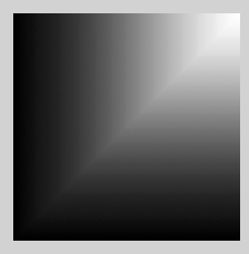
To better represent the resulting resulting tones, we will show them using the L (Luminosity component in CIE Lab color space) tonal scale in [0, 1] L ; where 0 L is black and 1 L is white (the actual L scale is in [0, 100]). We have chosen this tonal scale because it is very perceptually uniform and we will use the [0, 1] L range because this helps to get simpler formulas for the blending modes and the understanding of them.
However, the blends are build using the sRGB color space (or color profile in PS tongue) using 16 bits/channel . Later we will comment on the consequence of using other color spaces, like ProPhoto RGB.
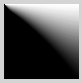
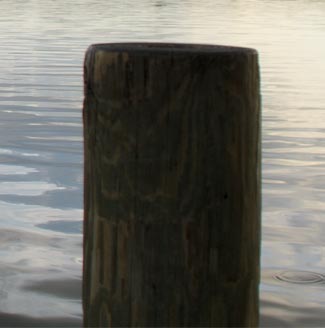
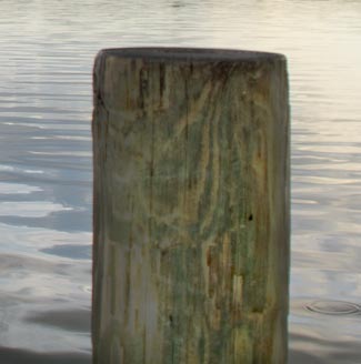
We will use the following top and bottom layers in order to get all the possible combinations of top and bottom channel values.

The top (left) and bottom (right) layers we will use.
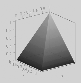
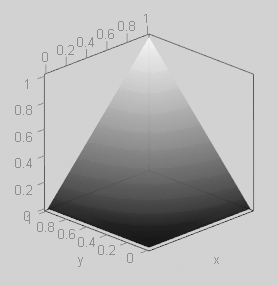
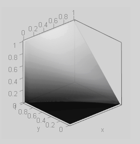
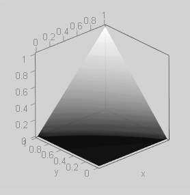
We will show a 3D surface where the horizontal plane will correspond to the blended layers (imaginatively speaking), and in the vertical dimension the surface will represent the luminosity of the pixels resulting from the blending of the layers. In this surface, the higher is draw the pixel, the greater is its luminosity in the blend. The surface color is slightly posterized to better notice the height of its points.

Example of 3D surface representing the resulting blend.
When this surface is symmetric to the diagonal $(y = x)$ plane —as in the above example— means that the blending mode is commutative: swapping the top and bottom layers will not change the resulting blend.
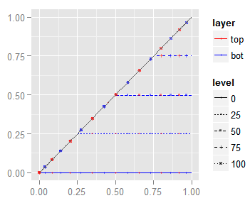
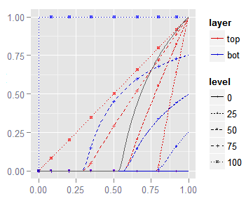
Also we will show 2D curves corresponding to equal value lines in the top and bottom layer (isolumas). The blue curves correspond to equal value pixels in the bottom layer and the red curves for the top one.
Notice that —by design— when one layer line has a constant value (isoluma) the other one is varying in a gradient from black to white. These isolumas are built selecting lines on the layers with luminosity values of 0% L, 25% L , 50% L, 75% L and 100% L.

You can think about the isolumas as cuts in the 3D surface through planes perpendicular to the xy base and parallel to the x or y axis. The dark gray diagonal represents the blend of the same channel values in the top and bottom layer.
In the 3D plot, greater values in the y 3D dimension correspond to lighter bottom layer tones, while greater x 3D values correspond to lighter top layer values.
For example, we will plot a red curve representing the pixel values in the resulting blend when the top channel is 25% L gray and the bottom layer has a gradient from black to white. As another example, we will also plot a blue curve when the bottom layer is 75% L gray and the top layer has a gradient from black to white.

The dark gray curve correspond to the blend of the same gradient in the top and bottom channel.
Please, be aware that in the 3D plots, the y dimension goes from 0 to 1 from right to left, but in the 2D curves they are plot along the x axis, which goes from left to right; don't let this fool you.
In these 2D curves, the diagonal $(y = x)$ line means the channel pixel in one layer are revealed unchanged in the resulting blend. Put differently, a blue diagonal means a bottom channel tone (isoluma) is bringing a blend exactly equal to the top layer channel; the same goes with a red diagonal, which means a top channel isoluma tone is bringing a blend showing the bottom channel.
When a point of a curve above this diagonal, means that the tone in the blend is lighter than the one in the other layer, and if it is below it means it is darker. For example, if we check the blue isolumas in the plot above, we will find that a white (100% L) bottom channel tone will bring in the blend the top channel tones unchanged, but the darker that bottom layer (75%, 50%, ...) is, the darkened the top layer is shown in the blend.
The slope of this curves tell us how the contrast will change. If the slope is 45 °, the contrast wont change. If it is greater than 45 °, the contrast will be higher, and —of ocurse— if it is smaller the contrast will be lower. For example, the plot above says that when a layer contains a solid color being darkened, the blend will expose the other layer with decreasing contrast. If the curve is not a straight line it is possible that some tones gain contrast and other ones lose it.
Notice that when the blend mode is commutative, the red and blue isolumas for the same tone will overlap to each other, as in the above graph. In general, when two isolumas overlap to each other, you can use the colored points to distinguish which of the are in the overlapping. For example, the diagonal line, in the above plot, has red and blue squares over it, which tell us the '100% L' top and bottom isolumas are overlapping to each other.
Finally, we will also show a (2D) dark gray curve representing the pixel luminosity resulting from the blending of two layers with the same content. In this case, the plotted curve is the blending of two layers with the same gradient from black to white, which corresponds to the diagonal dark gray curve in 3D surface above.
Right now, all of this may seem a bit overwhelming. However, we will explain these plots again when we describe the blend modes and you will get them easily.
Darken Mode
\begin{equation} \eqalign{ blend &= min(top, bottom) \\ &= min(bottom, top) } \label{eq:blend-darken} \end{equation}
This commutative mode exposes the darker tone in the layers channels. This is the tone with minimum value in the input channels.
 |
 |
 |
Notice that the tip of the above 3D pyramid is not over its base center but over the top right corner.
The isolumas graph look weird. To understand better how these curves are, in the following graph we show the 50% isoluma curve:

The 50% Isoluma composed bya a diagonal and a flat lin.
They are composed by a diagonal and a flat line segments. The tones of one layer channel are exposed in the blend, exactly as they are (diagonal $(y = x)$ line) as long as they are darker than the isoluma tone in the other layer. When those pixels become lighter than the isoluma one, this last tone is the one exposed by the blend (a flat line).
When both layers contain the same image (dark gray diagonal line) the result is that common image.
This blending mode is useful to replace overexposed areas of an image. For example, suppose that you have a subject over an overexposed background and you want to replace it with another picture. If the replacement background have darker tones than those in the original background, but not darker than the subject, this blending mode will easily make the background replacement.

Best case for the use of the Darken blending mode to replace a bright background.
Please, see the following example of background replacement.


As this blending mode is commutative, is irrelevant which layer goes above or on top, because the resulting blend is the same. However, for the sake of simplicity we will say the new background is in the bottom layer and the original image is on top.
In the example above, the point-and-shoot camera has chosen a too fast exposure time influenced by the bright sky. As consequence, the subject is a little too dark and the sky is very bright; so, the image can not be easily light up without the risk of highlight-clipping the sky. A less brighter sky will solve that and also will help the eye to distinguish more detail in our rather dark subject.
We can replace the original background setting the new (darker) background in a layer below the original image and blending them using the Darken mode. However, if an area of the subject overlaps the new background where the subject has lighter tones than the ones in the background below, the background will be exposed, and the subject will look like vanished in the background. This is a per channel issue.
In our example, a check to the blending red channel will reveal that the background is being exposed in some areas instead of our subject. This requires some masking, even though, the heavy lifting is already done just by the Darken blending mode.
Multiply Mode
\begin{equation} \eqalign{ blend &= top \times bottom \\ &= bottom \times top } \label{eq:blend-mult} \end{equation}
The tones in the top and bottom layer interact resulting in a blend which is darker than any of the input layers; as consequence, the contrast in the blend is smaller than in any of those input layers.
This commutative blending mode does exactly what its name says: it multiplies both input channel values to get the resulting channel blend. As the input channel values are in [0, 1], their multiplication brings a tone darker than each of them, except only when one of them is 1 (white) in which case the result is the other channel value.
 |
 |
|
As this blending mode is commutative, the top layer isolumas (red curves) exactly overwrite the ones from the bottom layer (blue curves), that is the reason why we don't see them in the above 2D plot.
All the isolumas are almost straight lines, except when they are close to the axes origin. This means that the pixel values in one channel (almost) linearly downscales the luminosity in the other one.
When both layers contain the same image (the dark gray curve in the above plot) the resulting blend is an image with higher contrast (a steep slope in the curve) for the lighter tones, and this contrast fades away for the darker tones, in particular below 30% L . For this reason, this blend mode is useful to recover contrast in overexposed areas of the image, multiplying that image area by itself.
Below we have an example multiplying the same image by itself to recover the overexposed sky.
The original dark tones are almost black in the blend. We should restrict this adjustment to only to the overexposed areas of the image.
Color burn Mode
\begin{equation} \eqalign{ blend = 1 - (1 - bottom) / top } \label{eq:blend-color-burn} \end{equation}
This non-commutative blending mode increases the contrast in the bottom layer image depending on the tones in the top one. The price for this is less room for the lightest tones. In the average case, the 53% of the image pixels are turned to black.
 |
 |
 |
The dark gray curve in the above plot, tell us that using this blending mode, with the same image in both layers, will bring a darker image and with higher contrast. However, it will clip to black those original tones below 53% L (we can notice that by checking the interception of the dark gray curve with the x axis). As a rule of thumb, this technique of blending the same image in both layers, more likely will work fin with tones above 70% L.
We can see, in the top channel (red) isolumas, how the contrast is increased while a solid top layer is being darkened, causing also more darker tones get clipped to black. This behavior is kind of complementary to the Multiply blending mode, which instead decreases the contrast darkening the lightest tone.
The following plot isolates the Color Burn and Multiply top layer isolumas.; there, the lines starting from the bottom left corner are the Multiply mode isolumas, while the lines starting from the top right corner are the Color Burn ones.

The Multiply isolumas start from the axes origin, the Color-Burn ones start from the top right corner.
Notice how the Multiply mode decreases the contrast by setting the lighter tone (check the right end of the curves) gradually darker, while the Color Burn increases the contrast turning more dark tones to black (check the left end of the curves). In both cases, a white top layer brings the bottom layer (unchanged) as the blend result.
In the following slider you can click on the titles at the right panel to see the corresponding image and comments. This slider shows some examples of using the Color Burn blending mode to enhance the contrast and diminish the overexposure, which we will comment below.

62 L gray and the original image in the bottom layer.The original image is a little bit overexposed in the sky area. If we blend this original image with a top layer containing a solid flat gray tone (62 L gray), we recover details in the sky, but —as expected— the darker tones are clipped to black. This means we should restrict this blend only to the overexposed areas of the image. If we Multiply the image by itself, we get a result similar to the previous one.
If we place the same image as top and bottom layers in a Color Burn blend, we recover again the sky from the overexposure, but this time, not as much as we would like. If we darken a little the top layer, using a levels adjustment {33, 0.85, 255}, we recover a nicer sky. Compared with "Solid gray top", this way we have also extra punch in the clouds and lake colors.
A useful characteristic of this blending mode is that it also increases the color of not too high image tones, lets say around the third quarter ([50%, 75%] L). As the tones below 53% L will be clipped to black we must use a mask to soften the blend effect over those mid tones, so they don't result too dark or just decrease the blend opacity.
In the following example, the reflections in the lake are above 51% L and look dull and lacking of contrast. We will try to amend this using the Color Burn blending mode with the same image as top and bottom layer.


50% L look too dark.87% we get a better result.With the adjustment applied with 100% opacity, the reflection tones closer to 50% L look too dark. This adjustment should be applied selecting the lightest tones in order to smooth the blend effect over the mid tones and below, in particular to avoid the black clipping in the pole.
Dividing a Layer by Other One
We must realize that the expressions with form $(1 - p)$ in the \eqref{eq:blend-color-burn} equation correspond to to the Invert operation in PS. This means that if we invert the bottom layer and also invert the resulting blend we will be dividing the pixel values in the bottom channel by those in the top one:
\begin{equation} \eqalign{ blend &= Invert {\large (}1 - (1 - Invert(bottom)) / top {\large )} \\ &= Invert {\large (}1 - (1 - (1 - bottom)) / top {\large )} \\ &= Invert {\large (}1 - bottom/top {\large )} \\ &= 1 - (1 - bottom/top) \\ &= bottom/top \\ } \label{eq:blend-divide} \end{equation}
We can use this to light up the image in the bottom layer using dark tones in the top one. The following image shows the layout of layers using this approach, the selected top layer has the Color Burn blending mode.

Layout to get the division of the bottom layer by the top one.
The layer labeled as "Light" is painted with a dark tones (13 L) and with a low opacity brush (7 %) in order to upscale the tone values in the lower layer producing an illumination effect in the following slider we can see the result using this technique.
Of course the result is not perfect, our focus is to give a simple example, not to get a great result using additional techniques obfuscating what we want to show.
As the top channel pixel value is the denominator in the \eqref{eq:blend-color-burn} equation, there is a singularity in this blending mode when this value is zero (black) : when the bottom layer is white, the blend is white regardless of the tones in the top layers; in particular the black tones in the top layer are shown as white in the resulting blend. However, if the white bottom layer is darkened, just a little bit, to a tone a tad less lighter than white, these top layer black tones —previously shown as white— now jump to black in the resulting blend.
Linear Burn
\begin{equation} \eqalign{ blend &= top + bottom -1 \\ &= bottom + top -1 \\ &= top - (1 - bottom) &= top - Inverse(bottom) \\ &= bottom - (1 - top) &= bottom - Inverse(top)\\ } \label{eq:blend-linear-burn} \end{equation}
As other blending modes in this group, this commutative one darkens a layer depending on the tones in the other, but what makes this different to the others, is that it keeps the contrast unchanged. Clips the same dark tones to black as Color Burn does.
 |
 |
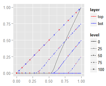 |
Notice how all the isolumas have the same constant 45 ° slope, meaning that when one layer is a solid gray being darkened, the blend will show the other layer, also being darkened, but keeping its original contrast.
Certainly, the surface of this blending mode resembles the one for the Multiply mode. However, there is a big difference, a Multiply blend exposes black only when one of the layers is black (the surface touching the axes), whilst a Linear Burn blend clips the result to black for almost the half of all the possible combination of top and bottom channels. Also the Linear Burn surface is almost flat when is not zero, whilst the Multiply surface is concave.

Linear burn clips to zero for the half of the possible top and bottom channel combinations whilst Multiply is black only when touching the axes.