In the post "Use of Linear Regressions to Model Camera Sensor Noise" we need to build some linear regressions. However, it turns out that the data was heteroscedastic and required some analysis, data transformation and cleaning. This was a chance to learn and practice some techniques about linear regressions using R Language.
This article contains all the analysis and steps required to get the most accurate linear regression from the given data.
- Building a Regression for HalfVarDelta ~ Mean
- OLS Regression
- Solving HalfVarDelta Heteroscedasticity
- Spline Regression
- Honing the linear part
- Adding a quadratic term to HalfVarDelta
- The Resulting Models
- Building a Regression for Var vs Mean
Building a Regression for HalfVarDelta ~ Mean
We need to build a regression line with HalfVarDelta as response variable and Mean as predictor. The data comes from a series of photographs taken as a study modeling the sensor noise in a Nikon D7000 camera.
From pairs of photos taken with exactly the same settings (e.g. aperture and exposition time) there are usually 15 observations with different values of HalfVarDelta and Mean caused by noise. The properties of each observation are:
- ID [int]
- Aperture [f number]
- Exposition Time (reciprocal) [s]
- HalfVarDelta [ADU²]
- Mean [ADU]
ID is an integer value, with a unique value for each observation, starting from those with higher Mean and increasing as the Mean decreases. The exposition time is represented with its reciprocal value in seconds. For example, the value 250 represents 1/250 seconds. HalfVarDelta is measured in ADU² and Mean in ADU.
By a theoretical analysis, HalfVarDelta and Mean are supposed to be linearly related.
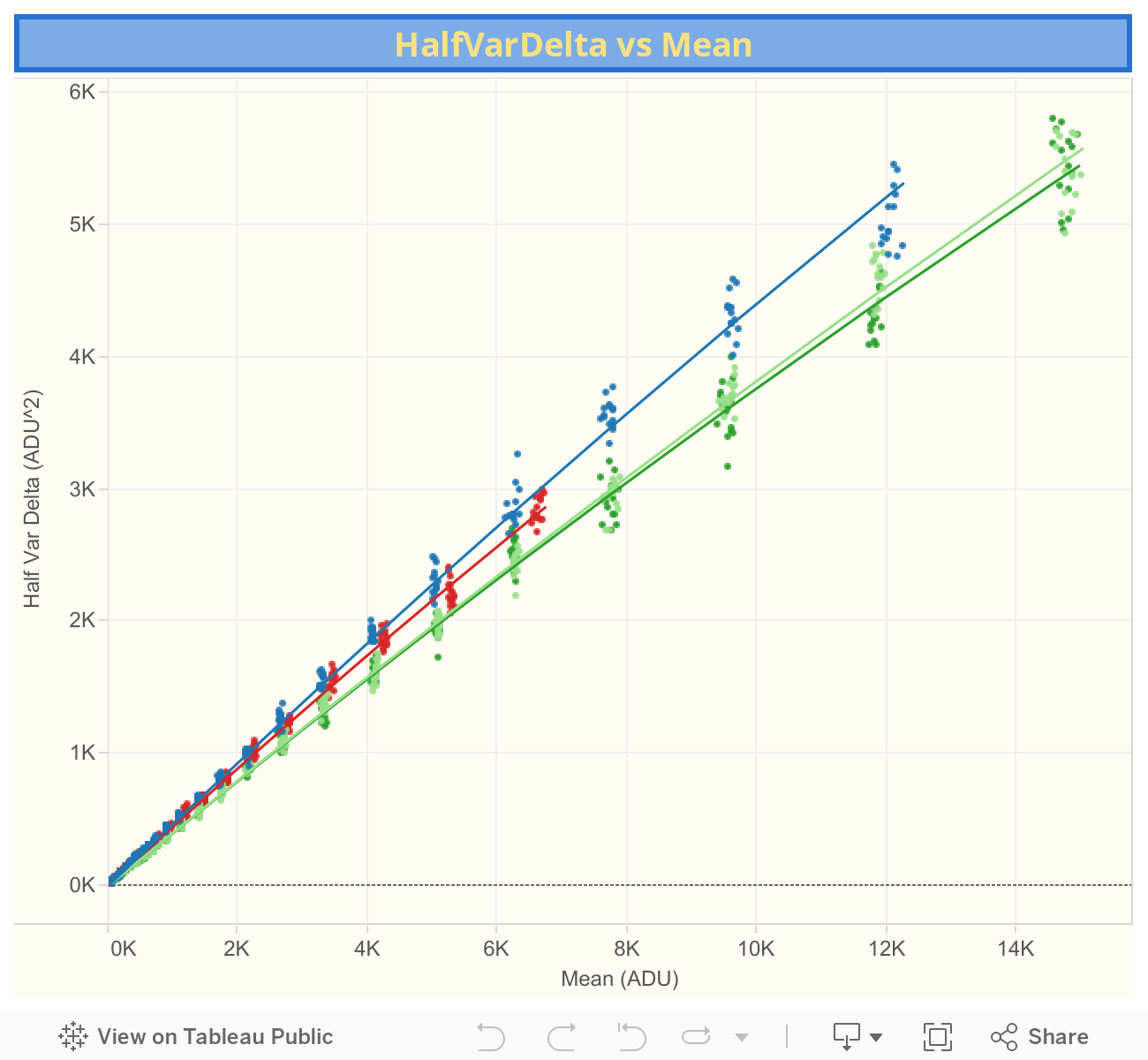
The plot of HalfVarDelta vs Mean from the green (blue row) photosites is shown below, where the dotted line corresponds to a simple (OLS) regression line. The points corresponding to photographs taken exactly in the same conditions are coded with the same color. You can download the all channels data from this link (17 KB).
OLS Regression
It is apparent the variance of the HalfVarDelta variable increases with the Mean: The points with higher Mean are more scattered than those with lower Mean. This is called heteroscedasticity and unfortunately means that an OLS (Ordinary Least Squares) regression is not adequate to model the relationship between those two variables: the regression coefficients wont be correctly estimated. Later we will make a transformation to overcome this difficulty.
Nonetheless, we will run some tests to see if the problems we found with this model can be solved in the following steps.
# A simple OLS linear regression
> lr <- lm(HalfVarDelta ~ Mean, data=gr)

# This will remove the "significance stars" in the summary output
> options(show.signif.stars=FALSE)
> summary(lr)

  Call:
  lm(formula = HalfVarDelta ~ Mean, data = gr)

  Residuals:
      Min      1Q  Median      3Q     Max
  -664.09  -16.25  -11.10   10.20  367.22

  Coefficients:
               Estimate Std. Error t value Pr(>|t|)
  (Intercept) 1.948e+01  3.427e+00   5.685 2.03e-08
  Mean        3.775e-01  8.719e-04 432.961  < 2e-16

  Residual standard error: 73.23 on 608 degrees of freedom
  Multiple R-squared:  0.9968,  Adjusted R-squared:  0.9968
  F-statistic: 1.875e+05 on 1 and 608 DF,  p-value: < 2.2e-16
The estimated coefficients seem to have great significance. However, because of the heteroscedasticity issue we know we shouldn't trust on them.
Regression Diagnostics
We will run some tests to validate or find out some properties of the model.
Testing the Normality of Residuals
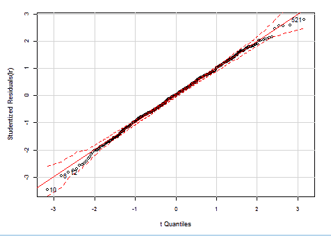
The Studentized residuals should have a Student's t-distribution with n-p-2 degrees of freedom. If we Q-Q plot our residuals against that distribution, with 95% confidence borders, we get:
> library(car)
> par(mar=c(4.9,4.8,2,2.1), cex=0.9, cex.axis=0.8)
> qqPlot(lr, id.n=4)
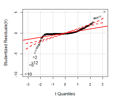
OLS HalfVarDelta vs Mean: QQ plot of studentized residuals against t-distribution. The dashed red lines are the borders for 95% confidence.
As we can see, the model residuals are not even close to the expected distribution.
When we run the Shapiro-Wilk test to validate the normality assumption with the residuals, we get:
> shapiro.test(residuals(lr))
Shapiro-Wilk normality test
W = 0.6085, p-value < 2.2e-16
In this test the null hypothesis is "The data comes from a normally distributed population". With our model, that hypothesis is rejected without any doubt (p-value is "technically" zero).
Homoscedasticity tests
If we run the Breusch-Pagan test to check if the model variance is homoscedastic, we get:
> bptest(lr)
"studentized Breusch-Pagan test for homoscedasticity"
BP = 171.4248, df = 1, p-value < 2.2e-16
This test checks the hypothesis "The model variance is homoscedastic". With our model, the p-value lead us to reject the hypothesis: the variance is heteroscedastic.
The ncvTest is another test to check if the variance is constant. In this case the hypothesis is "The model variance is constant". The zero p-value rejects the constant variance hypothesis, corroborating the previous test.
> ncvTest(lr)
"Non-constant Variance Score Test"
Variance formula: ~ fitted.values
Chisquare = 2245.776    Df = 1     p = 0
Analysis of Studentized Residuals
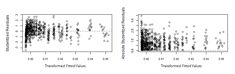
The following graphs, plotting Studentized residuals versus fitted values, show the residuals having a wiggly pattern and spread in a statistically excessively wide range —indicating lack-of-fit— and as expected, its absolute value grows with the fitted values.
> plot(fitted(lr), rstudent(lr), xlab="Fitted values", ylab="Studentized Residuals")
> abline(0, 0)

> plot(fitted(lr), abs(rstudent(lr)), xlab="Fitted values", ylab="Absolute Studentized Residuals")
> abline(0, 0)
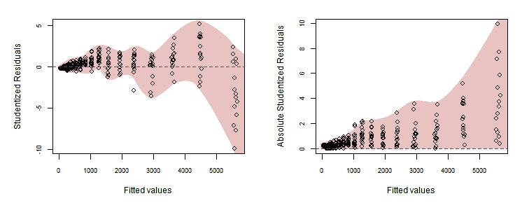
OLS HalfVarDelta vs Mean: Studentized residuals vs fitted values.
Residual plots
The function residualPlots graphs the residuals against the predictors and the fitted value. In our case both are very similar and we will show just one of them. The function also computes a curvature test, for each of the plots, by adding a quadratic term and testing if the quadratic coefficient is zero.
This is the Tukey's test for non-additivity. Stated in simple terms, the null hypothesis is "The data fits a linear model". If the fit is not bad, the p-value is big enough to do not reject the hypothesis.
> library(car)
> residualPlots(lr)
             Test stat Pr(>|t|)
  Mean         -12.984        0
  Tukey test   -12.984        0
OLS HalfVarDelta vs Mean: Residuals vs fitted values and a quadratic fitting test (red line).
The Tukey's test shows lack of fitting. There is a spreading wiggle pattern with an overall quadratic trend. The p-value is zero, it can not be more significant to reject the linear model.
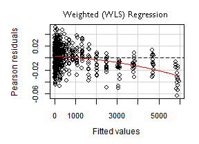
The vertical axis in the plot above, corresponds to "Pearson residuals". It has a particular meaning for weighted (WLS) regressions —in our OLS case— it just represents regular residuals.
Influence plots
If we look for the the outliers and most influential points —picture below— we will find that many of them are at the top right end of the plot (with lower indices). Those are the observations with higher Mean predictor value.
> library(car)
> influenceIndexPlot(lr, id.method="identify")
OLS HalfVarDelta vs Mean: Influence plot.
In the hat-values (leverage values) panel in the graph above, we can see how the Mean predictor value, being spaced geometrically (1/3 stop), makes the four or five groups of observations (those with the lower indices), at the top right of the plot, the ones with more leverage.
Another interesting measure of Influence is the Hadi's Index. When we calculate this index for our data we find out:
> library(bstats)
> influential.plot(lr, type="hadi", ID=TRUE)
Again, the observations with lower indices at the top right of the plot, are the ones with higher Hadi's influence indices (Hi).
OLS HalfVarDelta vs Mean: Hadi's Index (Hi).
Running the Bonferroni test to find potential influential outliers we find out that 6 of them are in the top right group of the plot
> outlierTest(lr)

    rstudent unadjusted p-value Bonferonni p
10 -9.921681         1.3592e-21   8.2369e-19
6  -7.726827         4.6252e-14   2.8029e-11
12 -7.151427         2.4965e-12   1.5129e-09
2  -5.853044         7.9274e-09   4.8040e-06
30  5.182201         2.9954e-07   1.8152e-04
9  -4.850593         1.5688e-06   9.5069e-04
1  -4.264211         2.3283e-05   1.4110e-02
26  4.005390         6.9650e-05   4.2208e-02
Running the influencePlot function we get again the usual suspects.
> influencePlot(lr, id.method="identify")
OLS HalfVarDelta vs Mean: High influence points: The size of the circles is proportional to Cook's Distance.
If in the HalfVarDelta-vs-Mean plot we double click on points close to the origin, we will see the OLS line regression (green dotted line) is missing the trend (red arrow) in its approximation to the interception with the vertical axis. This is evidence of how the coefficients are not well estimated because the error has not a constant variance.
The regression misses the trend close to the origin by the high influence of the points in the top right end.
Solving HalfVarDelta Heteroscedasticity
So far, the use of the Mean pixel values to linearly predict the HalfVarDelta ones, is problematic for the non constant variance or heteroscedasticity: the variance of the HalfVarDelta variable increases with the mean. In this section, we will analyze how exactly the variance of HalfVarDelta changes with respect to the Mean.
When we compute the HalfVarDelta variable, we first build a synthetic image from the difference, pixel by pixel, of two base raw images (the delta image); then we compute the half of the sample variance of that synthetic delta image.
As a nomenclature issue, to distinguish the sample variance from the population variance, we will call them $(sVar)$ and $(Var)$, respectively. Now we can represent the $(HalfVarDelta)$ variable as the evaluation of the following sample variance formula:
\begin{equation} HalfVarDelta = \frac{1}{2}\cdot sVar(D_p) = {{e_1^2 + e_2^2 + ... + e_n^2} \over 2\cdot(n-1)} = {{\sum_{k=1}^n e_p^2}\over 2\cdot(n-1)} \label{eq:hvdvm} \end{equation}
Where $(D_p)$ represents the value of a pixel in a sample of the synthesized delta image. The position of the pixel in the sample is represented by the p subscript in $(D_p)$, and the sample contains $(n)$ pixels. The term $(e_i)$ is the difference between each pixel value and their average value in the sample:
$$e_p = (D_p - \widehat{D_p})$$
In the article A Simple DSLR Camera Sensor Noise Model, we saw the pixel values in the base images come from a Poisson Distribution with mean values high enough to be very approximate to a Normal Distribution. In other words $(D_p)$, being the difference of the pixel values in two raw base images, is the difference of two normally distributed variates, which in turn is another normal distribution. So, $(D_p)$ is normally distributed.
Having samples with above of 1,000 elements, we can say $(\widehat{D_p})$ is a very good approximation to the population mean value $(\mu_D)$. Considering that, and dividing $(e_p)$ by the standard deviation of D ($(\sigma_D)$) we get:
\begin{equation} e_p/\sigma_D = {{(D_p - \mu_D)} \over \sigma_D} \hspace{2pt} {\large\sim N}(0,1) = Z_p \label{eq:toStdNorm} \end{equation}
Lets be aware the right side of the above equation is the transformation from a Normal Distribution variable $(D_p)$ to a Normal Standard Distribution, which we are calling $(Z_p)$.
$$ e_p = Z_p \cdot \sigma_D $$
If we plug this $(e_p)$ in the equation \eqref{eq:hvdvm}, we get:
$$ HalfVarDelta = {{\sigma_D^2 \cdot {\sum_{k=1}^n Z_p^2}} \over 2\cdot(n-1)} $$
Now we must notice the sum of $(Z_p^2)$ is a Chi-squared Distribution with $((n-1))$ degrees of freedom. Now, we finally have a clear view of the distribution of HalfVarDelta:
\begin{equation} HalfVarDelta = {{\sigma_D^2 \cdot \chi_{(n-1)}^2} \over 2\cdot(n-1)} \label{eq:hvd-chi} \end{equation}
If we take the expected value $(Eva)$ to both sides of the above equation, considering that a Chi-squared Distribution with $((n-1))$ degrees of freedom which has $((n-1))$ as mean, we get:
\begin{equation} Eva(HalfVarDelta) = {{\sigma_D^2 \cdot Eva(\hspace{1pt} \chi_{(n-1)}^2}) \over 2\cdot(n-1)} = {{\sigma_D^2 \cdot (n-1)} \over 2\cdot(n-1)} = {\sigma_D^2 \over 2} \label{eq:mean-hvd} \end{equation}
The equation above, tell us the expected value of HalfVarDelta is the half population variance of the pixel values from the delta image, which is exactly what we want to measure with this variable. Statistically speaking, this means HalfVarDelta is an unbiased estimator of the statistic we want to measure.
Lets see the variance of HalfVarDelta, which is what causes the heteroscedasticity in the regression data. Considering $(Var(k\cdot X) \equiv k^2 \cdot Var(X))$, and that the variance of a Chi-squared Distribution with $((n-1))$ degrees of freedom which has $(2\cdot(n-1))$ as variance, we will take the variance $(Var)$ to both ends of the equation \eqref{eq:hvd-chi}, to get:
\begin{equation} Var(HalfVarDelta) = {{\large(}{\sigma_D^2 \over 2\cdot(n-1)}{\large)}^2 \cdot Var(\hspace{2px} \chi_{(n-1)}^2)} = {(\sigma_D^2)^2 \over 2\cdot(n-1)} \nonumber \end{equation}
If we take the squared root to both ends of the above equation, and considering $(\sqrt{Var(X)} \equiv StdDev(X))$ —where $(StdDev)$ stands for the Standard Deviation— we get:
\begin{equation} StdDev(HalfVarDelta) = {Var(D) \over \sqrt{2\cdot(n-1)}} ~ {\large\sim} ~ k \cdot Var(D) \label{eq:var-hvd} \end{equation}
We can see, in the equation above, the standard deviation of HalfVarDelta grows linearly with the variance it is measuring ($(Var(D))$), which in the case of HalfVarDelta, grows linearly with the mean variable in our observations. In summary, the standard deviation of the HalfVarDelta variable grows linearly with the mean variable in our observations.
Our samples have 32x32 pixels per channel; hence we have (n-1) = 1023 degrees of freedom, which for a confidence interval between 2.5% and 97.5% corresponds to $(\chi^2)$ values between 936.25 and 1113.533. For a Mean around 14,800 ADU, we got an average HalfVarDelta of 5,397 ADU², this means a $(\sigma_D^2)$ approximately equal to 10,794 ADU² (the double).
If we plug this info in the equation \eqref{eq:hvd-chi}, we find we can expect HalfVarDelta values between 4,939 and 5,874 ADU² with a 95% chance, this is an spread of 935 ADU². However, for mean values around 6,287 with corresponding average HalfVarDelta of 2,430 we get HalfVarDelta values in a range between 2,224 and 2,645 ADU² with an spread of 421 ADU².
As we can see, higher means, linearly corresponds to higher spread of HalfVarDelta sample values. For a given Mean in our data, the 95% of time, the HalfVarDelta values will be around around 0.915 and 1.088 the expected value of HalfVarDelta (the value we want to measure). This is a 17% spread, 8.5% above and 8.5% below the mean HalfVarDelta.
Transforming the model
In the previous section we learn the variance of our HalfVarDelta variable linearly grows with the Mean variable in our observations. As we have not equal variance in the predicted variable, a simple OLS regression is contaminated for this heteroscedasticity and its output is not trustable.
Now we will explore, from a practical point of view, if and how the HalfVarDelta Standard Deviation and the mean, variables in our observations are related. Of course, under the light of our theoretical analysis above, we expect a linear relationship.
For each group of observations, with the same exposition time and aperture, we will get the mean and the standard deviation of the predictor Mean and the response HalfVarDelta variables —respectively— in our observations.
For example, we will calculate the mean of the Mean variable for all the observations in the group with exposition f/5.6 & 1/30s to get 14,797.72 and the standard deviation of their HalfVarDelta value to get 245.94. We will proceed this way with each group of shots with common exposition time and aperture. Then we will explore the relationship between that Mean and Standard Deviation calculating its Correlation Coefficient. Also we will plot them to see how they are related.
We have some data with the same exposition time but with different aperture. Most of the data has f/5.6 aperture, and fewer has f/7.1. To make the things easier we will split aside the data with f/5.6 aperture and work only with it. In R, all of this is easier to do than explain it:
> gbSub <- gr[gr$Aperture == 5.6,]
> etMean <- tapply(gbSub$Mean,         gbSub$InvExpoTime, mean)
> etSd   <- tapply(gbSub$HalfVarDelta, gbSub$InvExpoTime, sd)
> cor(etSd, etMean)^2
  [1] 0.9656132

> plot(etSd, etMean)
> lines(lowess(etSd, etMean), col = "red")
Plot of Mean(mean) versus StdDev(HalfVarDelta) for groups with the same exposition time and f/5.6 aperture.
As we can see in the graph, the relationship between the Standard Deviation of HalfVarDelta and the mean of the predictor Mean is basically linear. A measure of that is the 96.56% we get for the R² coefficient. Funny enough this data is again —somewhat recursively— heteroscedastic.
The simplest way to model this relationship is:
    HalfVarDelta = β₀ + β₁⋅Mean + δ
    δ ~ Mean⋅Ν(0, σ²)
Notice the Mean variable linearly amplifying the normal error. To get rid of this factor, we will divide the whole equation model by the predictor variable Mean:
    HalfVarDelta/Mean = β₀/Mean + β₁ + ε
    ε ~ Ν(0, σ²)
Notice we still have a linear relationship, therefore we can build an OLS linear regression over the transformed model.
    u = HalfVarDelta/Mean
    v = 1/Mean

    u = β₀⋅v + β₁ + ε
# Transformed model OLS regression
> lrt = lm(Var/Mean ~ I(1/Mean), data=gr)
Check how the interception for the transformed model, corresponds to the slope in the original one and vice versa.
In the OLS model, the linear coefficients (or model parameters) are estimated minimizing the sum of the squared residuals shown in the following formulas.
Which for the kind of the transformation we have used above, can be expressed as:
This is very similar to the model of weighted least squares (WLS) Linear Regression, where the model parameters are estimated minimizing:
This means, the transformation we described above, is equivalent to a WLS Linear Regression with:
In other words, instead of the OLS regression over the transformed model, we can also get rid of the heteroscedasticity using a WLS regression with (1/Mean²) as weight:
# WLS regression
> lr = lm(Var ~ Mean, data=gr, weight=1/Mean^2)
Relationship between the Weighted Regression and the Transformed Model
We can relate the elements in the WLS model with those in the transformed one considering the WLS regression is minimizing:
This means that instead of the ordinary residuals "ei", we should use the Pearson residuals "epi", which are the residuals "adjusted" considering the weights.
In the same sense, when we want to compare the weighted (Pearson) residuals with the regression fitted values, instead of the ordinary fitted values "y-hati" we should use the adjusted fitted values "ya-hati".
For our transformation, this adjustment means dividing the fitted value by the value of the corresponding Mean predictor.
Computing a regression With iid Error
In the previous section, we found a way to correct the heteroscedasticity issue in the model HalfVarDelta ~ Mean which will deliver what is known as a model with iid (Independent and identically distributed) error variance. We also learn two ways to implement this solution: transforming the model or weighting the errors. In this section we will implement both solutions in R.
We can use WLS Linear Regression in R, by just specifying the weight for each observation error, using the weight parameter in the lm function.
We will try to use WLS most of the time instead of OLS with the transformed model.
# Using OLS with the transformed model
#-----------------------------------
> lrt <-  lm(HalfVarDelta/Mean ~ I(1/Mean), data=gr)
> summary(lrt)

  Residuals:
        Min        1Q    Median        3Q       Max
  -0.063507 -0.012264  0.000692  0.012348  0.055473

  Coefficients:
               Estimate Std. Error t value Pr(>|t|)
  (Intercept) 0.3971996  0.0009727  408.34   <2e-16
  I(1/Mean)   1.8266340  0.1214040   15.05   <2e-16

  Residual standard error: 0.01867 on 608 degrees of freedom
  Multiple R-squared:  0.2713,  Adjusted R-squared:  0.2701
  F-statistic: 226.4 on 1 and 608 DF,  p-value: < 2.2e-16

# Using WLS with 1/Mean^2 as the weight
#---------------------------------------
> lr <- lm(HalfVarDelta ~ Mean, data=gr, weight=1/Mean^2)
> summary(lr)

  Weighted Residuals:
        Min        1Q    Median        3Q       Max
  -0.063507 -0.012264  0.000692  0.012348  0.055473

  Coefficients:
               Estimate Std. Error t value Pr(>|t|)
  (Intercept) 1.8266340  0.1214040   15.05   <2e-16
  Mean        0.3971996  0.0009727  408.34   <2e-16

  Residual standard error: 0.01867 on 608 degrees of freedom
  Multiple R-squared:  0.9964,  Adjusted R-squared:  0.9964
  F-statistic: 1.667e+05 on 1 and 608 DF,  p-value: < 2.2e-16
In the code above, we have run the two equivalent regressions correcting the non-constant variance. Notice how we arrive to the same estimations, but with the intercept and the slope swapped as we anticipated. They only differ in the Coefficient of Determination R², we will see more about that later.
Comparing this last regression with the original OLS regression, notice the strong change of the intercept value. In the original regression this value was 10 times greater!
WLS Regression Diagnostics
We will diagnostic the weighted regression using the tests we already used for the initial OLS regression (we will call it the original OLS regression). We wont show the R code already shown before.
# Plot the "Transformed OLS regression"
> plot(1/gr$Mean, gr$HalfVarDelta/gr$Mean, col="darkgreen", bg="green", pch=21, cex.axis=0.8, cex.lab=0.8)
> lines(1/gr$Mean, fitted(lr), lwd=2, col="gray25", lty=2)
Regression Plots: WLS Regression and 'Transformed OLS Regression'.
An outstanding difference between the transformed OLS and the weighted regressions (we will call them OLSTR and WLSR) is the difference in the Coefficients of Determination (R²). With the WLSR, R² is almost as good as with the original OLS regression (flawed), but for the WLSR it has a poor value, even when the p-values, for the coefficients and for the whole regression, are as good as possible. This can be explained by looking at the regression plots in the picture above.
In the WLSR —left plot— the observations lie very close to the regression, but in the OLSTR one, the points are very scattered around the regression line. That is why the OLSTR observation has more variance not explained by the model —diminishing R²— even when both plots are showing the same information but just with different mathematical models. However, both have the same outstanding p-values. This is a good example about how the p-values can describe the model fitting quality better than R².
As in the OLSTR —right plot— the horizontal axis shows the reciprocal value of the predictor variable Mean, the observations at the left side of the first plot are now at the right side of the second one, and vice versa. This way, at the left end of the OLSTR we can see some regression outliers, corresponding to the regression outliers at the top right end of the line in the left plot.
Testing Normality of Residuals
If we check again the Studentized residuals distribution, in our heteroscedasticity-corrected models, we can see they now really have a Student's t-Distribution! There are just some outliers at both ends, but the whole residuals spread is much more narrower than in the the original OLS regression.
WLS HalfVarDelta vs Mean: QQ plot of studentized residuals against the Student's t-distribution. The dashed red lines are the borders for 95% confidence.
Lets run the Shapiro-Wilk Normality test to our weighted residuals.
> shapiro.test(residuals(lr, type="pearson"))
Shapiro-Wilk normality test
data:  residuals(lr, type = "pearson")
W = 0.9977, p-value = 0.5765
Now we are OK. The hypothesis: "The sample comes form a Normally distributed population" can not be rejected!
Homoscedasticity tests
ncvTest(lr, var.formula= ~ fitted(lr)/gr$Mean) the same result as for the transformed OLS without success.
We will show the use of those homoscedasticity tests with the OLSTR regression.
> bptest(lrt, data=gr)
"studentized Breusch-Pagan test for homoscedasticity"
BP = 0.4863, df = 1, p-value = 0.4856

> ncvTest(lrt)
"Non-constant Variance Score Test"
Variance formula: ~ fitted.values
Chisquare = 0.4997825    Df = 1     p = 0.4795957
The big p-values tell us the heteroscedasticity has been removed by the transformation!.
Analysis of Studentized Residuals
The graphs below show the Studentized residuals more homogeneously distributed along the horizontal axis representing the transformed fitted values.
> plot(fitted(lr)/gr$Mean, rstudent(lr), xlab="Fitted values", ylab="Studentized Residuals")
> plot(fitted(lr)/gr$Mean, abs(rstudent(lr)), xlab="Fitted values", ylab="Absolute Studentized Residuals")
WLS HalfVarDelta vs Mean: Studentized residuals vs fitted values.
In both graphs above, some outliers at the left end, make the plots look like the vertical spread of the points is slightly decreasing along the horizontal axis. Eventhough, that spread is much more even than in the original -flawed- OLS regression.
Residual plots
If we run the residualPlots test with the weighted regression (WLSR), it does not adjust the fitted values considering the weights. This way, the horizontal axis shows the regular fitted values.
Looking at the numerical values from the test, we are OK now. This time we can not reject the hypothesis "The data fits a linear model".
> library(car)
> residualPlots(lr)
           Test stat Pr(>|t|)
Mean          -1.166    0.244
Tukey test    -1.166    0.244
WLS HalfVarDelta vs Mean: Residuals vs fitted values and a quadratic fitting test (red line).
Influence plots
Below is the graph from the influenceIndexPlot function, with the most extreme outliers flagged by their index. This time they are at the right end of this model, corresponding to the points close to the origin in the original OLS regression. However, it seems there is less outliers than in the original regression. The transformation has also helped in this issue.
There is only one outlier in the Bonferroni test and corresponds to an observation which also was an influence outlier in the original OLS regression!
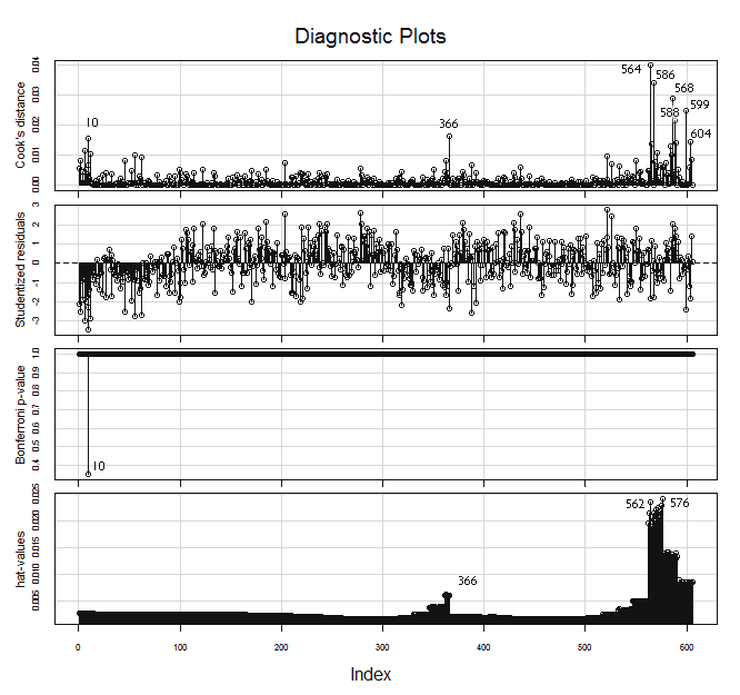
WLS HalfVarDelta vs Mean: High Influence points.
Lets check the Hadi's index below, there are 6 suspects.
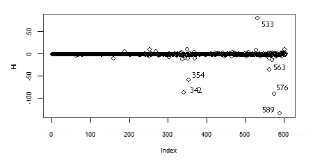
WLS HalfVarDelta vs Mean: Hadi's Index (Hi).
The influencePlot has the advantage of being very illustrative, but as it is showing the same information we checked with the influenceIndexPlot there is no big news. Notice how the Studentized residuals are spread over a much more narrower range than in the original OLS regression.
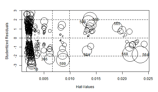
WLS HalfVarDelta vs Mean. High influence points: The size of the circles is proportional to Cook's Distance.
Removing the 6 groups with top values
In this regression we are more interested in the behavior of the model close to the origin, where Mean is zero.
If we look at the influenceIndexPlot , we can see how most of the observations with the lowest indices (below around 100), corresponding to those close to the top right end of Mean vs HalfVarDelta plot, have a negative residual. This group contains also the bigger regression outliers.
In the WLS regression plot all the points in the top group and all the points in the fourth top group are below the regression line.
If we count the observations above the regression line (positive residual) and subtract the count of the observations below the regression (negative residual), the running difference for the next 15 points (group average size) following each observation, is always negative for all the observations in the first 6 top groups.
All these considerations make us believe the points in those 6 top groups do not correspond to the behavior shown by the other observations. We will remove them from the model, keeping only those with Mean below 5,000 ADU (with the ID attribute above or equal to 91).
Now the influenceIndexPlot looks this way:
WLS HalfVarDelta vs Mean. High influence points after removing top 6 group of observations.
If after removing the top values, we run a Robust regression (using the robustbase library), we get:
Call:
lmrob(formula = HalfVarDelta ~ Mean, data = gr[gr$Mean < 5000,], weights = 1/Mean^2, method = "MM")

Residuals:
       Min         1Q     Median         3Q        Max
-174.77605   -2.88124   -0.07737    3.17385   94.96335

Coefficients:
            Estimate Std. Error t value Pr(>|t|)
(Intercept) 1.452633   0.134555    10.8   <2e-16
Mean        0.402161   0.001065   377.5   <2e-16

Robust residual standard error: 0.01789
Multiple R-squared:  0.9969,    Adjusted R-squared:  0.9969
Convergence in 10 IRWLS iterations
Selecting and Removing Extreme Outliers
We have built the data, sampling more than once the same information, to be able to remove some outliers. In the next step, keeping the data from the previous section, with the top groups removed; we will build a list collecting the indices of outliers in the plots for Cook's distance, hat-value (leverage-value), Studentized residuals and Hadi's index test. We will plot those observations with red color and select among them the "extreme" outliers. Later, we will remove them from the data.
# The model transformed to avoid heteroscedasticity with top groups
# values removed
lrt <-  lm(HalfVarDelta/Mean ~ I(1/Mean), data=gr[gr$Mean < 5000, ])
# Get the influence metrics
> hatVal = hatvalues(lr)
> cookDist = cooks.distance(lr)
> absRstud = abs(rstudent(lr))

# Select the outliers, the limits are chosen considering the previous plots
> gsr = absRstud[absRstud > 2]
> gcd = cookDist[cookDist > 0.01]
> ghv = hatVal[hatVal > 0.015]

# Build list of indices of the suspected observations
> ixSuspects = which(cookDist %in% gcd | hatVal %in% ghv | absRstud %in% gsr)

# Plot the observations and the model and pick the "extreme" outliers
> par(mar=c(4.9,4.8,2,2.1), cex=0.9, pch=21, cex.axis=0.8, cex.lab=0.8, col="gray30")
> plot(1/gr$Mean, gr$HalfVarDelta/gr$Mean, bg="green")
> points(1/gr$Mean[ixSuspects], gr$HalfVarDelta[ixSuspects]/gr$Mean[ixSuspects], bg="red")
> lines(1/gr$Mean, fitted(lrt), lwd=2, col="gray25", lty=2)
> identify(1/gr$Mean, gr$HalfVarDelta/gr$Mean, gr$ID)
The following plot shows with red background the points found as outliers in the previous tests. We have interactively selected the most extreme outliers (showing their index) and we will remove them from the data.
OLSTR HalfVarDelta vs Mean. Outlier points flagged with red background. The ones selected showing their index will be removed from the data.
gb <- gb[!(gb$ID %in% c(196, 339, 496, 587, 242, 556, 578, 609)),]
After the removal of the extreme outliers, we fit again the model with a WLS regression to get:
lm(formula = HalfVarDelta ~ Mean, data = gb, weights = 1/(Mean^2))

Weighted Residuals:
     Min       1Q   Median       3Q      Max
-0.04355 -0.01136 -0.00012  0.01135  0.04370

Coefficients:
            Estimate Std. Error t value Pr(>|t|)
(Intercept) 1.501389   0.118828   12.63   <2e-16
Mean        0.401721   0.001014  396.09   <2e-16

Residual standard error: 0.01684 on 510 degrees of freedom
Multiple R-squared:  0.9968,    Adjusted R-squared:  0.9968
F-statistic: 1.569e+05 on 1 and 510 DF,  p-value: < 2.2e-16
So far, the best regression we have as reference, are the robust one, with the top groups removed, and this last OLSTR above, with additional top outlier and influencer points removed. Both are very similar quantitatively speaking.
Notice how, the Intercept has diminished with respect to our first iid lr and lrt models in the section Computing a regression With iid Error. In the first simple OLS regression, flawed by the heteroscedasticity, it has a value of 19.8 ADU. The outliers and the heteroscedasticity affected mainly this coefficient. The slope has also changed but relatively very little, from 0.377 to 0.402 (+7%).
Spline Regression
Another way we can study the HalfVarDelta versus Mean data is through the use of smooth splines. Using the df parameter we can control the splines smoothness. This is a "synthetic" degrees of freedom parameter, which admits fractional values, where lower values render smoother curves than higher values.
In R we can use the smooth.spline() function to fit the spline model to our data. The wonderful of this function is that we can get predictions of the values fitted by the model and also the derivatives of it. In our case, we are interested in the y axis intercept (Mean equal zero) and the first derivative close to this interception: the slope close to the axes origin. Lets recall we have this interest because those values have an interpretation in the theoretical model of the raw image noise.
We will fit a spline with df = 2 to our data and plot the predictions of HalfVarDelta and its first derivative. Also we will check the corresponding spar value used in the fitting, and we will tweak the model adjusting that parameter from this first value; which in opposite way respect to the df parameter, lower values render wiggler curves than higher values.
> spFit <- smooth.spline(gr$Mean, gr$HalfVarDelta, df=2)
> spFit$spar
[1] 1.499948

require(ggplot2)
> qplot(spFit$x, spFit$y, col="darkgreen", geom='line', main='HalfVarDelta vs Main',
>       xlab='Mean', ylab='HalfVarDelta') +
>   geom_point(aes(gr$Mean, gr$HalfVarDelta), alpha = I(0.4), colour=I('black')) +
>   geom_line(size=1, colour=I('darkgreen')) +
>   theme(legend.position="none")
The effective spar is 1.5.
splines and HalfVarDelta versus Mean observations: The curve seems very linear up to around 5,000 ADU; then there are some linear segments with slight slope variations.
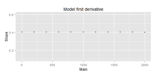
Notice how the whole spline seems to be linear up to around 5,000 ADU. The same limit we found linearity when trimmed the upper values. Now we will plot the predictions first derivative: the slope of the previous curve.
> slope <- predict(spFit, seq(0,15000, by=200), deriv=1)
> qplot(slope$x, slope$y, ylim=c(0.1,0.6), alpha = I(0.4), ylab='Slope', xlab='Main',
      main='Model first derivative')
HalfVarDelta spline first derivative (spar = 1.5): The curve seems to have an almost constant slope up to around 2,000 ADU.
Thanks to this plot, now we can see the most linear segment, close to the Mean = 0 interception, is up to around 2,000 ADU.
We will soften just a little bit the spline with spar = 1.6 and read the slope and interception point:
# A little bit smoother spline
> spFit <- smooth.spline(gr$Mean, gr$HalfVarDelta, spar=1.6)
# Interception with Mean = 0
> fit$y[1]
1.402723
> slope <- predict(spFit, seq(0,2000, by=200), deriv=1)
> slope$y[1]
[1] 0.4040944
> qplot(slope$x, slope$y, ylim=c(0.1,0.6), alpha = I(0.4), ylab='Slope', xlab='Main',
      geom='line', main='Model first derivative')
The interception is at 1.4027 ADU.
Splines and 'HalfVarDelta versus Mean' data (spar = 1.6): The fitting below 2,000 ADU is very linear. The interception is at 1.403
Splines and 'HalfVarDelta versus Mean' data: A close-up look to the previous plot. The slope below 2,000 is pretty much constant. It has 0.4040 as average and only 6.1E-05 as standard deviation!
Using splines we got 1.403 ADU as interception with Mean = 0 and a slope of 0.4041.
The great advantage of the spline modeling is that local features does not influence the whole fitting, as happens with the linear regression, where the points at the higher end of the range influence the fitting at the lower end. The disadvantage is, as any non-parametric model, we don't have coefficients and much less their estimation error. However, with the help of the derivatives we can understand better the data.
If now we fit our iid weighted regression for HalfVarDelta versus Mean data with Mean < 2000, which as we saw before is a very linear segment in the the data, we get:
> lfs <- lm(HalfVarDelta ~ Mean, weight=1/Mean^2, data = gr[gr$Mean < 2000,])
> summary(lfs)

Call:
lm(formula = HalfVarDelta ~ Mean, data = gr[gr$Mean < 2000, ],
    weights = 1/Mean^2)

Weighted Residuals:
      Min        1Q    Median        3Q       Max
-0.055609 -0.013064 -0.000221  0.011832  0.054089

Coefficients:
            Estimate Std. Error t value Pr(>|t|)
(Intercept) 1.420003   0.129538   10.96   <2e-16
Mean        0.402451   0.001195  336.76   <2e-16

Residual standard error: 0.01785 on 458 degrees of freedom
Multiple R-squared:  0.996, Adjusted R-squared:  0.996
F-statistic: 1.134e+05 on 1 and 458 DF,  p-value: < 2.2e-16
The slope and the interception are very close to what we found with splines. Now we are pretty sure the interception and the slope are very close to 1.4 and 0.40 respectively.
Honing the linear part
The whole HalfVarDelta versus Mean analysis is focused to get the linear part of the relationship between the Variance and the Mean values from pixel values in raw images. One way to hone the linear part of the linear regression on our observations, is including other terms (or predictors) that may help to fit better to the data. Lets explain the rationale behind this idea.
Added variable in a Regression
When one is still learning about the interpretation of regression coefficients, a regression with more than one predictor, is often a source of confusion: When there are multiple predictors, the coefficient for each predictor —in general terms— is affected by the existence of other predictors in the model, and the coefficient for each predictor $(X_j)$ is adjusted discounting the effect of other predictors from both $(Y)$ and $(X_j)$.
We will explain this by an example. Suppose we have the $(X)$ and $(Y)$ variables, related in the following way:
\begin{equation} Y = 7 + 5\cdot X + 0.3\cdot X^2 + {\large \epsilon} \\ {\large \epsilon} ~{\sim}~ N(0,2) \nonumber \end{equation}
Which we will generalize saying
\begin{equation} Y = 7 + 5\cdot X_1 + 0.3\cdot X_2 + {\large \epsilon} \\ {\large \epsilon} ~{\sim}~ N(0,2) \nonumber \end{equation}
If we make a regression relating $(Y)$ only with $(X_1)$. The resulting coefficient for $(X_1)$ will be "contaminated by the absence" of $(X_2)$ in the model. In other words, contrary to one may think, the coefficient for $(X_1)$ will not —somehow— capture the true linear relationship between $(Y)$ and $(X_1)$.
The absence of $(X_2)$ in the model will bring a coefficient for $(X_1)$ trying to explain also the part of the $(Y)$ variance that should be explained by the presence of $(X_2)$. Lets see this in a concrete case:
> x <- 0:10
> y <- 7 + 5*x + 0.3*x^2 + rnorm(seq_along(x), sd=2)

# Regression ignoring X2
> fit1 <- lm(y ~ x)
> summary(fit1)
Call:
lm(formula = y ~ x)

Residuals:
   Min     1Q Median     3Q    Max
-5.899 -2.945  0.218  2.571  8.079

Coefficients:
            Estimate Std. Error t value Pr(>|t|)
(Intercept)   2.3055     2.3891   0.965     0.36
x             8.0195     0.4038  19.859 9.67e-09

Residual standard error: 4.235 on 9 degrees of freedom
Multiple R-squared:  0.9777,    Adjusted R-squared:  0.9752
F-statistic: 394.4 on 1 and 9 DF,  p-value: 9.665e-09

# Regression considering X1 and X2
> fit2 <- lm(formula = y ~ x + I(x^2))
> summary(fit2)
Call:
lm(formula = y ~ x + I(x^2))

Residuals:
    Min      1Q  Median      3Q     Max
-3.3086 -1.5358  0.6852  1.3147  2.4744

Coefficients:
            Estimate Std. Error t value Pr(>|t|)
(Intercept)  7.94650    1.70573   4.659 0.001626
x            4.25885    0.79361   5.366 0.000672
I(x^2)       0.37607    0.07644   4.920 0.001164

Residual standard error: 2.239 on 8 degrees of freedom
Multiple R-squared:  0.9945,    Adjusted R-squared:  0.9931
F-statistic: 717.7 on 2 and 8 DF,  p-value: 9.434e-10
In the fit1 regression (ignoring $(X_2)$) we got very nice results: excellent p-value for the x coefficient and a R² close to 98%! However, as we really know the real $(X_1)$ coefficient is 5, we can see the coefficient of 8, given by the fitted model, is not close enough to the right value (the error is -3), against of what the p-values and R² are saying!
When in the fit2 regression we include both $(X_1)$ and $(X_2)$, the $(x^2)$ p-value tells this is a significant variable in the model, and because of that, now the coefficient for $(X_1)$ is fitted on the values of $(Y)$ after discounting the part that is explained by $(X_2)$. This means that now $(X_1)$ is being fit to the linear part of $(Y)$, which can be noticed by its coefficient having an error of just 0.75, this is 4 times better than before!.
When we don't know the true relationship between those variables, the hints that the new variable is a good addition to enhance the model, are the p-value of the added variable and the one for the whole regression, which in our example is one order of magnitude better with the presence of $(X_2)$! R² will almost always get better by adding a variable. Another good tool to check this is the added-variable plot (aka Partial regression plot).
Adding a quadratic term to HalfVarDelta
If we add a quadratic Mean term to our previous model...
$$ HalfVarDelta = \beta_0 + \beta_1 \cdot Mean + \beta_2 \cdot Mean^2 + \epsilon $$
... and fit this model to the complete green data (without removing any point), using a robust version of the weighted model that solves the heteroscedasticity issue, we get:
# Robust weighted model with quadratic Mean predictor
> lfs <- lmrob(HalfVarDelta ~ Mean + I(Mean^2), weight=1/Mean^2,
  data = gr, method = 'MM')
> summary(lfs)

lmrob(formula = HalfVarDelta ~ Mean + I(Mean^2), data = gr, weights = 1/Mean^2, method = "MM")

Residuals:
      Min        1Q    Median        3Q       Max
-565.3982   -3.6294    0.0912    4.8924  372.8353

Coefficients:
              Estimate Std. Error t value Pr(>|t|)
(Intercept)  1.313e+00  1.426e-01   9.205   <2e-16
Mean         4.043e-01  1.199e-03 337.116   <2e-16
I(Mean^2)   -2.186e-06  2.357e-07  -9.274   <2e-16

Robust residual standard error: 0.01741
Multiple R-squared:  0.9973,    Adjusted R-squared:  0.9973
Convergence in 10 IRWLS iterations
Considering the p-value of the Mean quadratic predictor, we can say it explains very well part of the HalfVarDelta values and in consequence is sharpening the accuracy of the linear part.
Under the light of our findings with the spline fitting, we can be sure this values are pretty close to the best fitting we can get.
The Resulting Models
Cleaning and scrubbing the data in the way we did in the section "Removing the 6 groups with top values" and then "Selecting and Removing Extreme Outliers", is very labor intense, even more for 4 channels and different ISO speeds; the same applies to the spline fitting to find the most linear segment close to the axes origin.
Moreover, the fitting with a quadratic Mean term, as we did in the previous section, under the light of the splines analysis, is a very precise model and is the one we will use for the other channels. However as we are not interested in the quadratic coefficient (even less with a negative sign) we will ignore it in further analysis of the noise in raw images.
| Channel | Intercept | Slope |
|---|---|---|
| Red | 1.87 | 0.4537 |
| Green R | 1.34 | 0.4026 |
| Green B | 1.31 | 0.4043 |
| Blue | 1.73 | 0.4723 |
Here we have more detailed information about the quality of this fittings.
HalfVarDelta_Red = 1.87 + 0.4537 ⋅ Mean_Red
HalfVarDelta_GreenR = 1.34 + 0.4026 ⋅ Mean_GreenR
HalfVarDelta_GreenB = 1.31 + 0.4043 ⋅ Mean_GreenB
HalfVarDelta_Blue = 1.73 + 0.4723 ⋅ Mean_Blue
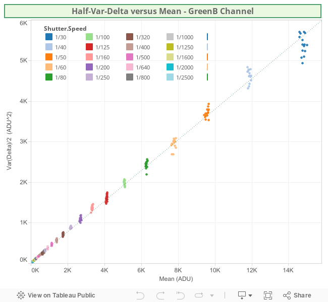
The following Tableau Visualizations shows the HalfVarDelta vs Mean data and fitted models.
The green channels are pretty much equal to each other; the red an blue ones show some amplification. A close inspection of the raw histogram shows this is a digital amplification:
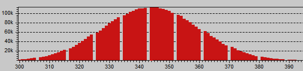
Red histogram showing digital amplification: An integer multiplication of 9/8 is evident for the periodic 1 ADU gap each other 8 values. The green channels are continuous, they are not amplified.
The histogram shows a digital amplification of 9/8 in the Red channel, this is a factor of 1.125. If we divide the red slope between the average Green slope 0.4537/0.4035 = 1.124 we get that factor!
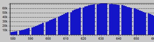
Blue histogram showing digital amplification: An integer multiplication of 7/6 is evident for the periodic 1 ADU gap each other 7 values.
Something similar also happens with the Blue channel, with 7/6 = 1.167 as amplification factor, which is also reflected by the regression we got: 0.4723/0.4035 = 1.17. The green channels does not seem amplified.
We will do regression coefficient comparisons (by channel) and even we will average them just as an analysis exercise. We say that, because the data behind each channel have a very different domains.
As the target was white, and for that color the blue and red channels have a light sensitivity 1.5 and 2.1 times smaller than the green one, the green channels data contain observations for the whole possible spectrum of the Mean variable, but the blue and red only 1/1.5 and 1/2.1 respectively. This makes unfair, at least en conceptually, compare regressions built on such a different domain of values.
The red and blue channels are amplified as a correction for the dark frame subtraction that most Nikon cameras do to their (not so) raw data. But that is another story we would like to tell in another post.
If we de-amplify the data to get what originally came out from the camera photosites, and rebuild the regressions, will just get the above regression coefficients divided by the amplification factors. If we just do that to those coefficients, we get:
| Channel | Intercept | Slope |
|---|---|---|
| Red | 1.66 | 0.4033 |
| Green R | 1.34 | 0.4026 |
| Green B | 1.31 | 0.4043 |
| Blue | 1.48 | 0.4048 |
| Average | 1.45 | 0.4038 |
Then, our best estimation for the very raw intercept and slope of HalfVarDelta vs Mean is 1.45 and 0.4038, respectively. If based on this averages we compute the coefficients for the amplified channels, we get:
| Channel | Intercept | Slope |
|---|---|---|
| Red | 1.63 | 0.4542 |
| Green R | 1.45 | 0.4038 |
| Green B | 1.45 | 0.4038 |
| Blue | 1.69 | 0.4710 |
Which are our best estimation of HalfVarDelta vs Mean on each (not so) raw channel.
Building a Regression for Var vs Mean
We need to build a regression with Var as response variable and a quadratic polynomial of Mean as predictor. The data comes from the green channel (blue row), of a series of photographs taken as a study modeling the sensor noise in a Nikon D7000 camera.
There are usually 6 observations from photos taken with exactly the same settings (e.g. aperture and exposition time) —with one observation per shot— where the different values of Var and Mean are caused by noise.
The properties of each observation are:
- ID [int]
- Aperture [f/number]
- Exposition Time (reciprocal) [s]
- Var [ADU²]
- Mean [ADU]
ID is an integer value, with a unique value for each observation, starting from those with higher Mean value and increasing as the Mean decreases. The Exposition Time is represented with its reciprocal value in seconds. For example, the value 250 represents 1/250 seconds. The Var property is measured in ADU² and the Mean in ADU.
- Var is expected to have a quadratic correlation with respect to Mean.
- The linear part of the correlation is expected to the models fitting HalfVarData vs mean done in the previous section.
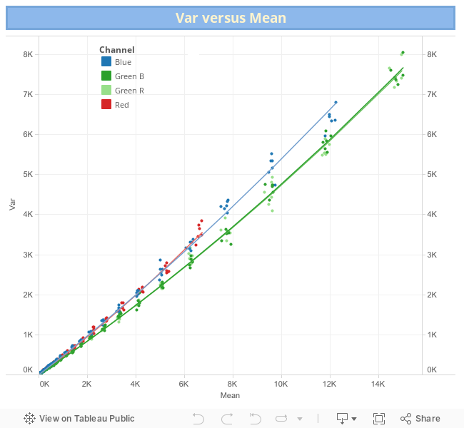
The plot of Var vs Mean is shown below. There, the green dotted line corresponds to a simple (OLS) quadratic regression line. The points corresponding to photographs taken exactly with the same conditions are coded with the same color. You can download the data using this link (8 KB).
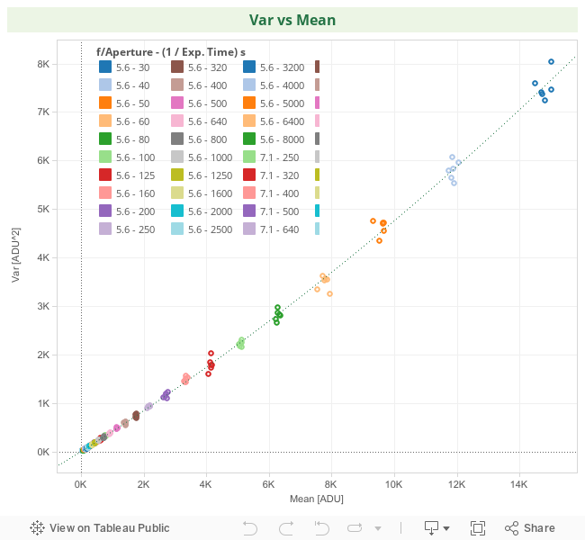
In the same way as in the previous regression of HalfVarDelta ~ Mean, this data is also heteroscedastic, the observations with greater Mean are more scattered.
Transforming the model
Following the same procedure we used in "Solving HalfVarDelta Heteroscedasticity", we find the Standard Deviation of Var is linearly correlated to Mean. In other words, if we transform the normal equation for Var dividing it by the Mean predictor, we will solve the no-constant variance issue and be able to run a valid OLS regression over the transformed model:
    # The normal model with heteroscedasticity
    Var = β₀ + β₁⋅Mean + β₂⋅Mean² + δ
    δ ~ Mean⋅Ν(0, σ²)

    # The transformed model without heteroscedasticity
    Var/Mean = β₀/Mean + β₁ + β₂⋅Mean + ε
    ε ~ Ν(0, σ²)
# Transformed model OLS regression
> lrt = lm(Var/Mean ~ I(1/Mean) + Mean, data=gr)
However, we have also seen in "Solving HalfVarDelta Heteroscedasticity", this transformation is equivalent to a WLS (Weighted Least Squares) regression over the normal model using 1/Mean² as weight:
# Normal model WLS regression
# poly() is a shorthand for a polynomial
> lr = lm(Var ~ poly(Mean, 2, raw=TRUE), data=gr, weight=1/Mean^2)

# We can also build the WLS regression this way:
> lr = lm(Var ~ Mean + I(Mean^2), data=gr, weight=1/Mean^2)
The only new thing here is the regressions have now —officially— two predictors: Mean and Mean² in the normal WLS regression and 1/Mean and Mean in the transformed OLS regression.
When we build the WLS regression, we get:
> lr = lm(formula = Var ~ Mean + I(Mean^2), data = gr, weights = 1/Mean^2)
> summary(lr)

Weighted Residuals:
      Min        1Q    Median        3Q       Max
-0.052966 -0.010708 -0.000467  0.012466  0.052551

Coefficients:
             Estimate Std. Error t value Pr(>|t|)
(Intercept) 1.112e+00  2.021e-01   5.502 9.53e-08
Mean        4.077e-01  1.880e-03 216.824  < 2e-16
I(Mean^2)   6.861e-06  3.720e-07  18.442  < 2e-16

Residual standard error: 0.01792 on 242 degrees of freedom
Multiple R-squared:  0.9972,    Adjusted R-squared:  0.9971
F-statistic: 4.245e+04 on 2 and 242 DF,  p-value: < 2.2e-16
All the performance p-values and R² are outstanding, and the linear part is very close to what we were expecting! The Intercept is just a little below to the expected value: the one we found in the regression for HalfVarDelta ~ Mean.
Regression Diagnostics
We will analyze the regression to make sure everything is fine. We will reuse some tests already used in "Building a Regression for HalfVarDelta ~ Mean" and we will use some new tests adequate for regressions with more than one predictor.
Analysis of Studentized Residuals
The following graph shows the Studentized residuals with respect to the fitted response variable and to both predictors in the transformed model. There are some outliers, but within a range statistically acceptable (not excessively wide), and there is not an outstanding pattern along the horizontal axis.
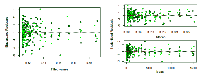
Studentized residuals against the response and predictor variables.
Testing the Normality of Residuals
The distribution of the Studentized residuals is also pretty much inside the expected range but with just some outliers out of range {19, 99, 223}.
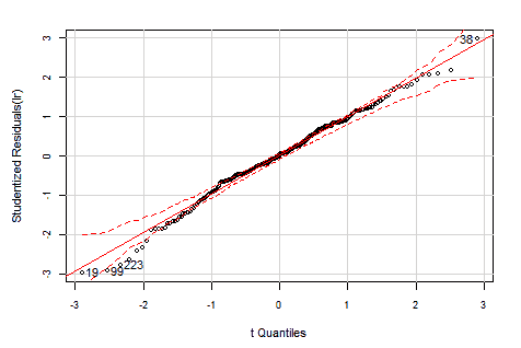
Distribution of Studentized residuals in the transformed model.
Even when the above distribution of Studentized residuals looks fine, it is an empirical test, let's check the normality of the residuals with the weight applied: the Pearson residuals.
# Get the Pearson residuals
> pearRes = residuals(lr, type="pearson")

> shapiro.test(pearRes)
  Shapiro-Wilk normality test
  data:  residuals(lr, type = "pearson")
  W = 0.9916, p-value = 0.177

> ad.test(pearRes)
  Anderson-Darling normality test
  data:  residuals(lr, type = "pearson")
  A = 0.5667, p-value = 0.1408
In both tests, we can not reject the normality hypothesis.
Homoscedasticity tests
Lets test the residuals homoscedasticity. The tests must run over the transformed model, they don't work fine with the WLS regression.
> bptest(lrt)
  studentized Breusch-Pagan test for homoscedasticity
  BP = 1.4318, df = 2, p-value = 0.4888

> ncvTest(lrt)
  Non-constant Variance Score Test
  Variance formula: ~ fitted.values
  Chisquare = 0.08497029    Df = 1     p = 0.7706715
In both tests we can not reject the homoscedasticity hypothesis. The non-constant variance seems to have been removed.
The added variable plots, also known as partial regression plots, show the response variable against each predictor in isolation of the other ones. This makes possible to see the contribution of each predictor to the whole model: the stronger the linear relationship the more important is the contribution of the predictor to the model.
Added-variable plots
The added variable plots also allows to find outliers for each predictor coefficient and potentially jointly influential points, corresponding to observations relatively far from the line and close to the left or right end of the line. For our data, we will plot the added variable plots for the transformed model, with the non-constant variance corrected.
> library(car)
> avPlots(lrt, id.n=3,  col="darkgreen", bg="green", pch=21)
Added-variable plots: transformed model.
We can see the point with index 99 has high leverage on both coefficients. The points {99, 19, 38}, outliers in the residuals distribution, are also outliers here.
Marginal-Model plots
The Marginal Model Plots display the marginal relationship between the response variable and each predictor ignoring the other predictors in the model, not in isolation of them as the added variable plots do.
Each one of the Marginal Model Plots shows two smooth lines —"Data" and "model"— one for the response values and other for the fitted values, both in the vertical axis, plotted in each graph against each predictor and the fitted values in the horizontal axis. If the model fits well the data, both smooth lines should approximately match each other on each marginal model plot.
> marginalModelPlots(lrt)
Marginal-model plots: transformed model.
In all the marginal plots the model fits nicely the data. Nonetheless, at the right end of the first plot, with 1/Mean in the horizontal axis, the model curve seems to depart from the data. Looking at the corresponding added variable plot, that might be caused for the observation with index 244.
Influence plots
If we look at the following regression influence plot we will corroborate what we thought above: the observation 244 has an outstanding Cook Distance value. The points {99, 19, 38} found as outliers in other graphs are also suspects in the Bonferroni test.
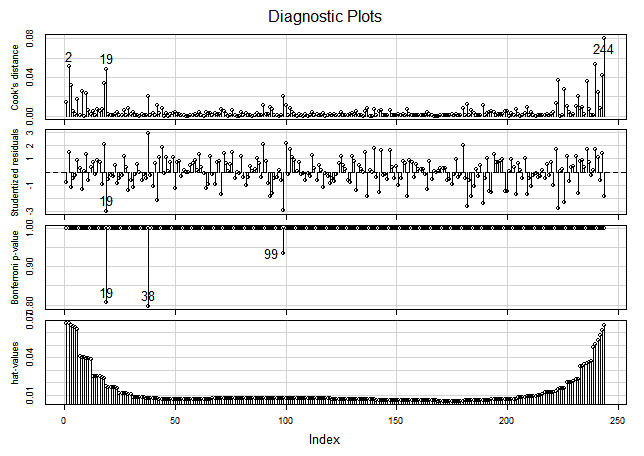
Regression Influence plot: transformed model.
Removing Extreme Outliers
Fortunately the data was sampled with more than one observation per predictor value. This way we can remove extreme outliers without leaving a gap in the sequence of observations.
After the previous regression diagnostics and analysis we have decided to remove the points {2, 19, 38, 99, 244}.
When we compute a Robust and a WLS regression without the extreme outliers we get:
# WLS regression
> lr = lm(formula = Var ~ Mean + I(Mean^2), data = gr, weights = 1/Mean^2)

Coefficients:
             Estimate Std. Error t value Pr(>|t|)
(Intercept) 1.208e+00  2.016e-01   5.993 7.63e-09
Mean        4.071e-01  1.834e-03 222.027  < 2e-16
Mean^2      6.833e-06  3.716e-07  18.387  < 2e-16

Residual standard error: 0.01718 on 236 degrees of freedom
Multiple R-squared:  0.9973,    Adjusted R-squared:  0.9973
F-statistic: 4.428e+04 on 2 and 236 DF,  p-value: < 2.2e-16
With respect to our initial WLS regression, the Intercept seems a little bit greater, but it really is in the confidence range of the previous interception: there is not a quantitatively significant change in this fitted regression. It doesn't seem to worth the removal of outliers. If instead, we fit a robust model, we get:
# WLS regression
> lr = lmrob(formula = Var ~ Mean + I(Mean^2), data = gr, weights = 1/Mean^2)

Residuals:
      Min        1Q    Median        3Q       Max
-420.8524   -3.6548   -0.1144    3.1132  381.0453

Coefficients:
             Estimate Std. Error t value Pr(>|t|)
(Intercept) 1.169e+00  2.286e-01   5.114  6.4e-07
Mean        4.078e-01  1.876e-03 217.424  < 2e-16
I(Mean^2)   6.853e-06  3.711e-07  18.466  < 2e-16

Robust residual standard error: 0.01727
Multiple R-squared:  0.9983,    Adjusted R-squared:  0.9983
Convergence in 11 IRWLS iterations
This regression is pretty close to the one we got removing outliers. The p-values are just a little less optimistic. We will use this model for the fitting of all the channels with the confidence, it is accurate.
The Resulting Models
We decided to keep the robust weighted model with all the observations, because it is pretty close to the one we get removing some outliers and that give as more confidence we can trust in these results.
The following table summarizes the four channels model coefficients:
| Channel | Intercept | Mean | Mean² |
|---|---|---|---|
| Red | 1.98 | 0.4527 | 1.121e-05 |
| Green R | 1.11 | 0.4061 | 6.770e-06 |
| Green B | 1.17 | 0.4078 | 6.853e-06 |
| Blue | 1.71 | 0.4733 | 6.585e-06 |
As theoretically expected, the linear part of this regressions is very similar to those found in the HalfVarDelta versus Mean regressions. In particular the confidence intervals of the Mean coefficients are virtually identical in each corresponding channel.
Here we have more details about the quality of these regressions:
Var_Red = 1.958 + 0.4527⋅Mean_Red + 1.121e-05⋅Mean_Red²
Var_GreenR = 1.11 + 0.4061⋅GreenR + 6.770e-06⋅GreenR²
Var_GreenB = 1.17 + 0.4078⋅Mean_GreenB + 6.853e-06⋅Mean_GreenB²
Var_Blue = 1.71 + 0.4733⋅Mean_Blue + 6.585e-06⋅Mean_Blue²
After deflating this coefficients, discounting the digital amplification we found analyzing the HalfVarDelta versus Mean regressions, we get:
| Channel | Intercept | Mean | Mean² |
|---|---|---|---|
| Red | 1.76 | 0.4024 | 8.857E-06 |
| Green R | 1.11 | 0.4061 | 6.770e-06 |
| Green B | 1.17 | 0.4078 | 6.853e-06 |
| Blue | 1.47 | 0.4057 | 4.838E-06 |
| Average | 1.38 | 0.4055 | 6.830E-06 |
The following Tableau visualization shows each fitted model per channel. The Red and Blue regressions seems to overlap each other. However, this is because the Red channel with smaller slope has a bigger quadratic term than the Blue channel with higher slope. This difference makes them almost overlap in such small scale, but a closer inspection reveals how the blue channel starts above the red one but around 4,400 ADU the red channel grows over the blue one.