Some concepts are essential to understand and explain precisely and concisely many photography topics. Here we have our growing list of definitions. We try to define the terms with simple words and the required level of detail and accuracy for a practical understanding, but without the burden of trying to be scientifically and rigorously precise and complete.
These definitions also appear in other wikis. However, we choose to gather them here in one place for future references.
The raw Image File Format
The term RAW is not an acronym; it is just an indication the image file contains —almost— non-processed sensor data. In a strict sense, the raw image format is a type of file that some cameras can produce and save in its storage device (SD or CF card for example) as a digital representation of what the camera sensor "saw" when taking a photo.
The raw format is a concept about what to save in the file, and is not a file format with a known structure and parts, as ".jpg" or ".tif" type of files are. For example, the raw format used by Nikon® cameras is very different to the raw format used by Canon® ones. Many cameras are supporting a raw format, here is a list of them.
As far as I know, all the digital cameras allow taking pictures in ".jpg" format so we will describe the raw format comparing both of them.
The Sensor
The sensor of a digital camera corresponds to what a frame of film is for an analogical camera. A digital sensor is composed by photosites (also called photosensors or sensels), where each photosite corresponds to each pixel the developed photo will contain.
As the raw file contains camera sensor data, the interpretation of the file content depends on the type of sensor. There are at least two kinds of sensors used by most of the digital cameras: the Bayer CFA (Color Filter Array) and the Foveon®, where the Bayer type is much more used. For example, all Nikon and Canon cameras use the Bayer type sensor.
In the Foveon sensors, each photosite can decompose and measure the light hitting it in red, green and blue components.
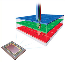
Each Foveon photosite can measure the amount of red, green and blue light hitting it. Image source: www.foveon.com
In the Bayer CFA sensor, each photosite can only measure the amount of one primary color component of the light hitting it; in other words, each photosite is sensitive to only one color component in the light. Usually, the primary colors in a Bayer sensor are Red, Green, and Blue (RGB).
In a Bayer type sensor, the distinct color sensitive photosites are usually arranged in a 2x2 pattern repeated all over the sensor surface. Currently, all Nikon® and Canon® D-SLR cameras use this type of sensor. However, there are variations to this pattern, for example in Fujifilm® X-Trans® sensors follow a 6x6 pattern. There are also Bayer type sensors with photosites sensitive to four colors, like CYGM (cyan, yellow, green and magenta) or RGBE (red, green, blue and emerald).
There are two types of rows alternating along the height of the sensor: a row alternating red and green sensitive photosites, followed by another row alternating green and blue sensitive photosites. As a consequence of this design, the quantity of green photosites is twice as red or blue ones.
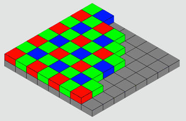
Each Bayer photosite can only measure the amount of one of the red, green or blue components of the light hitting it. Image source: en.wikipedia.org
A regular non-raw picture file, like in a ".tif" or ".jpg" format, built on the RGB model, save the red, green and blue primary color components of each pixel in the image, which once they are mix reproduce each image pixel color. Notice that this mixing occurs in our human visual and perception system, because in most displays each primary color is rendered next to the other to form a pixel.
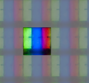
A micro detail of an LCD pixel (emphasized with a mask), showing its primary colors. As we are unable to discriminate these pixel components, our visual system makes the mixing, and we perceive the pixel as having a single solid color.
The additive mix of the primary color components (RGB) of each pixel brings each pixel color in the image. Each pixel RGB component value represents the intensity or brightness of each primary color as part of the mix of the pixel color. For example, for one yellow spot in the color image, the red and green components —for a pixel in that spot— have relatively higher values than the blue, because you get yellow from the addition of red and green with little or no blue in the mix.
Three layers, one for each primary color, is a standard way to model this; where each layer has the whole image dimensions, but it contains only the red, green or blue (RGB) values of each pixel. With this arrangement, when the software is going to draw the color of a pixel, on a given position of the image, it reads that position from each RGB layer to get the pixel RGB color components.
Each of this RGB layers is an image on itself, but as they contain information for one color only, it usually is displayed in a monochromatic way, with higher brightness to higher component values.
However, in a raw file, there is only one layer for the whole image. Each pixel on this layer represents the light metering from each photosite in the sensor, so the first-pixel value corresponds to the reading from the red sensitive photosite, the next pixel corresponds to the green one and so on, according to the Bayer pattern we saw before. As you can see, for each pixel there is only one RGB component value, and the other two are missing.
As there is only one layer in the raw file, you can represent it as a monochromatic image. However, the brightness can vary considerably from one pixel to the next one, because these neighbor pixels represent different color components. For example, a pixel in a reddish spot, has a relatively higher value than the green and blue neighbor pixels with lower brightness, just because a reddish color has little or nothing of blue and green. This characteristic makes the distinctive appearance of the raw files when visualized with monochromatic colors, as shown in the following picture.

Strawberry detail in a raw photo image (3X). The image is shown (above) in grayscale and (below) using the color corresponding to each photosite. Notice the grayscale is a better choice.
The Units of Pixel Color values
The pixel color values in a raw file are technically dimensionless quantities, but in technical papers they are expressed in ADUs (Analog to Digital Units, a "dimensionless unit"), this naming is in reference to the component in the sensor called Analog to Digital Converter (ADC), which converts the electric charge, produced by the hit of the light in each photosite, to Digital Numbers (DN) which is also an alternative "unit" used for the raw pixel color values.
In general terms, in a n-bit raw file, there are 2n possible ADU values, ranging from 0 to 2n - 1, where higher values represent higher brightness. e.g. 12-bit raw files can contain pixel color values from 0 to 4,095 ADUs, and 14-bit raw files can contain pixel color values from 0 to 16,384 ADUs.
What Contains a Raw File
The sensor of a digital camera corresponds to what a frame of film is for an analogical camera. A digital sensor is composed of photosites, where each photosite corresponds to each pixel the developed photo will contain.
When the camera takes a picture, the light hits the sensor for an amount of time. When the exposition has ended the electronic of the camera quantifies how much light hit each photosite, and after a minimal or not process at all, the camera saves this data in its storage device, in the form of a RAW file. This raw file will also contain tags indicating all the photographic parameters the camera has set when the picture was taken, saying for example it was taken with the "Sunny day" option set for White Balance, the color intensity option was "vivid", the enhance fine detail option was "normal", and so on. Those tags will also record which lens were used, its aperture, the exposition time, ISO speed, etc.
Each photosite in a Bayer CFA sensor type can only measure the amount of one primary color component of the light hitting it; in other words, each photosite is sensitive to only one primary color component in the light. Usually, the primary colors in a Bayer sensor are Red, Green and Blue (RGB). In Bayer sensors the distinct color sensitive photosites are arranged in a 2x2 pattern repeated all over the sensor surface, while the in Fujifilm X-Trans sensors they follow a 6x6 pattern.
Raw Ingredients
This file contains the raw ingredients for the final picture, in the opposite side a ".jpg" contains a "cooked" picture. It not contains the data read from the sensor photosites but their interpretation or rendering according to the camera (or post-process software) settings. This is like the difference between a musical score (or sheet music) for a concerto and a CD with the interpretation (or performance) of that music. In the first case you can (supposing you have the required knowledge and resources) perform and record the music in different ways or styles until you find the one you like the most. In the second case you mostly have a situation of take it or leave it as it is. In this analogy, maybe you can say it is possible to enhance poorly equalized tones with a fine sound system, or you can argue there is some people who can perform their version of the music from what they hear from a CD, but the point here is you have a lot more of choices and chances to get what you consider the best performance from the score music than from its recording.
Some important degrees of freedom
If mistakenly, your camera was set to indoor light White Balance, when you really shoot an outdoor scene, the ".jpeg" pictures you will get from the camera will be cooked with an awful color balance. You can amend this in lesser or greater degree according to your skills, time and software, but (usually) never as well and as easy as when processing the picture in raw format.
The data in the raw format can tell in a very detailed way what the sensor "saw" regardless of any setting your camera had, so you can render the picture using the White Balance setting you thing is better, and the same apply to every other setting, as the intensity of colors, contrast and so on. That way, you developing a raw photo you can get a picture exactly or better as if you taken it with this settings in the camera.
Of course there is some limits about what you can change processing the raw file. For example, you can not decrease the aperture and gain more depth of field. You can neither recover detail from severely burned areas in a over-exposed raw photo nor get detail from black areas in a severely under-exposed raw photo.
However, it is very different to state a raw photo is over/under exposed than stating the same about a ".jpg" photo. In many cases, white or black areas in a over/under exposed ".jpg" can be rescued by a better processing of the raw file. Only when the raw file is severely under/over exposed that rescue is not possible.
Processing Required
When we say "render the picture" we mean post-processing the picture, typically in a computer, but that can also be done in-camera: some cameras (e.g. Nikon D7000) has features to post-process raw photos in-camera and can produce many ".jpg" image files form one raw image file.
As you can see the post-processing of the raw file is a mandatory step in this style of photography, but it can be a very light step: the camera vendors provide software that render the picture using the in-camera settings tagged in the raw file when the photo was taken. In this case, you just load on your computer the pictures from your camera, run the camera software, select the pictures you like and click whatever is required to start the rendering. At the end, some folder in your computer will contain your ".jpg" photos; but you will be leaving a big door open: when you have the desire, skills and time, you can come back to your raw files and process them with the settings that best suit your taste.
To me, another good reason for raw photography is the evolution of software and hardware. Problems hard to solve with today hardware and software can be solved easily in the future. I had photos from some years ago that processing then were painstakingly slow and without being able to get acceptable results. I refused to discard those raw photos because the scene was very nice to me, some of them are about some monkeys under the shadows of the closed canopy in the Peruvian rain forest, the picture had bad white balance and too much noise because I had to crank up the ISO speed in order to use short exposition times in a dark environment. Nowadays with the help of a powerful computer and the right software that correction is easily unachievable.
Gamma Correction
The image in the RAW file is expected to be photometrically (also called radiometrically) correct. This means the pixel values are directly proportional to the intensity of the light that hit each photosite. In other words, if in one spot of the sensor the amount of light that hit the photosites was the double than in another spot, the pixel values in the first spot would be twice as the pixel values in the second spot. This characteristic is also called linear brightness and is required for the most part of the image processing.
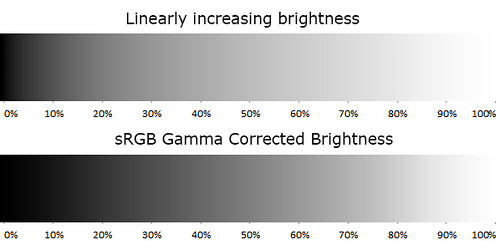
The top strip has linear brightness changing from black to white. The bottom strip is equal to the top one but is Gamma Corrected.
However, the human vision has a non-linear perceptual response to brightness and paradoxically linear brightness is not perceived as linear.
A Linear Perception of brightness occurs when the changes of the perceived brightness has the same proportion to the changes of the brightness value. For example, at the image above, the top strip has linear brightness, changing in the horizontal axis from black to white. This way, —for example— at one third of its length, the brightness value is one third of the way between black to white. However, the perceived brightness is not linear, e.g. it changes a lot more from 0% to 20% of its length than between 40% to 60% of it.
The bottom strip also has the brightness changing from black to white. But in this case, the brightness is Gamma Corrected, and now the perceived brightness changes more gradually, it is now perceptually linear.
The human eye perceives linear brightness changes when they occur geometrically. We can detect two patches has different brightness when they are different in more than about one percent. In other word, our perception of brightness is approximately logarithmic.
Considering the linear brightness is not perceptually linear, the RGB color spaces usually includes a Gamma Correction.
In the Gamma Correction model, the input is linear brightness, with values from 0 (black) to 1 (full brightness) and is applied over each RGB color component. The output is the gamma corrected (non-linear) brightness. The Gamma Correction is a power function, which means the function has the form y = xγ, where the exponent is numerical constant known as gamma (this is the function: x raised to gamma). The very known sRGB color space uses approximately a 2.2 gamma. However, even when it is said "the gamma is 2.2" the value for the gamma term in the formula for the Gamma Correction is 1/2.2, the inverse of the referred value and not directly the value.
Mathematically speaking, the gamma correction in the sRGB color space is not exactly a power function, you can read the details here in Wikipedia, but numerically speaking, it is very close to the function we saw above with a 2.2 gamma.
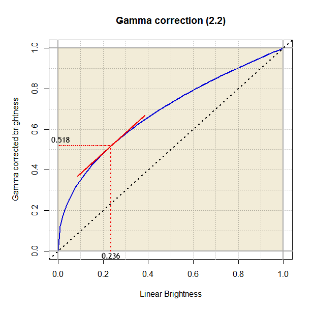
Gamma Correction function (blue colored curve). At lower input values, the curve has a very steep slope, expanding broadly the darkest shades. Starting from 0.236, the slope is slowly less steep.
At the darkest input values, the correction adds rapidly growing amounts of brightness to the input. For example, a brightness of 0.1 is corrected up to 0.35 (+0.25), that behaviour goes until reach 0.236 which is mapped to 0.52 (+0.28). Then the brightness addition gradually decreases, and for example a brightness of 0.8 is mapped to 0.9 (+0.1).
Color and Light
I think it is funny to realize the colors are just a human invention, they really don't exist as such. The colors are a human categorization of their visual experience.
We call light to the electromagnetic radiation (EMR) band between approximately 300 and 700nm (nanometers) of wavelength: the visible spectrum. When the light comes to our eyes, it has a given mix with relative power for each wavelength in the visible spectrum. When the EMR mix has a dominant power presence of waves close to 450 nm we call it blue, when the dominant waves are close to 515 nm we call it green, and so on with each color we can see.
Color Model
The RGB way of representing a color as a mixture of red, green and blue values is one of many existing color models. A color model defines a way to uniquely represent a color through the use of numbers. As analogy let's think about how to represent a position in a plane. For example, there are the Cartesian and the Polar coordinate systems: both are models to uniquely specify the position of a point in a plane by the use of numbers. In the same sense, there are many models to represent colors, all of them requires three values to represent a color. For example there are the XYZ, xyY, Lab, Luv and CMY color models, and the RGB is just another color model.
Some color models use absolute coordinates to specify a color, in the sense the coordinates in the model are enough —without any additional information— to uniquely specify a color. However, other color models use relative coordinates: they specify colors as the mix of other (primary) colors (e.g. RGB —Red, Green, Blue— and CMY —Cyan, Magenta, Yellow— color models). Because of that, those relative color coordinates do not uniquely specify a color, their exact meaning depends on the absolute color of the primaries —additional information!—. To get the absolute coordinates from the relative ones, we need the absolute coordinates of the primaries.
The names of all the aforementioned color models are acronyms of the three values used for the color representation: Obviously, three coordinates (or three degrees of freedom) are enough to uniquely specify any color. The CMYK color model, which uses coordinates relative to cyan, magenta, yellow and black, has 4 color components just for practical reasons: printing with the addition of black tint has practical printing advantages than using just the primaries of the CMY model (without the K), which however, is enough to unambiguously specify the same colors (assuming the same primaries).
Color Space
A color space is the set of all the colors available in a given color model. In other words, the set of colors having a valid representation in that model.
We speak of a color space because a color requires three coordinates to uniquely specify it, so we can visualize the colors in the model with a 3D representation of the model coordinates. In that context, the set of valid colors get usually represented by a solid object (occupying a space) in the model system coordinates.
Some authors distinguish between absolute and relative (or non-absolute) color spaces. When the color model has absolute coordinates or when it has relative ones but there is a way to map those relative into absolute coordinates, they say the color model has an absolute color space. If the color model uses relative coordinates, and there is no way to get the absolute coordinates, or even being a way it isn't used, they say the model has a relative color space.
This differentiation is useful: in a relative color space we can only know the relationship between the colors in the space, (e.g. 'this color is greener than the other') but we can not assess characteristics of them for comparison with colors out of the color space, which is something we can do in an absolute color space. However, for some authors, what we referred as the absolute color space is the only accepted color space and the relative color space is not a color space at all.
The Mother of All Color Models
Over-simplifying the whole story, the color values and models we actually use are very related to two "surveys", one of 10 observers and another with 7 observers conducted independently by William Wright and John Guild in the late 1920’s. These "surveys" were based on the question "Give me the RGB combination that matches this color". I find fascinating how despite some technical details were different in their experiments, and so few observers were included, the results from them —independently collected data— are almost identical.
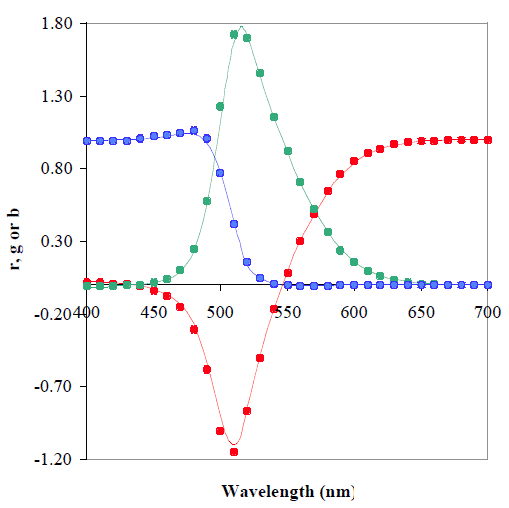
This is the comparison of Wright’s RGB coordinates at every 10nm (the points) against Guild's values at every 5nm (the lines). Look how they are almost identical. Source: www.cis.rit.edu.
In the image above, the RGB coordinates are normalized to achieve r+g+b = 1, this way, they are the fraction of red, green and blue (summing 1) required to match each (wavelength) color. Guild's values are based on measurements at only 36 wavelengths (approximately each 10nm), the other values were obtained by interpolation and extrapolation using a graphical technique. Notice there are negative value! I promise to post details about that data in the future.
Their data was averaged, normalized in more than one sense, and finally, in the quest of some desirable properties this data was transformed to give birth not only the CIE 1931 standard RGB color space, but also the CIE 1931 XYZ model and its sibling the xyY model. These models represents the whole human vision color space.
Notice that between the original experimental collected data and the final published standards there are only mathematical transformations, new data was not added. Many other studies have followed, but in the literature and many web sites you’ll find CIE 1931 XYZ color space making an appearance often.
As the universe of colors needs three values to represent them, we can "see" those models in a 3D space and find the color universe as a contiguous solid object. The Bruce Lindbloom's web site has nice and interactive representations of the universe of colors.
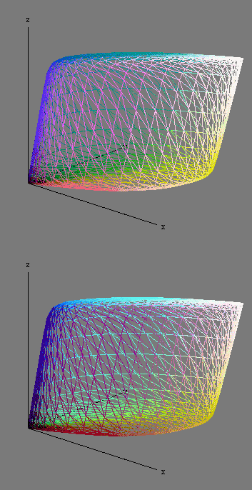
This is the universe of colors represented in the XYZ color model: the solid object is the XYZ color space. Source: www.brucelindbloom.com
In the above image, the points on the surface corresponds to the most intense (saturated) colors, whilst those close to the core (where x = y = z) are the neutral ones, from black in the origin to white in the farthest point from the origin. The wall closer to the XZ plane has the red colors. The opposite, close to the YZ plane, has the green colors. The surface close to the Z axis has the blue colors.
Chromaticity
When referring to colors, it is useful to realize each of them can be described through two main components: Luminance and Chromaticity. For example, we can imagine one image projector showing a scene on a projection screen. If we vary the intensity of the light beam, or move the projector closer or farther to the projection screen (while keeping the image on focus), we will clearly see how the brightness of the projected image will vary, and so the colors will have a changing luminance, while other color quality will stay equal, that quality is the Chromaticity. To be technically correct we will add we are assuming the projector beam and the projection screen has the same white color.
As we know the color specification has three degrees of freedom, or in other words, they need three values to be uniquely specified, our color decomposition in only two coordinates (Luminance and Chromaticity) seems to be missing something. What happens is the chromaticity is a two-dimensional entity, it is specified with two coordinates. In that way, we specify uniquely a color using three coordinates: two for the chromaticity and the third for the luminance.
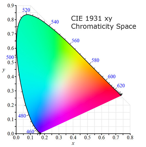
It is customary to show the chromaticities on the CIE xy Chromaticity Space. Image source: Wikipedia.
In the above CIE xy Chromaticity space, the points in the border, with a blue colored scale from 400 to 700nm, correspond to the colors of the wavelength indicated by the scale, they represent the deepest or purest colors. While a point in the way from the border of the space to the point on the position (0.333, 0.333) represents the color of mixed wavelengths, and finally the color at that point represents the model white reference.
Color Gamut
Color Gamut is the complete subset of color that can be represented in a given circumstance, as within a color space, the colors a camera "can see", or those that an output device can show. However, the Color Gamut is used for comparison with other color gamuts, and as we saw when discussing about color spaces, this requires to have the color gamut expressed in absolute terms. Besides, when comparing colors from two color gamuts, we are mostly interested in the color chromaticities, because we don't want to distinguish between two colors with the same chromaticity but just different luminance. Moreover, when comparing color gamuts we want to have as reference the whole human vision color gamut.
For all these reasons it is customary to show the color gamut on the CIE xy chromaticity diagram, which shows all the chromaticities the human eye can see.
White, White Point and Illuminants
White is the color we perceive when we see a material —that do not emit light by itself— reflecting with equal relative power all the light wavelengths striking it, and the white point of an illuminant is the chromaticity of a white object under that illuminant. In simple words, white is the color of the illuminant light, and as with any color, its definition must be made as a mix of relative power for each wavelength in the visible spectrum.
All color models, to be fully specified, require a white point reference, or in other words a standard illuminant. For example, in the CIE 1931 XYZ color space the standard illuminant is called "E" with Equal power for all the wavelengths in the visible spectrum. In a diagram of wavelength power vs wavelength this is a flat line. This is a theoretical spectrum and it was chosen looking for some desired properties in the color model.
Two very commonly used standard illuminants are the D65 and the D50. According to the CIE, the D65 "is intended to represent average daylight" whilst D50 corresponds to daylight light when the sun is close to the horizon. The Adobe RGB and the sRGB color models use the D65 as reference white.
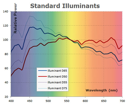
This diagram shows the relative power of some standard Illuminants according to CIE standards. In the background are the approximate colors of each wavelength, this way we can see the D65 illuminant is little more bluish than the D50.
The RGB Color Model
In the RGB model, each color is described as a mix of red, green and blue primary colors, where each primary can vary from a continuum between 0 to 100%.
When there is the same amount of the three primaries R = G = B the resulting color is neutral, from 0% for black to 100% for white.
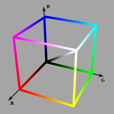
3D representation of the RGB model. The origin is black. The diagonal represents the mix of the same amount of each primary rendering shades of gray from black to white.
When a spot on a RGB display has one of its primaries at the 100% and the others are at 0%, the spot will show the purest or deepest possible color corresponding to that primary. For example (r:0, g:100%, b:0) will show the deepest green possible on that display. As the display can only show colors based on the combination of its primaries, the depth of all the colors it can produce is limited by the depth of its primaries.
The RGB color model is like a "template" of a color model, the absolute specifications of the primary colors are required —and also the white reference as for any color model— to have an absolute color space. That's why there is one RGB color model but there are many RGB color spaces: Adobe RGB, Apple RGB, CIE RGB, ProPhoto RGB, sRGB, etc.

Comparison of Adobe RGB and sRGB gamuts. Adobe RGB has a larger gamut, basically to accommodate colors with deeper green. Image derived from Wikipedia.
Technically speaking the chromaticity of the colors a RGB output device can produce is limited by the chromaticities of its primary colors. This can be clearly seen on the chromaticity space shown in the image above. The surface of each triangle represents the set of chromaticities the corresponding color space can represent.
The vertex of each triangle corresponds to the absolute chromaticity of the primaries defined by the represented RGB color spaces. The borders of the triangles correspond to the deepest colors available on each space.
Color Profile
The sRGB color space is a very well known standard, which is assumed by many applications, including web browsers, as the color space of the screen when it has a not known color profile describing its real color space.
From a practical sense, the color profile is a file associated to an input or output device, with the required information to transform absolute color coordinates to/from the device color space. Only with this information an application can accurately represent colors in/from the device. As we said, when this information is not available the software will usually assume the device color space is equal or at least very close to the sRGB color space, so in this circumstance —when the device has not a color profile— the accuracy of the colors in/from the device depends on how close is its color space to the sRGB.
What is the matrix?
Unfortunately, no one can be told what the Matrix is.
You have to see it for yourself.
Very often, when working at low level with colors, arises the need to use a matrix. This matrix basically represents the change of a reference color model or space to another. Which in generic terms involves the transformation of one point coordinate from one system to another. I know, this starts to sound as a complicated mathematical subject, but don't worry, we will deal here with it as a notational subject, we just want you to know from were everything comes from.
Let's suppose we have the (x, y) coordinates of a point P with respect to the system XY and we want the coordinates (u, v) with respect to the system UV.
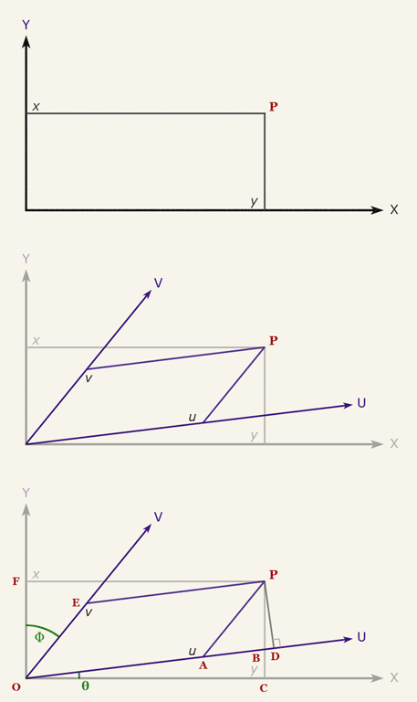
The coordinates of the point P are (x,y) and are given with respect the system XY, we want to obtain the coordinates (u,v) with respect to the UV system.
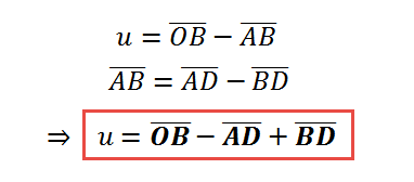
If you look at the diagram above you will notice we can compute u by adding and subtracting the length of some line segments. In particular we can get u this way:
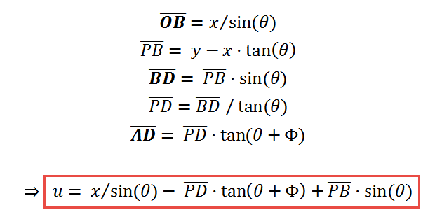
With the help of trigonometric functions we can find the length of the line segments we need to compute u. For example we can say:
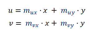
We would continue and get the formula of u, but instead, we can also look at those formulas at a higher level of abstraction and see that at the end u should be a linear function of x and y, like u = m1·x + m2·y + c —for some m1, m2 and c— after all, x and y are the only lengths we have, right? Besides, the coordinate systems XY and UV have the same origin, so when (x,y) = (0,0) also (u,v)=(0,0), which gives 0 = m1·0 + m2·0 + c, in other words c = 0. If we follow the same reasoning, we will get a similar formula for v, and at the end we will have something like:
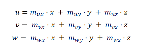
In the case of colors, we use points with three coordinates, so to transform the (x, y, z) coordinates the formulas will be like:
This is the kind of formula that arises very often transforming color coordinates from one space or model to another, so it worths simplify its notation making explicit the matrix operation inside it:
In the above formula, as M is a matrix, the multiplication by xyz implicitly denotes a matrix multiplication, not a scalar one. Here you will find this kind of formula to transform a color from CIE XYZ coordinates to sRGB linear coordinates, and here is used for chromatic adaptation.
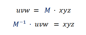
When you have this matrix for transforming from xyz to uvw, you implicitly have the formula for the other way around, from uvw to xyz. You just have to invert the matrix at the other side of the formula:


