Hi Tony.
This page is hidden in the sense that do not exists any link to this page from any part of this or any other web site. The objective of this page is only to share with you some findings in my TK Luminosity mask analysis.
I learned about luminosity masks from Tony Fisher's "The Digital Zone System", from your site, and later from the material I bought from you since 2012. I recently updated the panel to the CS6 PS version.
I have done this analysis —as usual in my case— mainly for pure curiosity and also looking for actionable knowledge that can help me to develop better photos. You can find this kind of analysis about different photography subjects in my site. I am a software engineer actually studying data science (which is very useful for digital photograph analysis). Some of my photos are here and here.
I always avoid as possible the use of technical jargon and terms, to make this content readable for any person with just some basic knowledge about digital images. If the text starts to seem too technical, please bear with me and keep reading, because probably the matter will be explained in better way few lines later.
This analysis considers the three most common color spaces: Adobe RGB, ProPhoto and sRGB. They are also the ones suggested in the TK package documents.
Finally, my English is not yet as good as I would like. Please feel free to ask me better explanations about the topics you want.
License
By sharing this with you, I will not expect, and much less demand, any retribution from you; I just want a better tool. If you enhance the TK tool somehow based on this material, it would be nice. Otherwise, I will just implement and try ideas from this analysis by myself.
I am sharing this page with you under a CC Attribution license: You can freely include, in your web page or product, content from this page: If you use a graph, code, ideas or anything —directly or derived — from this page, I will appreciate the attribution or mention of my name (and/or my site).
Tonal Values
We have made the analysis building luminosity masks for a gradient of neutral colors. A neutral color is encoded having the same pixel value on each RGB channel (e.g. as in (127, 127, 127)). In turn, those pixel values are encoded in each color space (color profile in Photoshop terms) using different tonal scales. This way, two different color spaces may have similar, or even exactly the same tonal scale, and however depict the colors with different RGB pixel values. As this may seem confusing; we will make a short review of this subject.
The tonal scales encode gray colors, from black (0%) to white (100%). The root of all the tonal scales is the linear tonal scale, which is the scale used in the camera raw image data, and has the dark tones very compressed in the lower values (to the left side of the scale). This is so notorious that the perceptual middle gray; this is the gray that seems halfway between black and white; is just the 18.4% linear, very low for a "middle gray" tone, which should have a value closer to 50% as the middle term suggests.

(Tonal Scales) The white ticks mark the same perceptual middle gray.
These clumped-to-the-left linear dark tones, cause technical issues that are addressed by the different non-linear tonal scales: They map the perceptual tones referred by the linear tone values to a different tonal scale, using a function which is basically a gamma curve, that look like this:

Close to the origin the curve may have a linear segment, represented by the blue line.
For example, the Adobe RGB and sRGB color spaces, use a curve based on a 2.2 gamma; the ProPhoto space uses 1.8 gamma, and the L one (The L —Lightness— component in the Lab color space) uses a 3 gamma. The greater the gamma value, the higher is pulled the curve to above.
In general, this curve produces tonal scales with more room for the dark tones —as desired— taking the space from the lighter ones: the curve stretches the linear dark area while compressing the lighter one. The higher the gamma value, the more are stretched the dark tones to the right. We can notice this in the tonal scales graph above, where the middle gray is moved from the far left to the middle of the scale in the L tonal scale.
As we know, each RGB channel can be seen as a gray scale, and correspondingly, a color space uses these non-linear tonal scales to encode the tonal values in their RGB channels, representing from 0% to 100% the channel color intensity. However, they do a step ahead, mapping each channel 100% value with a specific hue of the RGB colors, which makes them encompass different color spaces. Nonetheless —internally— each RGB channel intensity value is mapped from linear to non-linear values using the tonal scales we have seen above.
Introduction to the Kinds of Graphs we Will Use
We will use graphs plotting the source tonal values (image pixel values) in the x axis and the luminosity-mask transparency in the y axis.
In the x axis, 0% refers to the minimum and 100% refers to the maximum pixel value intensity. Of course, this is relative to the channel we are talking about; in the red channel a 100% tonal value means the maximum intensity of red.
In this analysis I am considering only neutral colors. For this reason, a 0% value in x corresponds to black, and 100% to white. These tonal values are expressed in the tonal scale referred by the color space in use (e.g. Adobe RGB tonal scale).
I am using the percentage format for tonal values, because we are dealing with 16-bit images, whose pixel values are far beyond of [0, 255]. This way —for example— 50% ProPhoto is easier to grasp than 8191 ProPhoto.
Higher values in the y axis mean the luminosity mask is exposing more the source pixel: a 100% value corresponds to total revealing and 0% means total concealing.
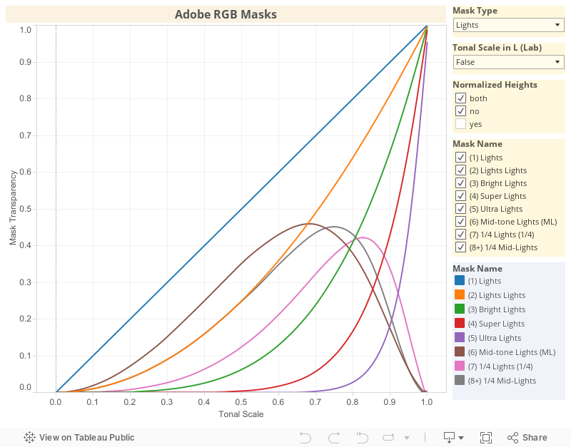
For example, the following graph shows the Lights masks in Adobe RGB (aRGB).

Adobe RGB Lights Masks
You can make a reality check of this values in Photoshop (PS) using the Information panel showing the RGB values in 32 bits (floating-point) while checking the channel containing the luminosity masks.

Checking the highest mask value of (6) Mid-tone Lights: 0.463 aRGB
In the example above, the highest (6) Mid-tone Lights mask value is 46.3% which pretty much corresponds with the value shown in the plot.
Graph Showing the Tone Values in L (Lab)
A given tonal value, in different tonal scales, may correspond to different perceptual tones. For example 18% Adobe RGB (which we will denote using 18% aRGB) does not correspond to the same tone we see (hence "perceptual") with 18% proPhoto RGB.
Considering this, is useful to show the plot with the x tonal values marks expressed in L (the L "Lightness" component in the Lab space).
Notice in the following plot the x axis is still labeled as Adobe RGB Tonal Scale but it shows mark values converted to L.

Adobe RGB Light Masks. The marks are showing equivalent L(ab) values. However, as the x label says they are spaced as Adobe RGB
Notice this is not —at all— the same as converting all the source tonal values from Adobe RGB to L. This is exactly the same plot shown in the previous section. However, the x tick labels show the L equivalent value. For example, we can see, the second mark for 10% aRGB corresponds to 9.0 L
This is similar to the case when —for example— the x marks are logarithmically spaced, as in photo stops for example. In this example, the x marks on the plot are really located and spaced at positions proportional to 0, 1, 2, 3 .... However, the plot may show under those marks 1, 2, 4, 8 ... as labels: The x axis is logarithmically spaced, but shows the natural x values (instead their logarithms) under each mark.
In the same sense, in the plot above, the x axis is drawn and spaced as Adobe RGB tonal values. Nonetheless, is showing the equivalent L tonal values.
Graph Plotted with the Tone Values in L (Lab)
Sometimes we will show a plot with the x tonal values converted to the L (Lab) tonal scale. In this case, the x axis is labeled as L (Lab) Tonal Scale. Because of this transformation, some parts of the non-converted plot are shown horizontally stretched or compressed in the converted plot, horizontally "deforming" the plot without such transformation.
The following plot is the same shown in previous sections, but with the x axis tonal values converted to L. As the Adobe RGB tonal scale is similar to the L one, except for the darker values, the shape of this image is similar, but not exactly equal to the previous ones; and is more deformed close to the axes origin.

Adobe RGB Light Masks. The x axis is show with the tonal values in L.
Why we Want Plots with the L (Lab) Tonal Equivalents
The Lab color space was built with the intention to get color values correlated with the perceptual color (the color we see). This means, the more different two colors look, the greater will be the difference between their Lab color values. This desired property is something that does not occur with most color spaces, at least not along all their possible values.
For the case of neutral colors, this means the L tonal scale describes better how different or similar will look two tonal values. Additionally, the ubiquitous 18% linear photographic middle-gray corresponds exactly to 50L, the middle of the L scale. As consequence, this kind of L plot, describes better which perceptual tones (lights, mid-tones, darks) will be really affected by a given luminosity mask, regardless (or despite of) the tonal scale related to the color space we are using.
As we have already seen, the Adobe RGB tone values correspond pretty much to the L ones, and consequently the masks will affect the targeted perceptual tones.
This match between Adobe RGB and L occurs because the L tonal scale is based on a gamma of 3, while Adobe RGB and sRGB are both based on a gamma of 2.2. Even when 3 doesn't seems very close to 2.2, they are close enough to make both, the sRGB and the Adobe RGB tonal scale values close to the L ones, as we will see in the following plot.
On one hand, the Adobe RGB and sRGB tonal scales are very similar to each other (because of the fact that both are based on a 2.2 gamma) except for the darkest values. On the other hand, the ProPhoto color space uses tonal values based on a 1.8 gamma, which is not close at all to the L 3 gamma. This will cause some issues in the luminosity masks that we will address later.
The following plot shows how the Adobe RGB and sRGB tonal scales are pretty close to the L one (represented by the dark gray dashed diagonal line) and how they are close to each other except for the darkest tones. However, the ProPhoto tonal curve is notoriously different to all the other ones.

Tonal scales versus the L one. The L tonal scale is represented by the dark gray dashed diagonal line.
Notice how for the darkest tones, the sRGB tonal values are closer to the L ones than those in the other curves. This nice property, and the fact that the ProPhoto tonal scale is too far from L, is the reason why Adobe Lightroom uses internally the ProPhoto color space but with the sRGB tonal scale (instead the 1.8 gamma tonal scale prescribed by the ProPhoto definition), which sometimes is informally called the Melissa color space.
Normalizing the Mask Scales Curve Height
The beauty of each luminosity masks is in how they target the pixels within some luminosity range and very softly diminishes its transparency to protect the pixels with luminosity different to the targeted one. This relative mask values —masking profile— is the more relevant characteristic of the TK masks.
On the contrary, the absolute mask value for each pixel luminosity is not so relevant. We can say that because if the mask exposes too much the targeted image pixels, the image developer can use softer adjustment intensity or diminish the adjustment layer opacity; and if the mask exposes the targeted pixels too little, greater adjustment intensity or the cloning of that adjustment solves the issue.
All of this means that if two given masks have the same profile, but just different scales, one of those masks is redundant; because the same adjustment effect can be produced with the other mask by just varying its intensity as we described above.
To fairly compare the profile of two masks, it is required to normalize their scale so they both have the same maximum transparency value. For example, the following two masks may seem different:

Both mask curves have their natural scale.
But if we scale them up, normalizing their heights, we will find something different:

Both mask curves have their height scaled to match at 100%.
We can see they have almost the very same profile. So, they are equivalent and consequently one is redundant!
The subtitle With normalize y Scale will be an indication that the mask curves have a normalized height.
How did we get the Data for these Plots?
Except when indicated otherwise, these plots were built from images prepared with PS using the settings in the recommendations given in the "AA--Setting Up the Color Working Space.pdf" document, which is included in the TKActions package.
All the tests were done using all the time 16-bit color depth. All the tests for each color space was done in a single .psd document, with the PS color settings adjusted before the test and never changed again for the resulting .psd working document.
The basic test procedure is:
- Create a new document with 512 bits of width in the
Labcolor mode (16-bits). - Paint a horizontal gradient from black to white and from end to end, in the luminosity channel.
- Convert the document (menu option "/Image/Mode/RGB color") to the current RGB working space.
- This source document is exported as a (16-bit)
.tiffile. Notice the three channels will contain the same information. - Build a luminosity masks as a channel using the TK panel.
- Create new image layer and copy the luminosity channels into the image layer RGB channels (e.g. the red channel).
- The image created in the previous step is exported (the masks) as a (16-bit)
.tiffile. - The pixel source values are plotted in
xaxis and the mask value corresponding to each source value is plotted in theyaxis.
I am including a section with all the R-Language code used for this analysis. Probably you don't know how to use it, but you can share it with a friend who can handle it, either for validation or for further analysis. If you want I can help you with further analysis.
Adobe RGB Luminosity mask
In this analysis we will make remarks and suggestions valid for the masks in all the other color spaces.
Adobe RGB Lights Masks
As prescribed, the PS color settings are RGB: Adobe RGB and Gray: Gray Gamma 2.2.
In the following gadget, please click on the titles at the right side to see the graph corresponding to each of them.


It is very nice to see how each mask slowly conceals more the pixels with their luminosity out of the mask target.
Surprisingly, the "Lights" mask is just a diagonal line, which means the mask strength is linear with respect to each pixel luminosity.
The "Lights Lights" mask corresponds to a curve with 1/2 gamma and the following "Bright Lights" mask corresponds to one with 1/4 gamma. These approximations were found accurately (not eye balled for example). However, I won't bore you with the technical stuff.
The gamma pattern in these curves, means that they have lower and lower values from light to dark tones, but only really reach to zero in the black tone 0%. The lower the gamma, the steep is the dive to the 0% transparency level, but the curve hits that level only at the 0% black tone: the axes origin. This is the mathematical explanation of how they gradually protect the darkest tones in these Lights masks.
In the PS reality, this is limited by the image bit depth. So, in 16-bit images the channels and hence the mask values are saved as 16-bit integers, which means the real channel values are quantized to 1/(2^16-1) = 1/32767 = 0.003% steps, this means values below this limit are considered zero, which of course is still a great precision.
About the "Mid-tone Lights" and "1/4 Lights" Masks Height
It would be great to have "Mid-tone Lights" and "1/4 Lights" masks with transparency values above 50%. As we have commented before, a change of mask scale won't change its profile and consequently won't damage its overall adjustment effect; and this will bring the benefit to see the PS marching ants when using those selections. I have normalized them to 61.8% aRGB —the golden ratio— just for not to pick a totally random value somewhat above 50%.
A greater transparency scale will be also beneficial, because, even if it is a little greater than you need, it is easy to soften by just lowering the adjustment layer opacity. Also, avoiding too weak masks is beneficial because this way we need less often to clone an adjustment layer to raise its strength, which is rather annoying and hits the document size.
However, I don't think the aforementioned masks are too weak. The above comments are included for the sake of completeness about the benefits of having not too weak masks.
The scale of the masks can be changed in PS converting the mask to quick mask mode and applying an image curve adjustment, where the curve is a straight line. For example, to raise the scale in a factor of 1.335 the adjustment line would start at (0,0) and finish at (255/1.335=191, 255). After the scale adjustment, the mask is reverted to normal mask mode, and the next steps can be resumed as normal.
As software engineering myself, I understand that changing too much the product from one version to another, might upset some old users. However, in this case, both aforementioned masks have their peak almost to the same height and not too far to the 50% limit. So, I would consider in first place to set them to the same height and in second place raise them a little above the 50% limit.
The "Mid-tone Lights" mask is intended to be focused to pixels with 160/255 = 63% luminosity. The observed mask peak is around 68% aRGB which is a negligible difference.
The "1/4 lights" mask is intended to be focused in pixels with 192/255 = 75% of luminosity. However in Adobe RGB and in L tonal values its peak is in 83% aRGB and 85 L respectively. Not very far, but nevertheless too far from the 75% target. To solve this issue I have as suggestion the mask shown in the following graphs with the name "(8+) 1/4 Mid-Lights", which has a peak exactly at 75% aRGB.


The "(6) Mid-tone Lights (ML)", "(7) 1/4 Lights (1/4)" and "(8+) 1/4 Mid-Lights" mask curves are normalized to the same height using as corresponding factor 1.335573, 1.459237 and 1.3586.
The proposed "(8+) 1/4 Mid-Lights" mask was built with the following formula, where the "Super Lights" mask is subtracted twice from the "Lights" mask.
1/4 Mid-Lights = Lights - Super Lights - Ultra Lights - Darks - Super Lights
The proposed curve profile is very similar to the "(6) Mid-tone Lights (ML)" curve but with its peak shifted over the 75% aRGB mark; those masks protect the "Super Lights" far more than the "1/4 lights" mask does.
The proposed mask is a good addition, if not a replacement, to the original "1/4 lights" mask. However, I haven't test yet this mask in my actual photo development.
Adobe RGB Mid-Tone Masks
There are three mid-tones masks that when their height is normalized, they look pretty much the same.

Redundant Mid-Tone masks.
These masks are not exactly equal to each other. However, they are too much alike to have a mask devoted to each curve.
The following graphs show the actual set of mid-tone masks curves.


When plotted with the tonal values converted to L, the curves are slighted tilted to the light side, but this tilt is negligible.
To handle the issue of having three very similar mid-tones masks, I suggest one that I thought I will find among those mid-tone curves: The sum of the "Mid-tone Lights" and "Mid-tone Darks" which is denoted as "(7+) Mid Mid-tones" in the following graphs.
Mid Mid-tones = Mid-tone Lights + Mid-tone Darks
To target the mid-tones in a tighter way, I have another suggestion which is denoted as "(6+) Inner Mid-tones". This curve is obtained like the previous one , but also subtracting the "Lights Lights" and "Darks Darks" masks:
Inner Mid-tones = Mid Mid-tones - Lights Lights - Darks Darks
From the three similar mid-tones masks, in the following height-normalized graph, I am leaving the central one "Basic Mid-tones" and including the above suggested mid-tones masks.

Mid-Tone masks with two added suggestions: (6+) and (7+).
Notice how the additional curves are gradually more bell shaped, protecting more the lightest and darkest tones, as expected from a mid-tone curve.
About the Mid-Tones Curves Height
I really think the "Basic Mid-tones" mask, as-is (natural), is too weak. Also, I think that realizing that three of these mid-tone curves have almost the same profile is an unavoidable call to enhance them. I would take advantage of this situation to raise the height of the weak "Basic Mid-tones" mask curve above the 50% limit and I would also introduce the new masks matching that height, leaving the "Super Mid-tones" and "Ultra mid-tones" masks at their current similar level.
This way, the suggested set of mid-tone masks would have the following curves:

Suggested Mid-Tone curves.
In the above graph the "(1) Basic Mid-tones", "(6+) Inner Mid-tones" and "(7+) Mid Mid-tones" have been normalized to the same height using as corresponding factor 2.462463, 1.876162 and 0.8208377.
Adobe RGB Darks Masks
The Darks masks curves are equivalent to the Lights masks but flipped horizontally. All the suggestions and remarks to the Lights curves are valid for these Darks curves.
Adobe RGB Zone Masks
The following graphs show the actual set of Zone masks curves.


I am still a rookie using the Zone system. However I understand very well the schema and found it very useful in my photo development. Nonetheless, I don't look for selecting image pixels in a zone; I work with the regular luminosity masks and every now and then I check if some image areas are in the intended zone.
In general, the zones 2 to 6 are the most important because they will contain most of the image detail, and in particular the middle zones, 3 to 5, are still more important, because there will be the most clearly visible detail. Of course this may change with the user aesthetic intent, but is valid in the general case targeted by the zone system. Therefore, these zones must be crafted with the best quality.
Having said that, I see the zone 3 to 5 masks calling for enhancement for the following reasons:
- They don't protect enough the darkest and lightest tones.
- The zones 3 and 5 are not centered in the expected luminosity zones.
There is a too big change of protection of the darkest tones between the zone 5 and 6, mainly because the zone 5 doesn't protect enough the dark tones. Symmetrically, the same occurs between the zones 3 and 4 with respect to the lightest tones. This is flagged in the following image with (1).
In similar sense, the zone 5 should protect more those darkest and lightest tones with a shape more bell alike. Perhaps for this zone is more useful the proposed mid-tones mask "(7+) Mid Mid-tones"; this is flagged with (2).

Areas with enhancement potential.
Another aspect that would enhance the zone masks is making them more targeted to the L tonal values. Even when there are proponents of different sets of specific RGB values defining the zones, the most commonly used, is the one with the zones centered in the multiples of 10L (e.g. this is proposed by Lee Varis in his book "mastering exposure and the zone system". This way, zone 1 is centered in 10L, the zone 2 in 20L, etc. Each zone covers ±5L. So, at the end the zone 0 is in [0, 5]L, zone 1 in [5, 15]L and so on, at least approximately.
This makes a lot of sense, because being based in L, the zones are evenly spaced in the perceived luminosity, which is the gist of the zones concept. This is also great to get consistent results regardless which specific color space you are using in the photo development.
From this perspective, there is a huge gap between the zones 3 and 4: The zone 3 is centered around 25L (which is acceptable close to the desired 30L), but the zone 4 is centered in 45L: this is a two zones difference! Of course the same happens with the zones 6 and 7. Also from this perspective, the zones 1 and 2 are too dark and the zones 8 and 9 too light.
Adobe RGB Masks: All Curves and Data
With the following gadget you can explore, zoom-in (double click), zoom-out and even download the data behind the plots. When you hover the mouse over the curves, a tool-tip window will show you curve attributes related to the mouse position.
You can select:
- The type of mask you want to see (Darks, Lights, Mid-tones, Zone).
- If the tonal scale in the
xaxis is in the Adobe RGB tonal scale (false) or in L (true). - If the curves must have their height normalized.
- Which individual masks you want in the plot.
The different masks are encoded by color. At the bottom right corner there is the mask color legend.
ProPhoto RGB Luminosity Masks
In the section Why we Want Plots with the L (Lab) Tonal Equivalents we saw the PropPhoto RGB color space (pRGB) uses a tonal scale based in 1.8 gamma and that makes its tones a little too far from the L scale; and that brings some issues when working with luminosity masks.
When the luminosity masks are plotted against the L tonal scale, it is evident their target is shifted to lighter tones:

The luminosity target of each mask is shifted to lighter tones.
Notice how the peak of the Mid-tones masks is at 60L. The same happens with the zones masks, the zones 4, 5, and 6 have peaks at 52L, 60L and 65, which is not acceptable for the zone system.
A solution to deal with this is use of the Melissa RGB color space; which is the ProPhoto gamut of colors but encoded with the sRGB tonal scale. I have found the ICC/ICM profile of the Melissa space, among others, in this page, and they are free. I haven't tested the profile colors, but being easy to build with the correct data —which in this case is in the public domain— very probably they are fine. The profile tonal scale, as we will see below, is correct.
Using this profile, the previous graphs now look similar to what we got with the other color spaces.

ProPhoto issues solved with Melissa RGB space.
For the sake of completeness I will include the graphs from ProPhoto RGB luminosity masks. Even when in their own RGB space they look exactly as waht we get with the other color spaces. As prescribed, the PS color settings are RGB: ProPhoto RGB and Gray: Gray Gamma 1.8.
ProPhoto RGB Lights Masks


ProPhoto RGB Mid-tone Masks


sRGB Luminosity Masks
I haven't made the tests in the sRGB space. However, we have seen the tonal scale of this space is very similar to the Adobe RGB one except for the darkest tones. Therefore we can expect results similar to the ones we have seen in Adobe RGB just with some variation in the darkest tones visible only in the plots with the tones converted to L. Anyway, it would be interesting to have this graphs which will also portray the luminosity masks in the Melissa RGB space.