We have analyzed the noise in raw images, proposed a raw noise mathematical model and saw how this model arises from the sensor characteristics. Also, we have compared real raw image noise data against this model —using R-language— and found how this data corresponds very close to the model. Also we have seen it is not easy to correlate that data with the model, because it suffers an issue called heteroscedasticity.
So far, it has been an exciting journey, giving us the perfect excuse to learn more about the technical basis of photography and to develop and hone our data-analysis skills. However, the knowledge we have acquired, can not really be applied so much in the way we take or develop a photograph. This is because, the photo developing tools (like Adobe Lightroom and Camera Raw, Phase-One Capture One, Apple Aperture, DxOMark Optics Pro, RawTherapee, etc.) isolate from us the raw issues and let us edit the photograph when it has already been converted into a RGB color space. However, this is for our own good, because that way we don't have to deal with the idiosyncrasies, technical issues an gore details of each camera we use.
In summary, the RGB image we can edit and develop, does not have at all the raw noise profile we have studied. Even worse, we don't (at least I don't) have a clue how the RGB image noise is related to the raw one we know. This means we can know our camera has a great raw noise behavior, making us willing to pay more for it, but have no idea how exactly this is reflected in our final images.
We know —of course— less noise is better, specially in the image dark areas. For example, comparing the camera SNR chart with the other ones of its class, we can rank them by noise performance. But the fact is we don't know how and how much of that raw noise is present in the final developed image.
In this article we will start to fill that gap. We will continue with the study of the image noise, but this time we will learn about how the noise profile changes from a raw image to its equivalent in a RGB space and we will continue the noise study from there.
This kind of analysis requires such a lot of labor that this article wouldn't be possible without the help of a tool automatizing most of it. We will use the imgnoiser R package we introduced in this article. We wont explain in full detail the package usage, for that matter, please check the aforementioned article.
SNR Quality Reference Values
We make noise measurements and analysis to understand its behavior under different conditions, like exposition level, ISO speed or target RGB space. We do that in part just for pure curiosity, but also with the wish the knowledge we get can help us to get better images; which means how to choose a better camera, and how to better take and develop photograph. With that in mind, we will show indicators in our SNR plots, reminding us, what levels of noise will be unnoticed, acceptable or will correspond to a really noisy image. That way it will be easier to notice what action has caused the noise to shift in or out the desired range and by how much.
In the SNR plots we will draw a red horizontal line at 20 dB, a cyan one at 32 dB and a green one at 36 dB. The ISO 12232 standard regards 20 dB as the minimum acceptable limit and 32 dB as an excellent quality one. Nonetheless, DxOMark uses 32 dB as good and 36 dB as excellent, in the sense that better than that is hard to notice.
We must keep in mind, those quality limits are "officially" for the noise at 18% gray in a linear space, even when for practical reasons we will draw those reference lines along the the width of SNR plots for all the gray levels and even for data in non-linear spaces.
Besides the disclaimer above, we want to warn you that those SNR reference values must be used with careful even for linear data at 18% gray. The SNR is not the single ultimate measurement of noise. On the contrary, it is one of other factor to take into account. One image can have greater or similar SNR than other and however the noise may appear stronger. Notice how we are comparing an engineering noise measurement with the human noise perception.
In the article "A Simple DSLR Camera Sensor Noise Model" we explain some of the subjects between the measured noise and how much it is perceived. The human perception depends on how much detail we can perceive per degree, which can be measured by CSFs (human eye, Contrast Sensitivity Functions). Hence, all the factors influencing that, affect how much noise we perceive. Among them, the perceived image detail density is perhaps the more important. This in turn depends on the viewing distance and the real image detail density, like the noise grain size (spatial frequency) and the number of pixels/dots per image inch.
To complicate a little bit more this subject, in this article we will introduce another factor: the tone curves. With tone curves we refer to the one corresponding to the color space (a.k.a. gamma-correction) and to those additionally applied for a given camera. Later we will see in detail how the tone curves usually stretches the darkest gray shades and compress the brighter ones and its effect in the noise.
In the case of raw images, the noise grain size is one pixel. However, the demosaicing and other detail enhancing algorithms may amplify the noise grain size. As we neither do demosaicing nor any kind image enhancements, we keep the noise grain size at one pixel. Unfortunately, by the moment, we are not able to measure the noise size in the RGB samples as we wish.
With regard to the image size, the smaller it is, the smaller the perceived amount of noise. However, this can be caused by two different facts. One is the use of greater number of pixels/dots per spatial unit. In this case, there is the same amount of detail and noise in the image, but using a smaller spatial scale. In this case, the viewing distance will determine the perceived image detail density and that is a subject we have already mentioned as factors of the perceived noise.
Nonetheless, the other cause that may reduce the image size is down-sampling it. For example, if you look the entire photo in your camera rear screen, or cell phone, you may not notice noise that you will discover when watching the image at 100% scale on your computer screen. In this case, the noise reduction is caused by a mathematical fact, independent of the human eye detail resolving power (CSF): it will happen even if you look closely the reduced image. Of course, the viewing distance would —additionally— cause a reduction of the perceived noise because the human eye CSFs.
In this second case, the noise reduction is caused by the down-sampling algorithms, which in one way or another, averages (over-simplifying the whole process) the pixel values in the original image. Here, we are talking about usual algorithms to scale photography images, trying to render results where such scaling is not apparent, like if thw photograph was taken with other lenses (smaller focal length) or greater distance.
For example, to reduce an image by half, the bilinear algorithm, basically does:
$$y[i/2, j/2] = (\tfrac{1}{4}) \cdot {\large (}x[i, j] + x[i+1, j] + x[i, j+1] + x[i+1, j+1]{\large )} $$
If we consider $(x[a, b])$ as random variables from the same population —like in a shot of a plain surface— and we take the variance to both equation sides; we get:
\begin{align*} var(y) &= (\tfrac{1}{4})^2 \cdot {\large (}var(x[i, j]) + var(x[i+1, j]) + var(x[i, j+1]) + var(x[i+1, j+1]){\large )} \\ var(Y) &= (\tfrac{1}{4})^2 \cdot {\large (}var(X) + var(X) + var(X) + var(X){\large )} \\ {\large \sigma_Y^2} &= \dfrac{\large\sigma_X^2}{4} \\ {\large \sigma_Y} &= \dfrac{\large\sigma_X}{2} \end{align*}
Notice, in the above example, that when reducing an image by half, the number of pixels in the reduced image is a quarter of the original image. Considering that, it seems natural to generalize the above last equation saying:
\begin{align*} {\large \sigma_2^2} &= {\large\sigma_1^2} \cdot \dfrac{N_1}{N_2} \\ {\large \sigma_2} &= {\large\sigma_1} \cdot \sqrt{\dfrac{N_1}{N_2}} \end{align*}
This way, the half size reduction is a particular case of this latter equation where $(N_1/N_2 = 1/4)$ .
This is exactly the adjustment that DxOMark does when computes the normalized Print SNR 18%, which corresponds to a 8 Mpix image. The equation above, in terms of SNR is:
\begin{align*} SNR_2 &= SNR_1 + 20 \cdot log_{10}(\sqrt{\dfrac{N_1}{N_2}}) \\ SNR_{norm} &= SNR + 10 \cdot log_{10}(\dfrac{N}{8}) \\ \end{align*}
For example, for the Nikon D7000 camera, with 16.37 Mpix, the Print SNR 18% has a $(10*log_{10}(16.37/8) = 3.1)$ constant bias above its Screen SNR 18%.
As in our calculations we don't do this kind of adjustments, we can consider our values as for screen at 100% scale.
The Effect of the Color Space Conversion in the Noise Variance
A color space transformation is made by multiplying a 3x3 color matrix ($(m[i,j])$) by the RGB components of the source color. The immediate result is a color in the "linear destination space", for example in "linear sRGB". Then, the destination space tone curve is applied and the color is completely in the destination space.
Finally, a change of scale of the color components values can be required. For example, we may have at the beginning raw values in the [0, 15779] range while we want 8-bit ones (in [0, 255]). To achieve this, a scale factor of 255/15779 can be applied to the output of the matrix multiplication. Nevertheless, for performance reasons, this factor can be embedded in the same matrix values or in the tone curve conversion.
The color matrices, the tone curves, and other color conversion data, normally assume the input color values are in the [0,1] range. If that is a fact, the output values will also be in the [0,1] range.
The first part of this conversion, the multiplication of the matrix by the source color components, can be represented by:
\begin{align} \label{eq:col-conv-space} Dest[c] = m[c, red] \cdot red_s + m[c, green] \cdot green_s + m[c, blue] \cdot blue_s \end{align}
Where $((red_s, green_s, blue_s))$, at the equation right side, are the color components in the source color space. $(Dest[c])$ represents the generic color component in the destination color space, where $(c \in \{red, green, blue\})$. Put in words, color component in the destination space is a weighted sum of the RGB color components in the source space.
If we take the variance to both ends of the \eqref{eq:col-conv-space} equation, we get the color variance in the destination space.
\begin{align} \notag var(Dest[c]) = & + m[c,red]^2 \cdot & var(red_s) \\ \notag & + m[c,green]^2 \cdot & var(green_s) \\ \notag & + m[c,blue]^2 \cdot & var(blue_s) \\ \notag & + 2 \cdot m[c,red] \cdot m[c,green] \cdot & cov(red_s, green_s) \\ \notag & + 2 \cdot m[c,red] \cdot m[c,blue] \cdot & cov(red_s, blue_s) \\ \label{eq:var-conv-space} & + 2 \cdot m[c,green] \cdot m[c,blue] \cdot & cov(green_s, blue_s) \end{align}
Notice the first three operands in the sum will be alway positive, while the following ones can be negative or not, depending on the sign of the matrix values and the covariances.
As we will use \eqref{eq:col-conv-space} to convert colors from our camera raw space. Consequently, the covariances in the last three rows, of \eqref{eq:var-conv-space} can be replaced by these equations.
\begin{align} \notag cov(red, blue) & = 0.0012833 \cdot mean(green) \\ \notag cov(red, green) & = 0.0132576 \cdot mean(green) \\ \label{eq:raw-cov} cov(green, blue) & = 0.0265306 \cdot mean(green) \\ \end{align}
For the variances in the first three lines, we will make an approximation using just the first degree term in the equations relating the noise variance with the mean signal. Hence we will approximate $(var(c_s) \approx \beta * mean(c_s))$, where $(\beta)$ is the first degree term.
\begin{align*} var(red_s) & \approx 0.4471 \cdot mean(red_s) \\ var(green_s) & \approx 0.4032 \cdot mean(green_s) \\ var(blue_s) & \approx 0.4679 \cdot mean(blue_s) \end{align*}
We are neglecting the interception, and the quadratic term, because —for our camera— this linear component corresponds to the photon shot noise, which is —by far— the dominant noise component from dark to medium tones, where the noise is more challenging.

Considering that our target samples have neutral colors, and that their average color component values have the relationship (R:0.4476, G:1, B:0.7920), we will use that to set each color value as a proportion to the green one. For example, $({\small var(red_s) = 0.4471 \cdot mean(red_s)})$, then $({\small var(red_s) = 0.4471 \cdot 0.4476 \cdot mean(green_s)})$. Proceeding this way with each channel variance, we get:
\begin{align} \notag var(red_s) & = 0.2001 \cdot mean(green_s) \\ \notag var(green_s) & = 0.4032 \cdot mean(green_s) \\ \label{eq:raw-var} var(blue_s) & = 0.3706 \cdot mean(green_s) \\ \end{align}
The right $(m[i,j])$ matrix for a color conversion depends on the color of the scene illuminant. For example, DxOMark publishes —for each camera model— the conversion matrices to sRGB for the CIE D50 and CIE A illuminants. They give separately the white balance scales, which for the color conversion must multiply each matrix row. The CIE D50 one, for our Nikon D7000 is:
\begin{bmatrix} ~3.946 & -0.81 & -0.090 \\ -0.338 & ~1.55 & -0.585 \\ ~0.106 & -0.47 & ~2.130 \end{bmatrix}
In the case of our samples, for the illuminant of two of our sets, the matrix we will use in this article is:
\begin{bmatrix} ~3.841 & -0.626 & -0.118 \\ -0.364 & ~1.669 & -0.638 \\ ~0.024 & -0.474 & ~1.847 \end{bmatrix}
Understanding the Color Conversion Matrix
In the ideal case, the color conversion matrix would have a diagonal of 1s and zeros in the other positions. Even when that is not possible, and the current state of the art is far from that, lets start with that ideal matrix, explaining the reasons that make it change to what it usually is.
One factor to the diagonal not being all 1s is the raw channels not having the same sensitivity. For example, we have seen that for our neutral color samples, the average raw color values have the relationship (R:0.4476, G:1, B:0.7920). This happens because the photons with those colors have different physical properties and our current knowledge allow us to capture better the green ones and worse the blue and red ones.
To compensate this, we have to up-scale the matrix diagonal by the reciprocal values of those relative sensitivities. Now the conversion matrix has as diagonal 1/(R:0.4476, G:1, B:0.7920) = (2.23, 1, 1.26). This values are known as the raw white balance scales.
The matrix non-diagonal values would be all zero if our camera photosites would perfectly read the primary destination colors. This mean that a red light source, with exactly the same color as the one specified in the destination space as the red primary color (e.g. the chromaticity of the sRGB red primary color), when hitting the sensor, would cause zero readings in all but the red photosites. The same with the green and the blue destination primaries.
Nonetheless, this is not what really happens, for any pure red light (irrespective of what the RGB destination space is) the green and blue photosites will bring non-zero values; and the same happens with the other primary colors. This happens because the photosites color filters are not perfect and do not filter the light colors exactly as desired.
In a general situation, when a color hits the sensor, the channel values have not the same proportion as when that color is described with linear values in any given destination RGB color space. Which is what would cause to have zeros in the matrix non-diagonal positions. Consequently, each channel must be corrected with an estimation using the readings from the other channels.
This makes sense if we think, for example, the amount of green photons that mistakenly hit the red photosite must be directly proportional to the percentage of green photons in the light, which in turn can be estimated with the reading from the green photosite.
For example, notice in our color conversion matrix first row, corresponding to the conversion to the sRGB red color component, the coefficients are 3.841, -0.626, -0.118. As they include the scaling for the different channel sensitivities (2.23, 1, 1.26) —explained at the beginning— we will multiply those matrix coefficients by the reciprocal of those relative sensitivities (0.4476, 1, 0.7920) to get (1.719, -0.626, -0.093), which are the factors used to remix, previously white-balanced, raw color components to get the red sRGB color.
As the sensor red photosites, are incorrectly collecting green and blue photons the matrix has to fix that. Therefore, from all the photons collected in the raw red channel, the conversion matrix subtracts the 62.6% of those in the green channel and 9.3% in the blue one.
Please realize these color coefficients must to sum 1. This condition is required to keep the neutral colors from the camera raw to the destination space. Raw colors having a same value as color components (neutral color) must produce a color whose components also have a common value in the destination space. This is guaranteed having the coefficients for each destination color sum 1.
When there are negative values among the remixing factors, the positive ones must be up-scaled to keep the sum 1. For example, for our raw camera red color, we might initially found as factors (1, -0.364, -0.054) but as this sum just 0.582, we must divide each coefficient by this last value to get their sum 1: (1, -0.364, -0.054)/0.582 = (1.719, -0.626, -0.093). Don't forget that above this the 1.719 factor must be upscaled again with the raw white balance scale 2.23, those are the two factors causing the final 3.841 matrix value.
Lets check the second row in our matrix for the green conversion. Once removed the raw balance scale, it is (-0.163, 1.669, -0.505). This is not much different than the the red row: the diagonal value and the non-diagonal ones (as a sum) are pretty much in the same scale. The advantage here is the green sensitivity is the better, so its raw balance scale is 1 and it stays as 1.669 in the final matrix. If it would have the same fate as the red diagonal, it would ended up being 1.669 * 2.23 = 3.72 in the final matrix!
Now lets check the third, blue conversion, row. Once removed the raw balance scale, it is (0.011, -0.474, 1.463). Those are pretty small values, the diagonal value is the best of all (with the raw white balance scales removed). It even has the luck to have a very small but positive factor which will absorb part of the upscaling to get the sum 1. But according to our explanations, how is possible this positive value?
The blue photosites collect a very little amount of red photons. This makes sense considering they are the hardest to get (check the white balance scales). This photosites also collect some green photons, relatively much more than the red ones. To discount the unwelcome green photons the matrix is subtracting the 47.4% of the green reading. However, as part of the green reading corresponds to red photons, by doing this subtraction, it is also discounting red photons, but in a greater quantity than it corresponds for the red photons that really hit the blue photosite. Therefore, the matrix restores the balance by adding some of the red sensor reading.
In summary, the non-diagonal values in the color conversion matrix are non-zero because the readings in the diagonal channels must be compensated using the values in non-diagonal channels. The negative non-diagonal values are undesired because they up-scale the positive ones including the one in the diagonal which additionally will be upscaled by the reciprocal of the channel sensitivities.
Notice than even when some parts of this explanations are naive to avoid technicalities, they allow a good understanding, very well correlated with what the matrix does. Technically, each matrix row is a linear regression from the camera raw values to the expected sRGB ones.
The bigger the matrix values, more will amplify the raw noise in its conversion to the destination space. However, having big or small matrix values is not correlated with having a good or bad color accuracy.
To know approximately how the noise changes from our camera raw space to sRGB, we will plug the last conversion matrix above, and the equations \eqref{eq:raw-var} and \eqref{eq:raw-cov} into \eqref{eq:var-conv-space} to get the an approximation to variance in the destination space.
\begin{align} \notag var'(c_d) &= var(r_s)~+var(g_s)~~+var(b_s) &+cov(r_s,g_s)+cov(r_s,b_s)+cov(g_s,b_s) \\ \notag var'(red_d) &= 2.95294 ~+0.15791 ~+0.00518 &-0.06374 ~~~-0.00117 ~~~+0.00393 \\ \notag var'(green_d) &= 0.02655 ~+1.12269 ~+0.15103 &-0.01611 ~~~+0.00060 ~~~-0.05652 \\ \label{eq:srgb-rel-var-sum} var'(blue_d) &= 0.00012 ~+0.09059 ~+1.26481 &-0.00030 ~~~+0.00011 ~~~-0.04646 \\ \end{align}
In the equations above, $(var'(c_d))$ is the color component noise variance in linear sRGB expressed as a fraction of the mean green in the source color space $(var'(c_d) = var(c_d) / mean(green_s))$. The first three elements on each sum come from the variance terms in \eqref{eq:var-conv-space} and the last three ones correspond to the covariance ones, this is indicated in the first row. If we sum all the terms, we get:
\begin{align} \notag var'(red_d) &= 3.055 \\ \notag var'(green_d) &= 1.228 \\ \label{eq:srgb-rel-var-val} var'(blue_d) &= 1.309 \\ \end{align}
The space conversion will amplify the raw noise. Other aspects of the photograph development, like the demosaicing or the application of tone curves will make the raw noise additionally decrease or increase in its way to the final image. Nonetheless, the space conversion only, without demosaicing, amplifies the raw noise.
It doesn't matter if the matrix coefficients are positive or negative, because the noise variance amplification it will cause is proportional to the square values in the matrix after the raw white balance scale have been removed, and is also directly proportional to those raw white balance scale. The square values and the white balance scale act like two factors in the noise variance amplification.
After the linear space conversion the source and destination color values will be related by a scale conversion factor like in $(\alpha \cdot green_d = green_s)$ where $(\alpha)$ is the conversion factor. That way, the above \eqref{eq:srgb-rel-var-val} equations have the form $(var(c_d) = \alpha \cdot k_c \cdot mean(c_d))$, where $(k_c \in \{3.055, 1.228, 1.309\})$.
This means the channel variance in the linear sRGB space will be linear with respect to the signal $(mean(c_d))$ with $(k_c)$ as the relative slope: while the green and blue variance will have rather similar slopes, the red variance will have a slope remarkable steeper than the other ones —for example— around 3.055/1.304 = 2.3 steeper than the blue one.
If we express the values in \eqref{eq:srgb-rel-var-sum} as a fraction of the final values in \eqref{eq:srgb-rel-var-val}, after summarizing the covariance values, we obtain:
\begin{align} \notag var'(c) &= var(r_s) &~+var(g_s) &~~~~+var(b_s) &~+cov() \\ \notag var'(red_d) &= 96.7\% &+~~5.2\% &~~~~+~0.2\% &~-2.0\% \\ \notag var'(green_d) &= ~2.2\% &~+91.4\% &~~~~+12.3\% &~-5.9\% \\ \label{eq:srgb-rel-var-perc} var'(blue_d) &= ~0.0\% &+~~6.9\% &~~~~+96.6\% &~-3.6\% \\ \end{align}
Estimating the Loss of SNR in the Conversion from Raw to Linear sRGB
In this section we will estimate how much the SNR will diminish after the conversion from camera raw space to linear sRGB (without demosaicing).
At the end we have the SNR in the destination space $(SNR_{cd})$ expressed as the SNR in the green raw channel $(SNR_{gs})$ diminished by some amount:
\begin{align} \notag SNR_{rd} &= SNR_{gs} - 8.7 \\ \notag SNR_{gd} &= SNR_{gs} - 4.7 \\ \label{eq:snr-dest-lost} SNR_{bd} &= SNR_{gs} - 5.0 \end{align}
It is interesting to be able to see how much SNR we will loose on each destination channel from a common baseline.
The transformation to linear sRGB (without demosaicing) will increase the noise in all the destination channels but more particularly in the red one.
In the previous section we have seen the first cause of this is the camera low sensitivity to the red colors (only 44.76% of the green sensitivity); and the second cause is the red photosites —incorrectly— collecting (too many) green photons.
According to the values in \eqref{eq:snr-dest-lost}, the green and blue SNR from our image samples will almost match in the linear sRGB space, but the red SNR will be 4 dB below to them.
Later we will see how these estimations are validated by the facts.
Selecting a Few Good Samples
We will use as a source of samples for our RGB analysis, the shots we took for "Profiling Noise of Nikon D700 Using the imgnoiser R Package". However, there are above a thousand of samples and we need to pick a subset to use them for our tests.
We will process our raw images samples with known raw photo editing software, like Adobe Lightroom (LR), and —of course— we won't process all of them on each test with this software.
Also, we don't want that few outlier samples may mislead us to wrong conclusions, so we will exclude the samples that are far from the expected noise variance.
With the R script you can get through this link, we will select few good samples for our further analysis. The steps in that script are:
- Digest all the raw samples, keeping only those with channel values between the min.raw and max.raw arguments.
- Fit the usual weighted, robust, quadratic regression with the average data trend.
- Get a data frame with the data computed (
varandmean) for the average green channel and order it by themeanvariable. - Compute the predictions according to the model in the step (2.): get the predictions for the average green channel using as predictors the mean values in the samples.
- Compare the
varvalues actually found in the samples against those predicted by the model: add a column to the data frame computed in the step (3.) with relative error or deviation of the actual data with respect to the predicted values. - We will keep in the
best.samplesdata frame those with the absolute error, computed in the previous step, below0.4. As a matter of fact, this step will select 616 samples. - Not necessarily there is data for all the channels in a sample. It is possible some channels result discarded because their pixel values are not in the digesting specified range, but not all of them. However, for the RGB analysis we need samples with all the channels. We need to keep in
best.samplesonly those whose all their channels are valid. Read in theall.samplesdata frame the same data as in the step (3.) but in wide form, where each row contains information about all channels. - Keep in
all.samplesonly the samples with data for all the channels. - Keep in
best.samplesonly those resulting in the previous step: those with valid data for all the channels. - We have taken five sets of shots with 30 different exposition levels, so we have potentially
5·30 = 150different sets of mean values, we all add 4 to that number as safety margin.
We will build our set of good samples with one from each group with the desire of include samples in the wholemeanrange in the original complete set of samples: Find the 150 clusters of mean values. - Add a
clustercolumn to thebest.samplesdata frame indicating to which cluster corresponds each row. - Split the
best.samplesdata frame in a list of sets of image sample names, where all the samples in each set correspond to the samemeancluster. - From the list of sets of image samples, resulting from the previous step, pick the one in the middle position. If there is an odd number of rows in the set, pick the median one, otherwise pick the one at the end of the first half of names in the set.
- Save the select picture sample names for future use.
Voilà!, now the sel.pics vector contains 154 sample file names from all the spectrum of pictures in the original set. Using this file names I have built batch files to copy the samples and the original raw image files to particular folders in order to process them later.
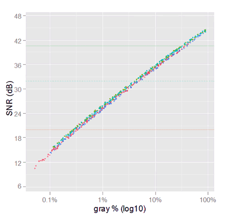
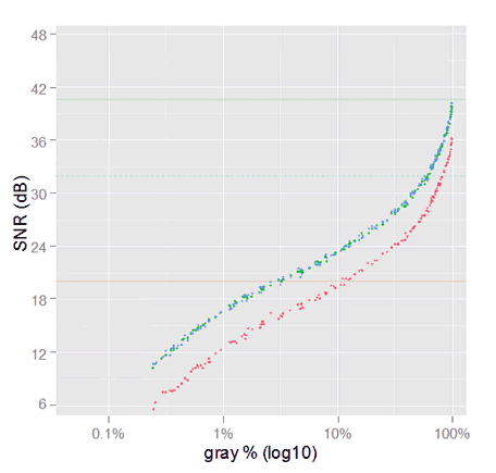
Now lets take a look to our selected samples using this script. The plots show the data with reduced opacity together with the channels regressions.


The horizontal lines show the SNR quality references values.
Comparing this plots with those from the whole original data set, our selected samples look good. They seem a fair surrogate of the initial whole set.
Noise in Images Converted From Raw to sRGB
As we stated at the beginning of this article, we want to know what happens with the noise beyond the camera raw space. We will begin that kind of analysis in the ubiquitous sRGB space.
Someone would prefer an analysis in the Adobe RGB space, which we might do in the future. However, we must take into account that sRGB and Adobe RGB share numerically the same tone curve, and their red and blue primaries has the same chromaticities, they differ only in the green one. However, most DSLR camera have the best performance with the green color and the key differences are in their red and blue sensitivities. So, we should not expect very much different —overall— results in an analysis in the Adobe RGB space.
Regarding the Conversion Process
We will convert our raw image samples into a RGB space using —basically— the technique described in "Developing a RAW photo file 'by hand'" in the section "Using Color Matrices from Adobe DNG". That process has been automatized in the code of the imgnoiser R package, which you can check in its Github repository.
In summary we will do a regular conversion, including a raw white balance, which is done using the process described in the DNG specification, using the camera color data embedded in the .DNG version of our raw Nikon D7000 files.
By design, we don't do demosaicing (debayering), this way we can not blame to the demosaicing process any feature or pattern we may found in our analysis. Also, that helps us to identify color or noise features introduced by the demosaicing process executed by the software in test.
White Balance per Sample Set
The five sets of photographs we have, were taken using daylight light, at different day hours; therefore, we will need to white-balance each set with different settings.
If we plot the ratio of each channel mean with respect to the average green channel we will notice the different balances.
ggplot(vvm.sel$wide.var.df) +
      geom_point(aes(x=green.avg.mean, y=red.mean/green.avg.mean), colour ='#BB7070') +
      geom_point(aes(x=green.avg.mean, y=blue.mean/green.avg.mean), colour ='#7070BB') +
      geom_point(aes(x=green.avg.mean, y=green.r.mean/green.avg.mean), colour ='#70AA70') +
      geom_point(aes(x=green.avg.mean, y=green.b.mean/green.avg.mean), colour ='#70DD70') +
      xlab('Green Avg mean [ADU]') +
      ylab('Ratio of mean values to Green average [ADU]') +
      labs(title='Ratio of mean values to Green average' ) +
      theme(plot.title = element_text(size = rel(1.5)))

We can clearly see two sets of samples with different blue balances, the same —but more subtle— happens with the red channel. If we look more carefully, there are really three sets of samples with different blue balances. This is the reason why we cannot white balance all the sets with the same setting.
As the white balance setting depends on the set of shots each sample come from, we need a process considering that. The following convert.to.rgb() function is our solution to that. It processes each set of samples with its own white balance settings and collects the result from each set which it returns in a single set. From the reproducible research point of view, it is great to have isolated a single procedure collecting data for all the test we will do.
This convert.to.rgb() function can split the selected samples in the sets from where they come by using the suffix embedded in each sample file name. For example, the file named _ODL0463s4.pgm corresponds to the fourth (s4) set of samples.
Each set of samples is digested with a imgnoiser::vvm class object, where those with the average green mean between the 45 and 80 percentile are averaged to get the neutral raw reference for the set. This neutral raw reference is used to set the white-balance point in a imgnoiser::colmap object, which in turn is used to convert the image data from raw to RGB.
The convert.to.rgb() function parameters are:
target.spacethe target RGB space.use.camera.tca logical flag indicating if the camera tone curve should be used or not.target.tcthe target tone curve. Can be the corresponding to the target space but not necessarily.cam.coldatathe camera color data corresponding to the camera where the samples come from.dest.scalethe scale of the color component values in the destination space, by default is255. The conversion is made with continuous values and not just the integers between[0, 255].
The convert.to.rgb() function code is shown below.
Conversion from Raw to sRGB
Using the convert.to.rgb() function explained in the previous section, we will convert our set of good samples from raw to sRGB. First, we will do it keeping the data linear. That means we wont apply neither camera nor the sRGB tone curve. This way we will see how the data gradually changes from raw to the regular sRGB we normally get using photo editing software. Later we will completely convert the samples to sRGB including the usual tone curves.
We will convert the images from raw to sRGB in the [0, 255] continuous scale. However, with the desire to don't get too much attached to this particular scale, sometimes we will express the sRGB color values as a percentage in a gray scale, where 0% is black and 100% is the maximum possible brightness.
Conversion from Raw to Linear sRGB
Using the convert.to.rgb() function, this is a straightforward process: we will call that function using target.space = 'sRGB' to convert the data to sRGB. To keep the data linear, we wont apply neither the camera tone curve use.camera.tc = FALSE nor the sRGB gamma curve target.tc = 'linear'. Then we will plot the VVM and SNR graphs:


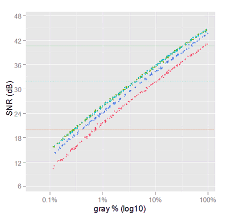
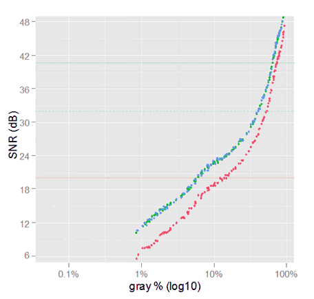
The fist thing that pop-ups, is the red noise variance in the VVM plot, growing very much faster than the others. In the SNR plots, it is about 4 dB below to the green and blue ones. However, the green and blue SNR values almost overlap to each other. However, this behavior is exactly what we estimated in \eqref{eq:snr-dest-lost}; we also predicted the red slope 2.3 times above the other ones.
In the following graph we can see the overall diminishing in the SNR performance. We ca be sure this is caused by the space conversion only, because there is nothing else between both data sets in the graph.
We anticipated in \eqref{eq:snr-dest-lost} a loss around 4.8 dB for the green and blue channels, and 8.7 dB for the red one, which is pretty much what has happened.

Only by the space conversion, from camera raw to linear sRGB, there is a loss in the noise performance.
The sensitivity of the camera photosites to the sRGB primary RGB colors is what makes the color conversion matrix to amplify less or more the camera raw noise. We have talk about this in previous sections. Be aware, this means the camera raw noise performance is not the only predictor of the noise in the final image.
Conversion from Raw to (non linear) sRGB
There are two tone curves that usually are applied in the conversion from camera raw to RGB values, one is the camera an the other is the target space tone curve.
First we will try the conversion without the camera tone curve and then with it. This means, we will call the convert.to.rgb() function with the same arguments as before, but this time with target.tc = 'sRGB'. First with use.camera.tc = FALSE and then with use.camera.tc = TRUE.
Without Camera Tone Curve
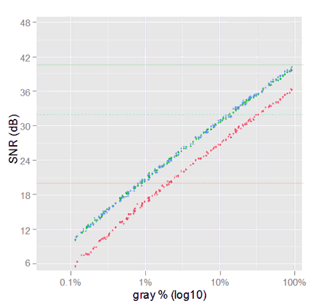
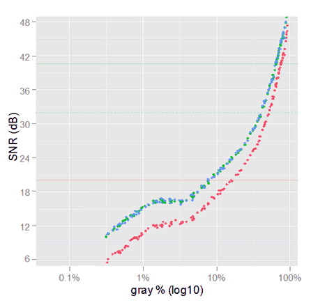
Now, the VVM plot (below) is not like it used to be any more. Again the red noise variance is above the one in other channels, but this time there is unusual very low variance for high signal (mean) values.

Data from samples in sRGB, without camera tone curve nor demosaicing. The right graph is a comparison with the SNR in sRGB linear; the linear sRGB SNR continues at the left, out of the chart.
The scale of the signal has been amplified by the sRGB tonal conversion: now the signal starts and ends with a greater value than in linear sRGB; check the relative horizontal position of the SNR curves. Be aware that this is just because the linear and the sRGB tonal scales use different values for the same tone, the image colors has not changed.
")
Comparison of SNR of gamma corrected sRGB (but without camera tone curve) against linear sRGB (the continuous curves).
The sRGB tone curve seems to be harmful for the darker tones, but without demosaicing. However, here we are comparing linear SNR with sRGB SNR, and later we will we can not directly compare SNR values from images with different tonal scales.
With camera tone curve
Now we will process the images as regular photo editing software does, with camera and space —sRGB in this case— tone curves.

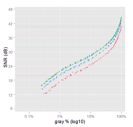
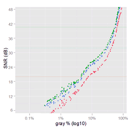
Noise in sRGB images without demosaicing. The SNR graph reaches 64 dB outside of the chart. The previous SNR, without camera tone curve, is shown with semi-transparent colors.
The VVM plot has a similar pattern like the previous one with only the sRGB TC. The patterns start closer to the axes origin and its peak has moved more to the right.

SNR in sRGB without demosaicing. The previous SNR TC without camera TC is shown with lower opacity.
We can compare this SNR with the one in the previous section (without camera TC), because both are in sRGB tonal scale.
The SNR is now better for the very dark tones (below 7% sRGB gray) and is still better for the lighter ones. However, the middle tones between around 12% and 62% are worse than before, up to 7 dB smaller.
Summary
Now we have a good idea about how the noise change in its conversion to sRGB.
The noise profile changes dramatically with the application of tone curves. In the section "The Effect of the Tone Curves on the SNR" we will explain the relationship between the SNR and the tone curves.
Before to jump into conclusions we will see what is noise profile in image samples processed by Adobe Lightroom. Then we will try to understand why the noise changes the way it does it.
Noise in sRGB Images Produced with Adobe Lightroom
Now we will process the original .NEF raw Nikon files, the source of the samples we have analyzed so far. We will use Adobe Lightroom V5.4 (LR). In the processing, we will crop from them exactly same areas from where the samples we have processed so far come from.
After processing those raw photo files in Lightroom (LR), we will export the result to sRGB, 16-bit .tif files, which we will read with the imgnoiser R-package to get the same kind of noise statistics we have got before.
Just like we did with the raw samples, each set of photographs is white-balanced with their own settings, using the white balance selector pipette on the sample in the set with pixel values in the third quartile in the histogram.
Adobe Lightroom with Zero Settings
For this test, except for the white-balance, we will set to zero all the settings. We are looking for the most basic LR processing to compare it with our previous results. For short we will call to this LR configuration "zero settings".
This zero settings means we will use LR with its the default factory settings, except for the Detail panel, where the default 25% amount of sharpening and 25% of color noise reduction will also set "manually" to zero. Furthermore, we are using the default Adobe Standard camera calibration.

Result of processing .tif files crops from Adobe Lightroom with 'zero settings'.
Notice we have got —qualitatively speaking— the same results as converting the raw samples to sRGB.
In the VVM plot we can see the variance from LR samples is almost the half of what we got with our raw-to-sRGB samples. That means 6 dB better (higher) SNR. This is something we expected, because —like every photo editing software— LR does demosaicing, and that process diminishes the pixel value variance.
For example, in a red row in a raw image, there is a pattern of pairs of red and green pixels repeated along the row. If two consecutive red pixels, separated by only a green one, have for example the values 6736 ADU and 6680 ADU; in our raw processing —without demosaicing— this two values means a variance of 1586 ADU^2.
However, the demosaicing will add the intermediate missing red pixel, and for a plain (featureless) image as our samples, that value will be a simple interpolation of its neighbors.
In a real demosaicing, that interpolation surely will be above to linear, probably bicubic, based on the neighbors pixels in both dimensions. For our example, only to show our point, we will just do a linear interpolation with those two neighbors, to get 6708 ADU, which is the value to set in the image just between the 6736 ADU and 6680 ADU red values. These three values correspond now to a variance of just 784 ADU^2 instead of the 1586 ADU^2 we got before. After this demosaicing LR will convert those camera raw values to sRGB.

SNR from samples processed with LR using 'zero settings'. The blinking points are from the SNR we got in the previous section, from the raw samples converted to sRGB without demosaicing. This comparison is not fair.
You might have realized that despite to the new fancy VVM plot pattern in the sRGB images, the SNR plot pattern has not changed that much.
.tif and our raw-to-sRGB samples SNR, in the above graph, is at first glance misleading, because the points are not vertically aligned. This is caused by LR using a different TC than ours (we will see this in detail later). Therefore, for a given sample and channel (a point in the plot), the gray tone value in a .tif sample is perceptually different than in our raw-to-sRGB image.
To make a fair comparison between the LR .tif and our raw-to-sRGB samples SNR, we will plot those SNR values, paired for each sample an channel, to obtain:

SNR comparison: LR zero settings vs raw-to-sRGB.
Now we can see that, in fact, most SNR values are better in LR .tif samples than in our raw-to-sRGB images; this occurs in 61% of our sample channels. However there are samples for which this goes in the opposite way. Looking in the data, we found that below 7% LR gray (equivalent to 10% raw-to-sRGB gray) the raw-to-sRGB SNR is better, otherwise the .tif SNR is the better.
Besides to lower levels of noise —thanks to the demosaicing— the darkest tone values in LR are lower than in our raw-to-sRGB samples. This is more evident when we plot, for each sample and channel, the ratio between our raw-to-sRGB mean pixel value to the ones in the LR .tif samples.
For lower gray tones, the LR pixel values are darker than those from our raw-to-sRGB.
For the darkest gray tones, our raw-to-sRGB values are from 2 to 3.5 times greater than the LR ones. For higher tones (above 50% sRGB gray) they match to each other. This is caused by the camera tone curve used by LR, which we will analyze in the following section.
The Lightroom Tone Curve
After the conversion from the camera raw to the linear sRGB color space, LR applies (conceptually) two tone curves (TC): one for the camera, and another corresponding to the sRGB space. The camera TC is applied for aesthetic reasons and the sRGB one is prescribed by that space.
To get a graph of the total scaling function applied by LR (including camera and sRGB TCs); for each sample and channel we will plot the LR mean channel pixel value (y axis) as function of the linear sRGB one (x axis) in our raw-to-sRGB samples.
Notice that this result is the sRGB gamma TC applied over the LR camera TC.

Scale applied by Lightroom to linear sRGB to get the final image.
Observe in the right plot, how the tones are upscaled beginning with a factor of 2 for the darkest ones, up to a peak factor of 6.2 around 4% linear gray (found in the data). From this point to the lighter tones the scale diminishes gradually.
Extracting the Lightroom Camera Tone Curve
In plots in the previous sections, we have seen the darker the tone the smaller is its value in LR than in our raw-to-sRGB samples. As the sRGB tone curve (TC) is prescribed by the sRGB specification, the camera TC must be the cause of the difference: LR uses a camera TC different to the ours.
We have got the scale function applied by LR over the linear sRGB values, but this curve also includes the sRGB TC. To get only the camera tone curve, we have to apply on this curve the inverse of the sRGB tonal conversion curve. Luckily, in numerical terms, this is easy to do.
The imgnoiser package comes with the most known tone curves, and among them there is the sRGB.gamma.curve. All of them are in the form of data frames, with x and y columns in the [0,1] range, with carefully chosen x values. To get the reverse of the sRGB gamma curve we just have to switch its x and y values.
To apply that sRGB inverse gamma function, we will need to interpolate between their given points. To do that, we will use natural splines. At the end of this section you will find the code we have used. After executing those steps we get:

The dots are the camera tone curve applied by Lightroom for a Nikon D7000. The dotted blue line is the camera tone curve we used in our raw-to-sRGB conversions.
We know the main effect of this LR camera TC is in the darker tones. Somewhere between the 25% and 50% marks, the LR TC and the ours match to each other. Also, the LR TC does not end in (1,1) as we wish. For these reasons we are interested in the segment at the left of the 37.5% linear gray mark.
To see more clearly the curve in the dark area we will switch to a $(log_{10})$ scale in both axes, to get:

For the darkest tones, the LR camera TC (the dots) is darker than the ours (the dashed line).
We will fit a smooth spline over the data in the left segment; starting from 37.5% linear gray we will gradually switch (interpolate) from the LR TC to our camera TC. This way we obtain:

The black curve is our natural spline approximation to the LR camera TC. The red points are the initial (experimental) data of the LR camera tone curve. The dotted blue line is the camera tone curve we have being using so far.
This way, we finally get an approximation to the LR camera TC, which you can download from here. The above plots show, as red points, the LR camera TC data; as a blue dashed line our original camera TC; and as a black curve the approximation we got using the splines.
Now we can apply the sRGB gamma correction to this camera tone curve to get the total TC that LR applies to Nikon D7000 images. This TC is shown below and you can download it from here
 tone curve")
This TC depends on the camera you are using with LR. We compared some points of this LR TC with those for a Nikon D800E and found an even more steeped curve for that camera. For example a 1.96% linear gray is expected to be 10.7% sRGB gray with the above Nikon D7000 TC. However, LR renders that tone at 17.1% sRGB gray for the Nikon 800E. Similarly, 3.8% linear gray, that is mapped to 23.2% srGB gray for the D7000 is converted to 29% sRGB gray for the D800E image.
The code doing what we just explained and show is this:
The Effect of the Tone Curves on the SNR
To understand the effect of the tone curves (TC) in the SNR, first we must have a clear understanding about the tonal scales, and the conversion from a linear to a non linear tonal scale.
Fast Review of Tonal Scales and Related Concepts
The following picture (Tonal Scales) shows three tonal scales plus the output tones from the LR total TC (for a Nikon D7000) in sRGB. The white tick marks flags the same perceptual middle gray on each tonal scale.
When we say perceptual, we refer to the way the color looks, irrespective of the tone value in any tonal scale. This way, when two colors —with different tone values in different tonal scales— look like the same color, we say they are perceptually equal.

Tonal Scales) Three tonal scales and the LR TC for Nikon D7000. The same perceptual middle gray is flagged with white ticks on each scale. The values in the tonal scales are —numerically— even spaced.
The perceptual middle gray is the tone that looks like in the halfway between the black and white. The Lab (formally CIELAB or L*a*b*) color space was designed to be perceptually uniform, in the sense that the perceptual difference between two colors should be proportional to the numerical values representing them in Lab.
Even when —in general— that has not been achieved as well as desired, it is accepted that the gray tone scale in the Lab (the Lightness color component) space is perceptually uniform. Hence, 50% Lab Lightness or just 50% L —by definition— is 50% perceptually gray. For this reason, this tone is often used as middle gray reference, as we will do. It helps to its popularity the fact that it is an unambiguous reference and it can be easily reproduced with different software tools.
The origin of the linear tone scale is in the physics of the light. This is the mother of all the tonal scales. That scale is linear in the sense that the tone values keep the same (linear) proportion with the amount of collected (or emitted) light. For example, lets suppose that for a given source of light, the corresponding spot in a image with linear tonal scale has $(x)$ as tone value. If we kept everything else constant and just double the exposition time (or the light intensity), that spot in the linear image will get a tone value of $(2 \cdot x)$.
Its interesting to take into account that what our eyes receive the tones in the linear scale, by the own nature of light. However, as our eyes sensibility is not linear, we can perceive more details in the dark tones than what the linear tonal scale allows us.
You can notice in the linear scale in the (Tonal Scales) image above, the tones are not perceptually evenly spaced. On the contrary, the dark tones are clumped to the left: the dark part of the scale, does not have room to those dark tones through which the human eye can resolve detail. An outstanding validation of this is that just 18.4% linear gray is our perceptual middle gray. Notice that this means that all the dark tones (50% of all of the possible ones) are encoded within just the 18% of the linear tonal scale.
As a consequence of this, an image with linear tones will have a very low contrast in the dark areas causing the loose of detail in there: when the image data is kept using floating point values, or big 16-bit integers, the detail in the dark zones is preserved like very small differences in the tone values, like from the third or fourth digit position (starting from the most significant one) to above.
However, eventually any image is converted to integers in the [0, 255] (8-bit) range, because it is the nowadays (best) standard input to computer screens (and tablets, and cell phones and so on), where the 'true' colors are represented by three RGB values in the 8-bit range; so, the displayed gray tones —with common RGB values— are in that integer range.
When this conversion occurs (quantization), the detail from the third digit (to above) in the tone values is lost (quantization error) and therefore the image detail represented by those digits disappears. This can be noticed in the image in the form of color banding.

Color Banding) The top half is a clip was processed to keep the image data in a linear tonal scale while the bottom one was processed in regular sRGB. The lack of tone values between the dark ones in the linear scale causes the banding.
The image above is a clip from a 14-bit raw image from the photograph of the reflections in a turned off LCD screen. The bottom half is the result of the regular image processing in sRGB and —as it should— shows a soft gradient of dark tones. The top half was processed as a tonal linear scale image, and as that scale —once the image is quantized— doesn't have enough gray tones to show the the soft dark gradient it looks like bands.
Now it is very clear that we need a tonal scale with more room for dark tones than the linear scale allows; and that is exactly why there are other non linear scales. An example of an often used tonal scale is the one prescribed by the sRGB specification, which is also used by Adobe RGB, NTSC RGB and PAL/SECAM RGB.
In the Tonal Scales image above, we can see how the perceptual middle gray in sRGB is not so to the left anymore. In fact, it is at the 46.6% sRGB of the scale, very close to 50% L in Lab. Why it is not exactly at 50% of the scale? because there are other factors, as the viewing conditions, which are expected to push the perception of that tone closer to the 50% L. Anyway, now we have a lot more space in the scale devoted to a more rich variation of dark tones.
Notice we have abstracted the numerical range of the scales. It is customary to represent and assume the tone values in [0, 1]. Nonetheless, if that is not the case, we can easily handle the range conversion. For example, in a 14-bit linear raw image 18% linear gray corresponds to $(2^{14} \cdot 0.18\% \sim 2949 {\small ADU})$; and for 8-bit sRGB tones (in [0-255]), the middle 46.6% sRGB gray is $(255 \cdot 46.6\% \sim 119)$.
Tonal Scale Conversions
Different tonal scales encode each perceptual tone with different tone values. For example —as we have already seen— the middle gray has the value 18% linear, 46.6% sRGB and 50% L on each of those tonal scales. We can think about tonal scales, as measurement units for the perceptual tones.
This is easy to understand looking measurement units like —for example— the Fahrenheit and Celsius temperatures, where the freezing point of water, is coded as 32°F in the first but 0°C in the second one: different values for the same temperature. To convert the tonal scale of one image, we have to change the tone values; like replacing the 32 by 0 from 32°F to 0°C; and the tonal scale tag associated to the image, like changing the F by C in the previous example.
In general terms, after a tonal scale conversion, the image should look the same. However, from a practical perspective, the conversion may introduce artifacts, like color banding in the linear tonal scale. But this doesn't occur because the tonal conversion per se, but because the tones will be eventually quantized in [0, 255].
Something different, but related with the tonal scale change, occurs when we change an image from one color space to another one, like linear camera raw to sRGB or from Adobe RGB to sRGB. It may happen that the color in the source space does not exists in the destination one: it is outside of the destination space. This color gamut mismatch will be handled according to the color space conversion intent.
Tonal Conversion Curves
The de facto standard form to define a tonal scale is from the linear tonal scale through a curve represented by a two parts function: one part with a linear function for the darkest tones; and a second one, a power function, for the other tones; where $(\epsilon)$ is the junction point of both parts:
\begin{equation} t_g(t_l) =\begin{cases} \phi \cdot t_l, & \text{if $t_l<=\epsilon $} \\ \\ (1+\delta)t_l^{1/\gamma} - \delta, & \text{otherwise} \label{eq:tonal-scale} \end{cases} \end{equation}
In the above equation, $(t_l)$ is the the tone value in linear space, in the [0, 1] range; and $(t_g)$ is the destination tonal scale, also in [0, 1]; $(\phi)$ is the slope of the linear part. Notice the power function uses the reciprocal of the gamma $(\gamma)$ parameter as exponent. Here $(\delta)$ is a given parameter for the tweaking of the junction point between the two parts of the curve.

General form of a tonal scale conversion curve.
In the above tonal conversion curve, the blue line represents the first linear part of the conversion function, with a slope of $(\phi)$. The curve is anchored to (0,0) black and (1,1) white. A greater gamma $(\gamma)$ parameter pulls the curve to above and vice versa.
To convert one image from a linear scale to a non linear one, we have to convert the tone values using $(t_g(t_l))$ function: applying the tonal curve to the image tone values; this is like converting 32°F to 0°C. We also have to tag the image indicating its new tonal scale, like when we changed the F by the C from 32°F to 0°C. This way the software will use the adequate perceptual tones corresponding to the image tone values. This is typically done embedding the corresponding color profile in the image file.
It would be simpler to have only the power function component; but in that case, we will have infinite as the value of the first derivative of $(t_g)$ when $(t_l)$ is zero (black), which is undesirable for numerical reasons.
Also numerically, it is required the continuity between both function parts in the $(\epsilon)$ junction point: a match in the function values and in their first derivatives (match in slope). Which means the following conditions:
\begin{align*} \phi \cdot \epsilon &= (1+\delta)\epsilon^{1/\gamma} - \delta, & \text{(match in value)} \\ \\ \phi &= \frac{(1+\delta)}{\gamma} \cdot \epsilon^{(1/\gamma-1)} & \text{(match in slope)} \end{align*}
Solving $(\epsilon)$ and $(\phi)$ from this conditions, for a given $(\gamma)$ and $(\delta)$, we obtain:
\begin{align} \epsilon &= {{\large(} \frac{\delta \cdot \gamma}{(1+\delta) \cdot (\gamma - 1)} {\large)}}^\gamma\\ \\ \phi &= \frac{(1+\delta)^\gamma \cdot (\gamma-1)^{\gamma-1}}{\delta^{\gamma-1} \cdot \gamma^\gamma} \end{align}
In the case of sRGB, the main parameters are $(\gamma = 2.4)$ and $(\delta = 0.055)$. Plugin these values in the equations above results in $(\epsilon = 0.003039935)$ and $(\phi = 12.92321)$ which sometimes are used to describe the sRGB tonal correction. However, the sRGB creators rounded $(\phi = 12.92)$ and, to comply the match in values requirement, they recomputed $(\epsilon = 0.0031308)$. Nonetheless, these values causes a discontinuity in the slopes, from 12.92 in the linear part to 12.70 in the power part.
Another example of the use of this kind of tonal scale is in the Lab color space, where the Lightness uses $(\gamma = 3)$ and $(\delta = 0.16)$ which result in $(\epsilon = 0.008856452)$ and $(\phi = 9.032963)$; which are the values used in the CIELAB specification. For better precision, they published the rational expressions behind these values $(\epsilon = (6/29)^3)$ and $(\phi = (116/30) \cdot (29/6)^2)$.
Here we are describing the Lightness (L*) color component in the Lab in the [0, 1] range. However, the standard L* is in [0, 100]. This means we have to multiply by 100 the output from \eqref{eq:tonal-scale} to get the standard value.
The $(\delta)$ parameter allows the tweaking of the tonal conversion. For example, in the case of the sRGB, with official $(\gamma = 2.4)$, the $(\delta)$ parameter causes a curve virtually identical to a simple (without linear part) 2.2 gamma : if we compute the correlation between the sRGB curve and a simple 2.2 gamma, we get 0.9998456! It seems the creators wanted a gamma 2.2 curve but without an infinite slope in the origin, and they made it. That's why it is often said the sRGB tonal conversion has a practical gamma of 2.2.
Notice a linear scale is also a particular case of this general form, where $(\epsilon = 1)$ and the second part of \eqref{eq:tonal-scale} is not used; or with $(\epsilon = 0)$ and $(\delta = 0)$ and $(\gamma = 1)$ where the first part is not used.
The SNR Change with the Tonal Scale
While the tonal scale is the same, even from scales with different range, it is fair to compare the SNR values from them.
For example, we can have sRGB tone values of a given image in [0, 1], [0, 255] or in [0, 32768], and the SNR values from all of these scales will result the same value: if the tone values in one scale is $(t_1)$ and the ones in the other is $(t_2)$, for some $(k)$, we have:
\begin{align*} t_1 & = k \cdot t_2 \\ stdev(t_1) & = k \cdot stdev(t_2) \\ SNR_1 & = t_1/stdev(t_1) \\ SNR_1 & = \frac{k \cdot t_2}{k \cdot stdev(t_2)} \\ SNR_1 & = \frac{t_2}{stdev(t_2)} \\ & \Rightarrow SNR_1 = SNR_2 \end{align*}
As another example, it is also fair to compare linear raw SNR against linear sRGB. The SNR differences will be only consequence of the transformation of the colors from one space to another, but not because they come from "different" tonal scales.
If two SNR values are computed from tone values in different tonal scales, it is not "fair" to compare them. This is like comparing quantities with different measurement units; like comparing apples and oranges.
To understand how the SNR changes, from a linear to a non linear tonal scale, lets take a look to the conversion curve transforming dark and light tone values.
Notice that all the tones get a greater value after the conversion; just for this fact, the SNR in the non linear scale will be better (higher) than in the linear one. Nonetheless, the slope of the curve will also affect the SNR in the non linear scale as we will see.

sRGB tonal scale conversion curve.
For the darkest tones, the curve have a steep slope, causing the neighbor linear tones to have more spread values in the non linear scale; this is represented by the thin blue line converted in a thicker one after the tonal conversion.
For the lightest tones —represented by the green lines in the image above— occurs the opposite, the neighbor linear tones have compressed values (closer to each other) after the tonal conversion. Here we have two factors for a greater SNR in the non linear scale: the increase in the tone value and the numerical reduction of the spread of neighbor tones.
Coming back to the dark tones, the gain in value is always greater than the spread of the neighbor tones caused by the curve slope: If we plot the ratio between the sRGB tone value and the linear one —the value gain just by using a different tonal scale— in turn divided by the sRGB curve slope or first derivative —the incremented value spread of neighbor tones— we will find always values above 1, telling us the gain in value is always greater than the spread of neighbor tones.
This suggest that a non linear tone scale will always have a numerically greater SNR than in a linear one, at least in the sRGB case.

Value gain divided by sRGB first derivative.
Let's see an example from "real data". We have a raw image channel sample having 2,847 ADU as mean pixel value and 34 ADU as noise (standard deviation). If we convert the image to the sRGB tonal scale, the mean pixel value changes to 7287 ADU with 40.5 ADU as noise (these data is computed from a sample, not theoretically):

Pixel values in a linear scale (green) and in the sRGB (blue) tonal scale. The standard deviation (horizontal spread) has grown, but the average value has increased a lot; consequently the SNR value is greater in the sRGB scale.
As —after the conversion— the average pixel value has incremented a lot more than the noise, the SNR seems very much better. It has changed notoriously, from 2847/34 = 83.8 (38.4 dB) to 7287/40.5 = 179.7 (45.1 dB). However, the image look wasn't changed at all, it is the same as before, just with tones using a different tonal scale. In other words, the better SNR doesn't correspond to a change in the image look, is just the distortion caused by an unfair comparison of SNR values in different (linear and sRGB) tonal scales.
We will convert the pixel value tonal scale in our set of good samples, from linear to sRGB. Notice we are not converting the images from raw to sRGB, which means remixing the raw colors with a conversion matrix.
We are just changing the tonal scale of the raw image channels from linear to sRGB —but keeping them in the camera raw color space— and computing the SNR before and after that tonal conversion. Also, we will use raw white balanced pixel values, and we will show only one of the two green raw channels. Please pay attention because it will be tricky to compare those SNRs.

SNR vs mean pixel value in linear and in sRGB tonal scales. Each tone value in the x axis corresponds to a linear or sRGB tone, depending to which point you are looking at.
In the plot above, each point shows the (x:mean pixel value, y:SNR) points in linear and in sRGB tonal scales.
It seems like the sRGB SNR is greater for the lighter tones but smaller for the darkest ones. But that is an illusion caused by the existence of two different x axis: each tone value in the x axis represents different perceptual tones on each tonal scale. Hence we are comparing apples and oranges along the x axis.
To make a fair comparison we have to use a single x axis: we will plot in the y axis the SNR from pixel values in linear and sRGB tonal scales as before. However, in the x axis we will plot each point using the mean pixel value always in the linear space.

SNR vs mean pixel value in linear and in sRGB tonal scale. The tone values in the x axis corresponds to same space tonal scale for both SNR patterns.
Now it is more clear that —numerically— the SNR is higher when the tone values are in sRGB than when they are in a linear scale. If it is not completely clear, we will plot in the x axis the linear SNR and in the y axis the corresponding sRGB SNR for each sample and channel.

Notice that except few outliers points, all of them have the sRGB SNR above or equal the linear one.
Except for few ones, all the points have the sRGB SNR above or equal the linear ones. Now it is clear the SNR in a non linear scale (with gamma above 1) has (at least very often) a —numerically— greater SNR than the corresponding in a linear one.
If we don't convert the tone values in a image using a linear tonal scale, and just tag it as sRGB, it will be like replacing each perceptual tone in the linear tonal scale, in the above Tonal Scales image, with those numerically equal (directly below in the Tonal Scales image) in the sRGB tonal scale.

The left clip uses a linear tonal scale. The right clip is the same image just tagged as sRGB but without converting the tone values.
Just tagging the image as sRGB without converting the tone values, is like replacing the temperature tag from 32°F to 32°C: we are referring to a completely different temperature. By leaving the same numbers but with a different tonal scale tag we are changing the image colors, it will look murky.
20 db, 32 dB and 36 dB linear SNR quality reference values cannot be used with sRGB SNR measurements. Also we can understand they are referred to 18 % linear gray, because the linear scale is the one farther way from perceptual uniformity.
A Better Tonal Scale to Calculate the SNR
With regard to tonal scales, the concept of better is related to better perceptually uniform; in this sense, the sRGB tonal scale is far better than the linear one.
| Lab | 0.0 | 3.6 | 5.0 | 9.0 | 10.0 | 15.0 | 15.3 | 20.0 | 21.2 | 25.0 | 27.0 | 30.0 | 32.5 | 35.0 | 37.9 | 40.0 | 43.2 | 45.0 | 48.3 | 50.0 | 53.4 | 55.0 | 58.3 | 60.0 | 63.2 | 65.0 | 68.0 | 70.0 | 72.8 | 75.0 | 77.4 | 80.0 | 82.0 | 85.0 | 86.6 | 90.0 | 91.1 | 95.0 | 95.6 | 100.0 |
|---|---|---|---|---|---|---|---|---|---|---|---|---|---|---|---|---|---|---|---|---|---|---|---|---|---|---|---|---|---|---|---|---|---|---|---|---|---|---|---|---|
| sRGB | 0.0% | 5.0% | 6.6% | 10.0% | 10.8% | 14.8% | 15.0% | 18.9% | 20.0% | 23.3% | 25.0% | 27.7% | 30.0% | 32.3% | 35.0% | 37.0% | 40.0% | 41.7% | 45.0% | 46.6% | 50.0% | 51.6% | 55.0% | 56.7% | 60.0% | 61.8% | 65.0% | 67.1% | 70.0% | 72.4% | 75.0% | 77.8% | 80.0% | 83.2% | 85.0% | 88.8% | 90.0% | 94.3% | 95.0% | 100.0% |
| Adobe RGB | 0.0% | 8.1% | 9.4% | 12.3% | 13.0% | 16.5% | 16.7% | 20.3% | 21.2% | 24.2% | 25.8% | 28.3% | 30.5% | 32.6% | 35.2% | 37.0% | 39.9% | 41.6% | 44.8% | 46.3% | 49.6% | 51.2% | 54.5% | 56.2% | 59.4% | 61.3% | 64.4% | 66.5% | 69.4% | 71.8% | 74.4% | 77.2% | 79.5% | 82.8% | 84.6% | 88.4% | 89.7% | 94.2% | 94.8% | 100.0% |
As we can see in the conversion table above, the sRGB tonal values are not too far from the corresponding Lab ones. The maximum difference between those scales is 3.4 percentage points (at 50% sRGB) and they have an average difference of only 2 percentage points. Which means that for precise values —certainly— a conversion is required, but to have a plus or minus reference, we can use any of them.
On the other hand, the sRGB and Adobe RGB scales are also pretty close to each other. They are different for tones below 20% —of any of both scales— where the closer to zero the higher the Adobe RGB tonal value with respect to the sRGB one. However, for values above 20% they differ in less than 1 percentage point.
Nonetheless, as we are more worried about noise in the dark tones, where these scales are numerically more different, it is not fair to compare the SNR values for dark tones mixing them. However, in general terms, it is far better (more perceptually uniform) the use of SNR values form sRGB or Adobe RGB than from a linear scale.
Measuring SNR from L (Lab) tonal scale
When speaking of perceptually uniform, undoubtedly the L (lightness) scale, from the Lab color space, is a good candidate to be the better tonal scale as base to compute the more perceptually uniform SNR.
In the case of noise analysis from neutral color samples, the L* (Lightness) color component in the Lab space, is the relevant value (because the a and b values will be meaningless, very close to zero), and it has the additional benefit to condense the noise from all the raw channels in a single value.
The following is the VVM plot (noise variance versus mean pixel value) of our ISO 100 raw samples using the L* tonal scale.

Noise variance versus mean pixel value in the L* Lab tonal scale.
We can see a pattern similar to what we get from noise in sRGB scale. Which shouldn't be a complete surprise, as we have seen Lab and sRGB are members of the same family \eqref{eq:tonal-scale} of tonal scales.
The peak corresponds to tone 8 L equivalent to 0.88565% linear; and the left and right sides from this point correspond to the linear and non linear parts of the L* scale definition. This means the linear part at the left represents the darkest tones; as a better reference, they are below to 9.22% sRGB or 23.5 sRGB in [0, 255].
The following graph show the SNR from L* tone values (red curve) and from linear raw tones (green curve); where those latter are calculated from the raw green channels in our samples:

SNR from linear raw and L tonal scales.
For the both top curves, the x axis is linear, while for the bottom ones is the L* tone scale. This way we can compare the numerical values from both tonal scales: for each pair of curves the x values corresponds to the same perceptual tone and we are just seeing the numerical difference caused by the use of different tonal scales.
In the linear part (below 0.88565% linear or 8% L), both SNR curves go in parallel with approximately 2 dB of difference and the linear scale brings higher SNR values. In the non linear part there is a better SNR contrast (higher slope) in the L* SNR.

L* SNR as function of linear SNR .
The previous plot show the relationship between L* SNR and linear SNR. At least for this samples, it seems like the 20 db, 32 dB and 36 dB linear SNR quality reference values are equivalent to the L* SNR values of 18.5 dB, 35.8 dB and 43 dB.
We should explore the possibility of normalize the SNR plots using the L* tonal scale. The conversion from sRGB tone values is not difficult.
A Brief History of Noise: from Raw To sRGB
We have seen evolve the noise from the raw noise pattern we are used to see, to the actual shape it has in sRGB images. In this section we will make a summary about how it has changed and its consequences.
We used to plot the raw noise with SNR graphs showing the SNR for each channel, with respect to their own channel signal, to get almost overlapping curves. Like in the following plot showing raw noise from our selected samples.

SNR plot of raw noise, with each channel having really a different linear gray scales. For example, the three arrows mark the signal and the SNR for the three channels of a neutral sample. Those channels have the same gray level but they don't match in the x axis.
Nonetheless, that plot is not a fair representation of the data, because the RGB raw channels are in different scales. For example, neutral colors are far from having the same value. In the image above the arrows are an example of the raw RGGB color component values for a given neutral sample. As they use different measurement scales, they are not over the same gray level.
The exact scales to make even the raw values of neutral colors, depends on the scene illuminant, and for that reason they are called white balance scales, but it is clear they are not as different as they are only for a white-balance matter.
In the case of our samples, the average relationship of those neutral color component values is (R:44.7%, G:100%, B:83.0%), which means the raw reds are below the half of the green values! The white balance scale, to make even those values, is the reciprocal of those value (R:2.24, G:1, B:1.2).
To make fair the above plot, we will apply to each channel mean value the white balance scale, and plot them again. This time they will be shown really using a common scale. Now the points flagged in the previous plot are over the same gray mark (10%).

SNR plot of raw noise (linear gray), with each channel 'white-balanced' to have all of them really the same linear gray scale. Now the channel values of the sample, shown in the previous graph, are all aligned over the 10% mark.
Now we can see, how for a given gray tone, the SNR for the green channel will be the best, then the blue, and then the red one, 4.5 dB below the greens.
After this last adjustment, the following linear sRGB SNR plot is less unexpected than when we saw it for very first time.

SNR plot of linear sRGB channels (linear gray). The semi transparent points represent the raw channels noise with the balanced scales we saw in the previous plot. The SNR for the linear sRGB channels have an almost constant bias along the linear gray axis, with respect to the raw channels SNR.
This plot shows the net effect in the SNR caused by the color space conversion only (excluding tone curves). We can see the conversion to linear sRGB degrading each channel SNR by an almost constant bias along all the gray tones. This bias can be estimated as we did in \eqref{eq:snr-dest-lost}.
This loss of noise performance can be better or worse depending on how good the sensor can distinguish the red, green and blue colors. To say it more formally, depending on "how good the sensor is sensitive to the RGB color space primaries". This means —for example— that good raw noise performance in a sensor, color blinded to the red and green colors (not a weird condition), may lead to bad noise performance in sRGB or Adobe RGB.
Now, it is the turn of the tone curve to come into play. There are two effects coming from the tone curve, one caused by their value mapping role, and other caused by their slope or first derivative. We will see first the value mapping effect.

Tone curve applied by LR, includes camera TC and sRGB gamma correction. Observe how the 18% linear gray will become 68% sRGB gray!.
Conceptually, the final tone curve is the interaction between the camera tone curve and the color space tone curve (aka gamma correction). However, we can "play" with the camera TC in order to, whichever the destination color space TC is, the final gray tones may have whatever value we want. Considering this, for short, we will talk about TC without making that camera/space distinction.
The tone curve makes a strong relocation and consequently change of brightness to the values in the input linear gray scale. Before the TC, a 20% gray shade in the raw data is still 20% gray in the linear destinations color space —like linear sRGB— but that changes a lot after the TC.
18% Linear Gray is not a Middle sRGB Gray!
Notice in the above TC how the 18% linear gray, considered a middle gray reference (and consequently used to measure the sensor noise at different ISO speed levels) will become 68.1% sRGB gray in the final image; and of course that is not a middle gray anymore.
This is a little worse if we take into account that in sRGB, the middle gray mark is at 46.8% (this is approximately (119, 119, 119) sRGB in the [0, 255] scale: which gives 50% Lightness in Lab space). This means, the reference 18% linear gray in sRGB is 68% - 46.8% = 21.2 % points above the real middle gray in our final images! at least in LR.
If we look up —in reverse— the above tone curve, starting with 46.8% gray in the vertical "Lightroom sRGB gray" scale, we get 8.5% linear gray!. For my camera, this is the (linear) middle gray to care about when checking its noise performance with raw (linear) values, not 18%!.
I wonder how the the ranking of cameras in DxOMark would change if they would use more realistic raw middle grays when benchmarking the cameras noise levels.
The following image is a numerically precise representation about how the above tone curve relocates the gray shades after its application. Check how strongly the darker values are stretched and the lighter ones are compressed after the TC.

The bottom points are in linear gray space. They are evenly spaced gray tones before the TC application. The top ones have the position they have after the application of the TC.
If we change only the horizontal spacing of the gray tones, in the linear sRGB SNR plot above, according to the LR TC we get the following graph.

This is the linear sRGB SNR plot after distorting the horizontal gray scale using the LR TC. The gray scale is non-linear LR sRGB gray.
In the above plot, the SNR values are the same as in the previous linear sRGB SNR plot. Only the horizontal scale has been changed using the LR TC, as a mean to see how the SNR gradually changes in its way to complete sRGB.
The second effect of the TC application is the change of variance caused by the TC slope, or more precisely its first derivative.

Approximation to the LR TC (blue curve: right axis) and it first derivative (black curve: left axis). The red curve is the reference line x = y
Except at both ends of the scale (when the input and output of the TC have the same value), the TC output is always a tone lighter than the linear gray input.
In the first derivative curve, we can see the TC starts with a small slope for the very darkest tones. However, between around 1% to 3.1% of linear gray (the geometrical middle point between 1% and 10%), the TC slope reaches its maximum, stretching the dark tones by a factor above 6. This means those tones are not just upscaled, but their difference with neighbor tones is amplified above 6 times, consequently increasing the noise.
From around 23% linear gray, the TC slope is below to 1 and stays diminishing, which means all the tones starting from this point are compressed, and the lighter they are the more compressed they are, this time diminishing their difference with neighbor tones decreasing the noise. Here we have greater pixel values with lower noise skyrocketing the SNR for the lightest tones.
Finally, we have the noise from the LR sRGB samples, including a gain in decreased by the demosaicing and and a loss of it by the LR TC. In the balance, the SNR in the darkest tones is worsened and in the lighter tones is a lot much better.

Noise in sRGB '.tif' Lightroom samples. The gray scale is non-linear LR sRGB gray. With fading colors is also shown the previous plot of linear sRGB with the LR TC applied only to the gray scale.
The following slider contains a summary of the evolution of the SNR graph from raw to full sRGB. The red, cyan and green horizontal lines are quality reference marks for acceptable, good, and excellent noise levels for middle gray.