In previous articles we have proposed a raw noise mathematical model which arises from the sensor characteristics. Then we have learn how to use this model applying it on noise data from a Nikon D7000 camera at ISO 100. Realizing the noise measuring is a labor intensive task, we prepared the imgnoiser R package ("Introducing the imgnoiser R package")
Now we want to use the imgnoiser R package to build a noise profile of the Nikon D7000 at ISO 100. The support from the imgnoiser will help us to devote less time collecting and double checking the data from our procedures and use that released time to make a more extensive analysis.
This article will also be useful as tutorial about the usage of theimgnoiser R package, with practical examples, not from naive situations but from real analysis cases.
Initial data from Nikon D7000 at ISO 100
We have five sets of shots from a Nikon D7000 at ISO 100, using as target a white cardboard, lit by daylight light in an slightly overcast summer day at different hours.
In one set we found two regions of interest, and consequently that set produced two sets of samples. For that reason the file name of each set of samples samples have a suffix like s1 in _ODL0515s1.NEF to avoid name collisions from different samples from the same photograph. At the end, we have 1,134 image samples.
The vvm Analysis
We can process all the images and read their mean, variance and covariance of their pixel values on each channel using the digest() function in the vvm class. The min.raw and max.raw parameters of that function determines which channel samples are included or not in the final result: If more than the 2% of pixel values in a channel are not between the min.raw and max.raw arguments the channel is rejected. This is done to avoid the inclusion of severely clipped samples.
Our camera clips the green highlights at around 15,779 ADU and the other raw channels at 16,383 ADU. Being conservative, I have diminished those values a little before use them as limits in the call to the digest() function.
After digesting the samples we will take a closer look to the data points near the axes origin.
library(imgnoiser)
vvm.all <- vvm$new(has.RGGB.pattern = TRUE)
vvm.all$digest(
    file.name.from = '_ODL0387s4',
    file.name.to   = '_ODL1671s6',
    file.name.ext  = '.pgm',
    file.path      = 'ISO100/crops',
    min.raw        = 1,
    max.raw        = c(16379, 15776, 15776 ,16379)
  )
# Plot where 'x' is in [0,50] and 'y' is in [0,30]
vvm.all$plot(with= ~ channel != 'Green Avg', xlim=c(0,50), ylim=c(0, 30))
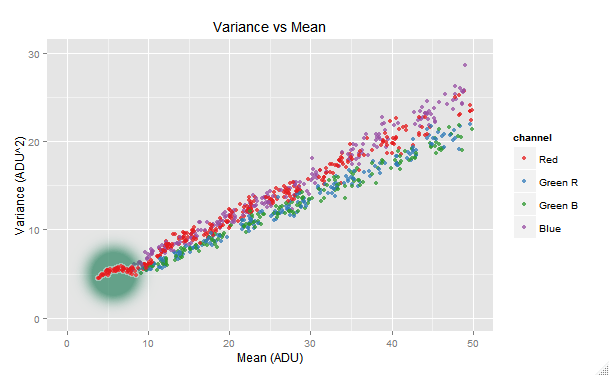
We can see the red channel making a funny tail shape at its lower end. This issue is probably related with the in-camera read noise handling: in the case of the most of Nikon cameras, a dark frame is already subtracted in the raw image in order to remove the read noise. We can get rid of this tail by raising the min.raw argument in the call to the digest() function. After some trial and error, 4 ADU is found as solution.
Right after digesting the samples, we will fit a robust weighted model, relating the var and mean variables, in the way we learn in the article Handling Heteroscedastic Data from Camera Sensor Noise as the solution to its heteroscedasticity. We will also make some plots showing the data and the regression predictions.
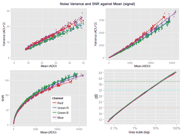
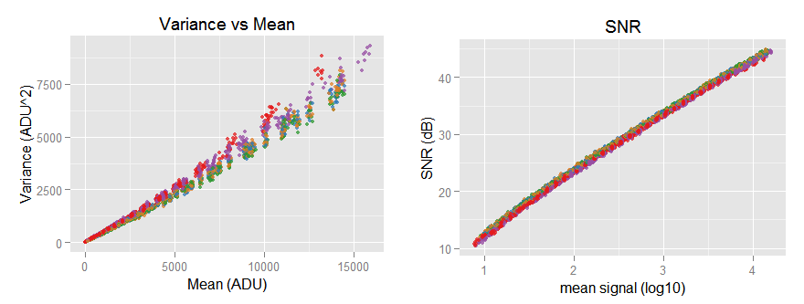
the [top-left] sub-graph shows the red channel without the funny tail and the regression lines correctly following the data trend. The [top-right] sub-graph shows all the noise variance versus mean (signal) with its characteristic slightly quadratic shape. [bottom-left] Is the Signal-to-Noise-ratio (SNR) in natural values, while the [bottom-right] one shows the same SNR curve but this time in a log-log plot, looking almost like a line with a slope of 0.5
After looking the plots, we can say the data looks like expected. An excerpt of the fitted model summary is shown below.
vvm.all$print.model.summary('weighted')
#>
#> #-------
#> # Model Name: "weighted"
#> #
#> # Call:
#> # lmrob(formula = var ~ mean + I(mean^2), data = model.src("std.var"), weights = 1/mean^2)
#> #-------
#>
#> ##--  channel  :  "Red" --##
#>
#> Coefficients:
#>              Estimate Std. Error t value Pr(>|t|)
#> (Intercept) 2.130e+00  8.531e-02   24.97   <2e-16
#> mean        4.475e-01  1.300e-03  344.24   <2e-16
#> I(mean^2)   1.311e-05  3.350e-07   39.15   <2e-16
#>
#> Robust residual standard error: 0.02278
#> Multiple R-squared:  0.9979, Adjusted R-squared:  0.9979
From this analysis we are more interested in the regressions quadratic term, because we know we can get more accuracy for the regressions linear part using the hvdvm technique that we will use later. We will get the regression coefficients confidence intervals to use them as reference when we get hvdvm regressions.
models <- vvm.all$get.model('weighted')
lapply(models, confint)
#> $Red
#>                    2.5 %       97.5 %
#> (Intercept) 1.962546e+00 2.297327e+00
#> mean        4.449379e-01 4.500392e-01
#> I(mean^2)   1.245719e-05 1.377177e-05
The hvdvm Analysis
One advantage of the hvdvm technique is that it uses all the possible combinations of pairs of shots taken under identical photographic conditions (without considering their order). For example, from 8 shots taken with identical photographic conditions it will convert that eight samples to choose(8,2) = 28 pairs of samples!. That greater data volume brings more accuracy to the models we fit on that data.
Feeding the hvdvm digest function with the same 1,134 image samples we used in the vvm analysis, we found we have now 3,769 different pair combinations as input data: 3.3 times more.
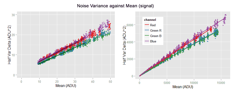
Plots from the pair of samples digested with the hvdm technique. The pairing used for that technique brings more data points. Theoretically the regressions should be linear, but they show a mild negative quadratic component.
Theoretically, the data shown above should have a linear pattern: the subtraction of two identical images cancels the part of the noise that is constant in both of them. To our knowledge, that is the PRNU noise, causing the (positive) quadratic pattern we can see in the VVM graphs at the beginning of this article. In other words, the remotion of the PRNU noise should left only the linear part of the noise variance with respect to the pixel mean value (signal).
Nevertheless, the data shown above does not look completely linear, the noise variance is diminishing along the x axis (mean signal) below a linear pattern. The subtraction of the images is clearly canceling more than the PRNU noise. It seems to be canceling part of the photon shot noise, which is the source of the linear component in the noise variance. The problem is that hypothesis makes no sense, the photon shot noise does not have a constant component, even in two identical shots the photon shot noise is totally random. It seems like we have a missing link in our model.
We have fitted a quadratic model over the hvdvm data and its summary shown below. However, we are interested only in the linear part, we should ignore the quadratic part.
As this data is expected to have a linear pattern, maybe you would expect from us to fit a linear model. However, we have explained the rationale of fitting that quadratic model in this section.
# Fit a quadratic model
hvm.all$fit.model(model.name = 'weighted', model.family = 'lmrob', degree = 2, weights=1/mean^2)
hvm.all$print.model.summary('weighted')
#> #-------
#> # Model Name: "weighted"
#> #
#> # Call:
#> # lmrob(formula = var ~ mean + I(mean^2), data = model.src("std.var"), weights = 1/mean^2)
#> #-------
#>
#> ##--  channel  :  "Red" --##
#>
#> Coefficients:
#>              Estimate Std. Error t value Pr(>|t|)
#> (Intercept)  2.186e+00  4.264e-02   51.25   <2e-16
#> mean         4.457e-01  6.768e-04  658.52   <2e-16
#> I(mean^2)   -1.749e-06  1.605e-07  -10.90   <2e-16
#>
#> Robust residual standard error: 0.0214
#> Multiple R-squared:  0.997,  Adjusted R-squared:  0.997
#> Convergence in 22 IRWLS iterations
In the model summaries, the t-value is the ratio between the estimated coefficient value and its standard error. We can see the t-values in the hvdvm regressions are around twice those in the vvm regression, meaning here we have twice accuracy.
All the coefficients in the regression of hvdvm data are inside the confidence intervals of those in the vvm regression, with the exception of the linear coefficient (not the interception) of the Blue channel which is very, very close to the left limit. Another interesting fact is that the Red noise variance grows faster than the Blue one in the vvm data while it is the opposite in the hvdvm. However, in both cases —as expected— the linear coefficient of the Blue channel is greater than the one in the Red one: the quadratic component in those regressions is what makes that different the overall growing ratio.
models <- hvm.all$get.model('weighted')
lapply(models, confint)

#> $Red
#>                     2.5 %        97.5 %
#> (Intercept)  2.101907e+00  2.269121e+00
#> mean         4.443593e-01  4.470132e-01
#> I(mean^2)   -2.063859e-06 -1.434436e-06
Cross-validated Regression Optimizing the Error in the SNR space
We are not completely satisfied mixing coefficients from different regression as we did in the previous section (equations \eqref{eq:vvm-red} to \eqref{eq:vvm-blue}). We would like to have some validation telling us that mix is better than the vvm models, which is just our gut feeling.
In this section we will test another way to model the variance and we will cross-validate them to find out which one is better, regardless of our feelings. We will include links to the R code actually used in this process.
The new model
We have always been aware that the noise variance data looks very heteroscedastic in the vvm plots (noise variance var versus mean signal mean) but very homoscedastic in the SNR ones:
However, we didn't try a regression in that SNR log-log space because to get —analytically— the regular VVM relationship from that model would be impossible. Nonetheless, we have a new idea: to model the regular VVM relationship, but instead to minimize the error in that space we will do it in the SNR log-log one.
A regular linear regression for $(var \sim mean)$ finds a $(var')$ approximation to the $(var)$ data values minimizing $(\sum_{i}(var_i - var_i')^2)$, which is where the heteroscedasticity kicks in. We want to change that in order to minimize the error in the SNR space, this means minimize $(snrError = \sum_{i}(snr_i - snr_i')^2)$ where $(snr)$ is computed —as usual— using $(snr_i = snr(var_i, mean_i))$ and $(snr_i' = snr(var_i', mean_i))$.
Probably there is an ad-hoc function to do this in R-language. However I haven't found it, so we will use the standard optim() R function to minimize our $(snrError)$ error target function.
Splitting the Data
For the cross-validation we will split our noise data in training and test sets in a 60/40 ratio. The complication we have here is the sets can not just contain a completely randomly chosen subset of data points, we need —in both sets— to span the whole spectrum of signal mean values in the data.
To do that, we have a split.data() function with uses kmeans() over the logarithmic mean values in the Green Avg pseudo-channel, to find out the clusters that must be split between the two sets. Then we randomly split those clusters in a 60/40 cut while possible. For example, if there are only two data points in a cluster, each set takes one of them. We have chosen the number of clusters avoiding to get one or more of them containing only one data point.
The Models to Build
We will build two quadratic models relating $(var \sim mean + mean^2)$ using the training data only. One model, called w.robust, follows the regular vvm model: a robust regression (using the lmrob() function) with $(1/mean^2)$ as weights to fix the heteroscedasticity.
The other model, called optim.snr, will use the optimization R standard function optim() to build the model minimizing our aforementioned target function $(snrError)$ error.
The Error Estimation Tests
Once both models are built, they will be tested using the test data set. The SNR test will measure the RMS of the $(snr)$ errors $((snr_i - snr_i'))$.
The w.mean test will measure the RMS of the $((var_i - var_i')/mean_i)$ errors; this means the errors weighted in the same way as the w.robust model is built, with the reciprocal $(mean)$ value.
The w.var test will measure the RMS of the $((var_i - var_i')/var_i')$ errors; this means the errors are weighted with the reciprocal of the predicted variance $(var')$.
Iterating the Evaluation Process
We will iterate the whole process 50 times. In each iteration the whole data, with 1,134 image files, will be split in randomly chosen training and test sets, as we already explained. Obviously, between iterations, some of the same data will be reused as training or test or swapped from one set to the other. This gives to the process a slight smell of bootstrapping.
We are using this design for the lack of time to prepare a more desirable k-fold partition cross-validation. The data for the w.robust model has to be more or less evenly spaced, spanning the whole spectrum of mean values because otherwise the heteroscedasticity cause different fits just for this reason. This makes the preparation of a k-fold test a non-trivial task.
After all the iterations, the errors on each test are averaged. Also the models coefficients are averaged as reference.
Evaluating the Results
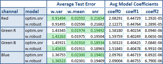
The following table shows the result after these tests.
The green background flags the best average result between both models. The new optim.snr model is undoubtedly the winner here. From all the 12 tests it won all except three of them. Is a little surprise to see it winning the w.mean test, because the other model (w.robust) is the one that uses mean values as weights when fitting the models. Instead, the optim.snr has nothing to do with them.
As the noise data is frequently shown in the SNR way, is a bonus when a regression has a good fit in that space, like the optim.snr model does.
As expected, the w.robust coefficients are consistent with those we found in the vvm analysis.
Fitting the Winner Model Over all the Data
Now we will fit the optim.snr winner model to all the data and yet evaluate the tests, to obtain:
| channel | w.var error | w.mean error | snr error | coeff0 | coeff1 | coeff2 |
|---|---|---|---|---|---|---|
| Red | 0.9248424 | 0.02486731 | 0.2088392 | 2.0881 | 0.44715 | 1.3135e-05 |
| Green R | 1.5224353 | 0.02048784 | 0.2032860 | 1.5796 | 0.40234 | 8.1056e-06 |
| Green B | 1.5006220 | 0.01947118 | 0.1932726 | 1.5049 | 0.40417 | 7.1347e-06 |
| Blue | 1.4160628 | 0.02334378 | 0.1949788 | 2.0812 | 0.46793 | 6.5365e-06 |
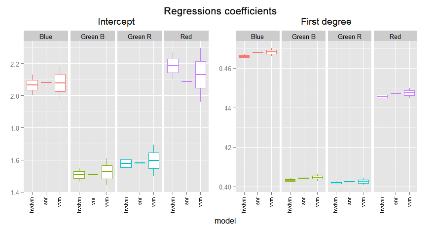
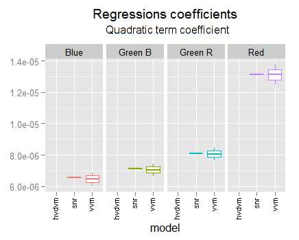
In the following graph we can compare the coefficients found in the different fittings we have made. We are using their confidence limits found with each analysis.
This regression is always in strong agreement with the vvm one. It is not only inside their confidence intervals but inside the two middle quartiles. This is more notorious when the vvm and the hvdvm have greater discrepancy, like in the red channel interception or the first degree blue coefficient. Notice the optim.snr is often a little below the vvm coefficient.
This makes us revalue for better the vvm regression, in particular in discrepancy cases with the hvdvm one. Which means the hvdvm has not better accuracy than vvm and consequently is useless.
The quadratic coefficients are again in strong agreement with the vvm ones.
Modeling with 'Smooth Splines'
Using the imgnoiser package is very easy to test new ideas. For example, the model fitting and its plotting is so easy that invites to experiment with other models. Lets give a chance to the smooth splines.
In the smooth.spline function, we can use as tunning parameters df "the desired equivalent number of degrees of freedom" and spar the "smoothing parameter". However, if none of them is supplied, the splines will be tunned —by default— using a leave-one-out generalized cross-validation. We will let the splines to find this way the best fit to our hvdvm data and then we will plot the resulting curve.
# We just need three lines of code!
hhvm.all$fit.model(model.name = 'sp', model.family = 'smooth.spline')
hvm.all$plot('sp', obs= TRUE, xlim=c(0,50), ylim=c(0,30))
hvm.all$plot('sp')
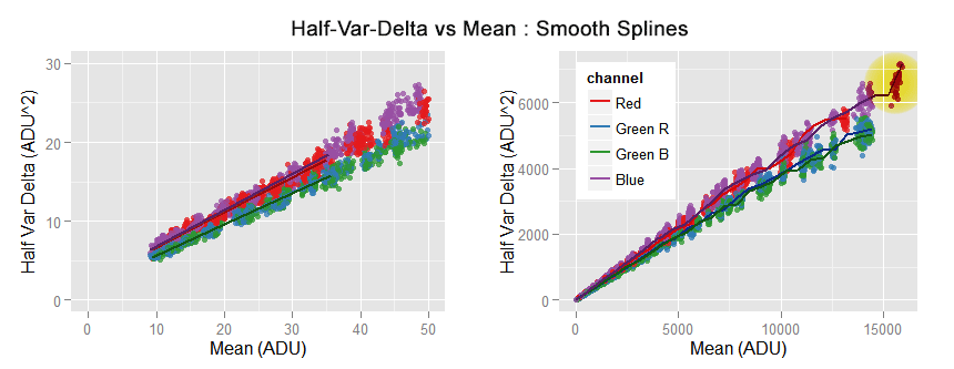
We can see the smooth.spline perfectly passing over the data close to the origin. However, we can also see it is chasing local features in the data, like in the top right area flagged with a yellow circle.
As the piece of spline close to the axes origin is linear, its extrapolation to zero is also linear.
pred <- hvm.all$get.model.predictions('sp', x=seq(0,50,10))
qplot(x = mean, y = var, data = pred, geom = 'line', colour=channel)
# Interception with mean = 0
hvm.all$get.model.predictions('sp', x=0)
#>    mean    var channel
#> 1:    0 2.2555     Red
#> 2:    0 1.6248 Green R
#> 3:    0 1.6899 Green B
#> 4:    0 2.1800    Blue
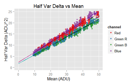
The piece of the spline close to the axes origin is linear, in consequence its extrapolation is also linear. The interception with mean = 0 brings similar values to those found in the previous section. However, the plot doesn't reflect that very well.
The interception with the axis mean = 0 (shown in the code excerpt above) brings very similar values to those we found in the previous section. All of them are just slightly greater. As this piece of regression is based on local values, one may think they are more accurate than those we found for the whole data in the previous section.
One nice thing about splines, is that we can get not only prediction values but also of their derivatives. If we think the hvdvm data can be modeled by a quadratic curve, its first derivative evaluated for mean = 0 would bring the coefficient for the linear part:
\begin{align} var &= \beta_2 \cdot mean^2 + \beta_1 \cdot mean + \beta_0 \\ var' &= 2 \cdot \beta_2 \cdot mean + \beta_1 \\ mean &= 0 \Rightarrow var' = \beta_1 \end{align}
Where $(var')$ denotes the first derivative of half-var-delta with respect to mean.
hvm.all$get.model.predictions('sp', x=0, deriv=1)
#>    mean    var channel
#> 1:    0 0.4442     Red
#> 2:    0 0.4015 Green R
#> 3:    0 0.3949 Green B
#> 4:    0 0.4601    Blue
Considering the linear coefficients we got in the previous section (equations \eqref{eq:vvm-red} to \eqref{eq:vvm-blue}) are accurate for the first two or three digits (check the log10 of twice the standard error) the coefficients, found above through the spline regression, are virtually the same!.
We can pass a linear regression over the values fitted by the spline model. As we know the data is heteroscedastic, we will use —as usual— weights to handle that issue.
sp.models <- hvm.all$get.model('sp')
lm.models <- lapply(sp.models, function(sp) lmrob(sp$y ~ sp$x + I(sp$x^2), weights=1/sp$x^2))
options(show.signif.stars = FALSE)
lapply(lm.models, summary)
#> $Red
#>               Estimate Std. Error t value Pr(>|t|)
#> (Intercept)  2.249e+00  5.784e-03  388.83   <2e-16
#> sp$x         4.433e-01  3.337e-04 1328.66   <2e-16
#> I(sp$x^2)   -1.311e-06  8.646e-08  -15.16   <2e-16
#> Multiple R-squared:  0.9997, Adjusted R-squared:  0.9997
For the sake of brevity, the summaries shown above are an excerpt of the real ones.
The linear part of the regressions above are qualitatively the same we found in the previous section (equations \eqref{eq:vvm-red} to \eqref{eq:vvm-blue}). This gives us more confidence we have not made some mistake computing them.
The Nikon D7000 @ ISO 100 Noise Profile
So far we have four models for the noise variance: one for each camera raw channel. The best equations we have, with tested accuracy, are from those coefficients of the optim.snr model we fit before.
\begin{align} var_r & = 2.09 + 0.4471 \cdot mean_r + 1.313 \times 10^{-05} \cdot mean_r^2 \label{eq:vvm-red} \\ var_{gr} & = 1.58 + 0.4023 \cdot mean_{gr} + 8.105 \times 10^{-06} \cdot mean_{gr}^2 \label{eq:vvm-green-r} \\ var_{gb} & = 1.50 + 0.4042 \cdot mean_{gb} + 7.135 \times 10^{-06} \cdot mean_{gb}^2 \label{eq:vvm-green-b} \\ var_b & = 2.08 + 0.4679 \cdot mean_b + 6.536 \times 10^{-06} \cdot mean_b^2 \label{eq:vvm-blue} \end{align}
The subscripts in the equations above stands for the ($(r)$:red, $(gr)$:green-red-row, $(gb)$:green-blue-row, $(b)$:blue) raw channels. However, it would be nice and useful to "merge" those four models into a single "representative" one. In this section we will do that.
I don't know if there is a standard prescribing how to do this. Here we will summarize the four regressions using a weighting sum of their coefficients, where each weight is proportional to the channel relative luminosity in the sRGB space.
The relative luminosity of the primaries of a RGB color space is given by their Y coordinate when them are expressed in the CIE XYZ space. That works, because in that space, the Y color coordinate was conveniently built to carry the color relative luminosity.
The Y coordinate of the sRGB primary colors are (0.2126, 0.7152, 0.0722). However, we can not directly use them to weight our models because they are in its own camera raw space, and these coefficients are in the sRGB world. However, we can handle those primaries luminosities as sRGB color coordinates and convert them to the camera raw space.
Assuming a D65 white point, those weights in the raw space become (0.1697, 0.6206, 0.2096). We will use the green weight for each of both green channels, so after normalizing their sum to 1 the weights are (0.1047, 0.3830, 0.3830, 0.1294).
We will average the square root of the channels quadratic coefficients and then will square the result of that, averaging in the linear space. This way we get for this camera:
\begin{equation} \label{eq:cond-iso100-var-mean-optim} iso100Var = 1.67 + 0.4162 \cdot mean + 7.972 \times 10^{-06} \cdot mean^2 \end{equation}
If we do the same merging with the vvm regressions, we get:
\begin{equation} \label{eq:cond-iso100-var-mean-vvm} iso100VvmVar = 1.69 + 0.4166 \cdot mean + 7.902 \times 10^{-06} \cdot mean^2 \end{equation}
Notice when averaging the vvm regressions we get virtually the same equation! The first degree term —the main noise component— in both equations differ just in the fourth decimal position, as expected considering its standard error. This difference alone is just a 0.1% with respect to our best \eqref{eq:cond-iso100-var-mean-optim} model. Later we will see the SNR plot from both models overlaps to each other.
The raw scale —at ISO 100 for our camera— is [0, 15779] ADU (the green channels clips highlight signals from this point). Then, the 18% gray in our camera raw scale is 18% * 15,779 = 2,840 ADU. If we compute the SNR in dB for this signal, we get 38.1 dB: the same amount reported by DxOMark! (check the Full SNR logarithmic curve).
In the DxOMark website, in the tab for Full SNR, if we hover the mouse over the ISO 100 SNR curve, a tool-tip with data about some points will pop-up, and we will be able to collect the coordinates from some points on that curve. Doing that, and plotting them together with the SNR from the \eqref{eq:cond-iso100-var-mean-optim} and \eqref{eq:cond-iso100-var-mean-vvm} equations above, we get:
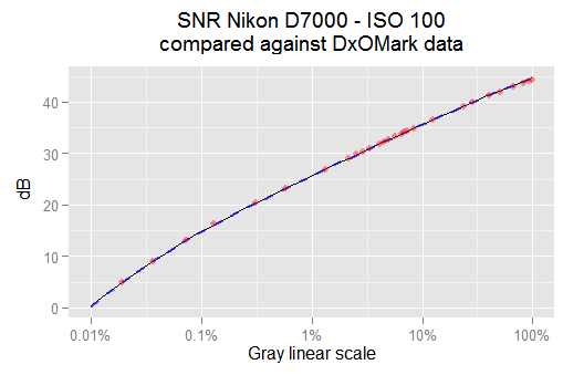
The thin black line is the SNR from the snr.optim model. The red points are some SNR values reported from DxOMark for this camera and ISO speed. The thick dashed blue curve is the SNR from the vvm model. All of them match each other pretty well.
In the plot above, the dashed blue line is from the \eqref{eq:cond-iso100-var-mean-vvm} vvm model. We can see it matches perfectly with our best model \eqref{eq:cond-iso100-var-mean-optim} snr.optim. A more detailed analysis shows the SNR difference between them is 0.06% in the worst case and below 0.01% in the average. It seems we can just use the vvm regressions without look further. Notice our SNR models also match very well the DxOMark data plotted as red dots.
The R code required to get the weights and to plot the SNR graph above is shown below.
Sensor characteristics
In the article about "Use of Linear Regressions to Model Camera Sensor Noise" we learn how to get the camera sensor characteristics from the noise variance versus mean pixel value regression:
\begin{align} \label{eq:sensor-charac} RN &= \sqrt{u_o} \\ EM &= u_1 - u_2 \\ PRNU &= \sqrt{(u_1 - u_2) \cdot u_2} \end{align}
Where $(u_0, u_1, u_2)$ are the correlation coefficients we found in \eqref{eq:cond-iso100-var-mean-optim}. So, we have $(u_0 = 1.67)$, $(u_1 = 0.4162)$ and $(u_2 = 7.972 \times 10^{-06})$.
Replacing these values in the above equations, we get: Read Noise (standard deviation σ) 1.29 ADU, EM (electron to ADU conversion factor) 0.4162 $(ADU/e^-)$ and PRNU Photo Response non Uniformity (standard deviation σ of EM) 0.0018215 $(ADU/e^-)$, which expressed relative to EM is 0.0018215/0.4162 = 0.44%.
Noise Covariance Analysis
"Covariance is a measure of how much two random variables change together" (quote from wikipedia). In the imgnoiser package the covariance for each pair of raw channels is computed by the digest() functions. This way, from the 4 raw channels we get six pairs of covariances. For example, the covariance between the Green red with the Blue raw channel.
When we plot a channel variance ('y' axis), we do it against its mean value ('x' axis). If we would like to resemble that for the covariance, it seems we should plot it against the mean of each of the two channels whose covariance is shown in the plot. But that would be a 3D plot, which is harder to built and read, so we will avoid them.
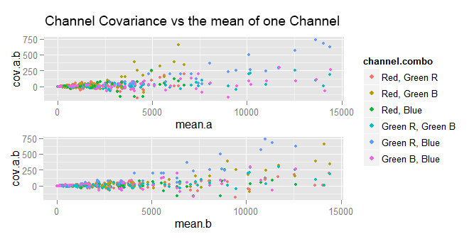
We can try plotting the covariance against the mean of either of the channels whose covariance is computed.
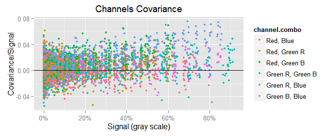
In the plots above, a is the first channel in the "channel combo" and b is the other. As we can see, the data points are very clumped at the left end and very spread at the right one. If we try again, but this time plotting the covariance versus the var of either channel, the plots are not very different to those above.
To make a long story short, the best way to plot the channels covariance $({\small cov(x,y)})$ is showing it in the y axis and in the x one the geometrical mean of the mean of the channels whose covariance is plot: $({\small cov(c,d) \sim \sqrt{mean(c) \cdot mean(d)}})$.
This makes more sense if we consider we use to plot $({\small var(c) \sim mean(c)})$, where $(c)$ is a raw channel. On the other hand, the variance $({\small var(x)})$ is a particular case of the covariance, where $({\small var(c) == cov(c, c)})$. So, the first relationship can be expressed as $({\small cov(c,c) \sim mean(c)})$, and then $({\small cov(c,c) \sim \sqrt{mean(c) \cdot mean(c)}})$. Finally, generalizing to any pair of channels we can say $({\small cov(c,d) \sim \sqrt{mean(c) \cdot mean(d)}})$.
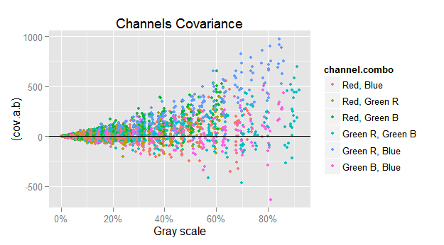
If we just plot $({\small cov(c,d)})$ versus $({\small \sqrt{mean(c) \cdot mean(d)}})$, we get the funnel shape showing the harsh heteroscedasticity in that relationship.
To counterbalance the heteroscedasticity, we will plot in the y axis the ratio between $({\small cov(c,d)})$ and $({\small \sqrt{mean(c) \cdot mean(d)}})$, and in the same sense we will also use $({\small 1 / \sqrt{mean(c) \cdot mean(d)}})$ as weight when computing the covariance regressions.
ggplot(subset(vvm.all$merged.var.cov.df, chan.b != 'Green Avg'),
       aes(group = channel.combo, colour = channel.combo)) +
  geom_point(aes(x = (sqrt(mean.a*mean.b)/157.79), y = (cov.a.b)/sqrt(mean.a*mean.b)), size = 1.25) +
  scale_x_continuous(breaks = seq(0, 100, 20), labels=c('0%', '20%', '40%', '60%', '80%', '100%')) +
  xlab('Signal (gray scale)') +
  ylab('Covariance/Signal') +
  geom_hline(yintercept = 0) +
  labs(title='Channels Covariance')
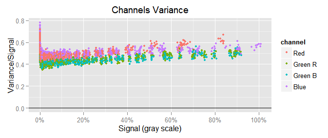
To notice the scale of the covariance with respect to the variance, we will plot $({\small var(c) \sim mean(c)})$ in similar way as we just did with the covariance, that would be $({\small var(c)/mean(c)})$ in the y axis versus $({\small mean(c)})$ in the x one:
We can see the channel variances are a lot bigger than the covariances, like 0.5/0.02 = 25 times greater!
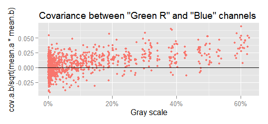
Checking the covariances, we can see that below a signal level of approximately 10% gray, the covariances vary randomly around zero, but at higher levels there is a growing linear pattern. This is more apparent if we realize that at higher signal levels less data points are below the x axis. For example, lets check the most notorious case, the covariance between Green R and Blue.
If we fit a linear model through the data in the above plot, we get:
cov.grb.lm <- lm(cov.a.b ~ I(sqrt(mean.a*mean.b)), weights = 1/sqrt(mean.a*mean.b),
             data=subset(vvm.all$merged.var.cov.df, chan.a == 'Green R' & chan.b == 'Blue' ))
summary(cov.grb.lm)
#> Coefficients:
#>                            Estimate Std. Error t value Pr(>|t|)
#> (Intercept)              -1.7885477  0.2685673   -6.66 4.37e-11 ***
#> I(sqrt(mean.a * mean.b))  0.0298109  0.0006162   48.38  < 2e-16 ***
#>
#> Residual standard error: 0.9224 on 1075 degrees of freedom
#> Multiple R-squared:  0.6852, Adjusted R-squared:  0.6849
#> F-statistic:  2340 on 1 and 1075 DF,  p-value: < 2.2e-16
In this regression, the R² (0.6852) is not too bad at all, and besides that, the coefficient p-value (<2e-16) cannot have greater significance. There is definitively a relationship $({\small cov(c,d) \sim \sqrt{mean(c) \cdot mean(d)}})$.
Covariance Regressions
This correlation we have found between the covariance and the signal (geometrical mean channel values), makes sense if we take into account that despite our best effort, the samples are not 100.00% uniformly lit, and when one part of the sample receives less or more light, all the photosites in that part will have lesser or greater values. In consequence, their value will vary together in the same direction, bringing a positive covariance.
We will compute all the covariance regressions as we did it above. To keep only one of the two raw green channels, we will discard the regression with the lower t-value (the less significant relationship):
\begin{align} \notag cov(red,blue) & = 0.0021552 \cdot \sqrt{mean(red) \cdot mean(blue)} \\ \notag cov(red,greenb) & = 0.0198153 \cdot \sqrt{mean(red) \cdot mean(greenb)} \\ \label{eq:raw-cov-sqrt} cov(greenr,blue) & = 0.0298109 \cdot \sqrt{mean(greenr) \cdot mean(blue)} \\ \end{align}
In camera raw space, the color components of neutral colors, does not have equal values as it happens in RGB color spaces. They are in completely different scales. The exact relationship between them depends on the illuminant color. For our camera (normalized to have 1 as the greatest value) under CIE D50 ("horizon" light) they are (R:0.474, G:1, B:0.667), and in our shots for this article they are (R:0.4476, G:1, B:0.7920).
Using the (R:0.4476, G:1, B:0.7920) relationship we will simplify our covariance regressions expressing them as proportions of the $(mean(green))$ value.
For example $({\small \sqrt{mean(red) \cdot mean(blue)}})$ is equal to $({\small \sqrt{mean(0.4476 \cdot green) \cdot mean(0.7920 \cdot green)}})$ which gives us $({\small 0.5954 \cdot mean(green)})$. This way $({\small cov(red,blue) = 0.0021552 \cdot 0.5954 \cdot mean(green)})$ which results in $({\small cov(red, blue) = 0.0012833 \cdot mean(green)})$. Applying this to all the \eqref{eq:raw-cov-sqrt} equations, we get:
\begin{align} \notag cov(red, blue) & = 0.0012833 \cdot mean(green) \\ \notag cov(red, green) & = 0.0132576 \cdot mean(green) \\ \label{eq:raw-cov} cov(green, blue) & = 0.0265306 \cdot mean(green) \\ \end{align}
These coefficients, even when they are significant from a model fitting point of view, are very small when compared to the variance, whose linear average coefficient is 0.4162 (check the \eqref{eq:cond-iso100-var-mean-optim} equation). The greatest covariance (green, blue) is only the 0.02653/0.4231 = 6.3% of the mean variances!.
On the other hand, they exist mainly because we can not uniformly lit sensor as we wish. The lack of an adequate technical environment to uniformly illuminate the sensor without lens is the cause of this. In a better environment these covariances should be random values around zero like it happens from the 10% gray to below.
We are keeping these values just in case, in future analysis, they become significant to the measures we get.
