The post "A Simple DSLR Camera Sensor Noise Model" develops some formulas modeling the image raw pixel value and its noise from camera sensor data. However, those formulas are expressed as functions of lambda "λ", which is the Expected Value of the electron count in the sensor photosites. That makes seem those equations belong only to the theoretical realm, to describe an abstract camera sensor, but they are not usable to model the noise in a particular camera sensor.
This article fills that gap showing a practical use use, for those formulas in Simple DSLR Camera Sensor Noise Model, to describe a particular camera sensor noise behavior.
We will show how to build a sensor noise profile, for any camera, from the Variance and Average pixel values in raw photos taken with that camera.
Summary of Formulas Modeling the Sensor Noise
The post "A Simple DSLR Camera Sensor Noise Model" develops some model equations for the image raw pixel value, its Average and Variance. Here we will summarize the main ones we will use for the camera noise profiling.
The Raw Image Pixel Value
The pixel value in a raw image file can be described as:
Where $(EM)$ is the average ratio used by the sensor to convert the electron count in each photosite to pixel value units ($(ADU)$). The $({\bf MD}_p)$ term represents photosite sensitivity deviations around $(EM)$, and the sum of these both terms is the photosite ratio for the conversion of the electron count in the photosite to ADU units. The count of electrons in the photosite is represented by $(EL)$.
Both, the $(EM)$ and the $({\bf MD}_p)$ term, are given in $(ADU/e^-)$" units, while $(\bf EL)$ is in $(e^-)$" (electron) units. This way the product result is in $(ADUs)$.
The term $(RNS)$ is the Read Noise "fake signal" bias (noise) added by the sensor circuitry to the "real signal", and is given in $(ADU)$ units. The term $(\mu_{RNS})$ —also given in $(ADUs)$— is the average value of that Read Noise bias $(\mu_{RNS} == Eva(\bf RNS))$, which is subtracted from the photosite reading to remove it.
The following equation describes the Expected Value of the sensor photosite reading from a photograph area, corresponding to a uniformly lit surface causing the same flux of electrons on each photosite. Here we are assuming there is not light fall off caused —for example— by lens vignetting. The same context will apply to the Variance formula we will show below.
We will estimate this Expected Value through the arithmetic mean of the raw image pixel values.
In the above equation, $(\lambda)$ represents the Expected Value of the electron count in the photosites.
The Raw Image Pixel Value Variance
The following formula models the Variance of the sensor photosites readings —again— from a photograph area corresponding to a uniformly lit surface. As the count of electrons in each photosite follows a Poisson distribution, their variance and their Expected Value have the same $(\lambda)$ value.
We need the spatial (photograph area) Variance to measure the noise. The noise is measured by the Variance square root: the Standard Deviation statistic of the raw image pixel values.
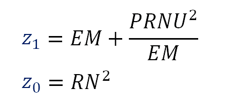
In the equation above, the term $(PRNU^2)$ is the variance of the sensor photosites sensitivities, this is the Variance of the $({\bf MD}_p)$ term in the formula S1. Do not confuse it with the image PRNU noise this will cause. The $(RN^2)$ term represents the Read Noise variance ($(Var({\bf RNS}) == RN^2)$), which is also the square of the Read Noise measurement.
The Variance of the Difference of two Identical Images
We can measure the sensor noise, with the PRNU noise component removed, by using the following equation.
This equation models the Variance of the difference of two identical images: Two identical photographs of the same scene, with identical camera settings and illumination: like two consecutive images of a still target in a shooting burst.
If we take two identical photographs to the same uniformly lit surface, and we subtract each pixel value in one image from the corresponding pixel —the one with the same position in the sensor— in the other, the half of the pixel values Variance in the resulting image will be equal to the right side of the equation above, which is also, the linear part of the equation in the formula 3.
Use of Linear Regressions to get Sensor Noise Characteristics
For the sake of simplicity, when describing the values and variables we will use in the regressions, we will assign simple names to some terms in our previous equations.
HalfVarDelta versus Mean
We will refer to the left side of the equation in formula 4 as "HalfVarDelta" (for the Half of the Variance of two images Delta). In the same sense, we will refer to the left side of the equation in formula 2 simply as the "Mean". After this change, we have:
We can see the Mean and HalfVarDelta are linear with respect to $(\lambda)$. This means that Mean and HalfVarDelta have a linear relationship between them. In other words, if we plot HalfVarDelta versus Mean we should get a line. Lets suppose the equation describing that line is:
Using these equations we can say:
In other words, if we make a linear regression between HalfVarDelta and Mean, we can relate the coefficients of that regression with "RN", "PRNU" and "EM".
Var versus Mean
Now, we will repeat the name simplification we just did, but this time with Var(ADU) vs Mean.
We will call "VarAdu" to the left side of the equation in the formula 3. This equation together with the second one in the formula 2 is shown below.
The equations above tells us that if we make a regression of Var as function of Mean we will get a quadratic curve, where the linear part of that curve equation should be identical to HalfVarDelta in formula 5.
Sample Data versus Population Equations
We must realize, the above equations are describing statistics considering the whole population of data. The sample data from raw images are just random variables whose expected value and variance are described by the above equations.
For example, if we compute the average from the reading of 1,000 photosites, that average is a random variable and the Expected Value of that variable is what Mean in the formula 8 represents. In the same sense, the Variance we will measure from our 1,000 photosites sample is also a random variable, and its Expected Value is what Var in the formula 8 represents.
If we repeatedly take photos in identical conditions and plot the pairs of Var and Mean measurements on the same graph, we will get a cloud of points, whose centroid will approximate, with eventually increased precision (asymptotically), to the point where the "real" curve of Var vs Mean passes.
In other words, do not expect from our Mean and Var samples to fit perfectly in the above equations, they are just estimators &mash;random variables&mash; of those statistics.
The Plan
Lets suppose we make a regression with the noise variance Var as response variable and with the Mean pixel value and Mean² as predictors. We will get an equation with the following form:
Using these equations (formula 33) we can say:
\begin{align*} \color{blue}{u_2} &= \dfrac{PRNU^2}{EM^2} \cr \vphantom{-} \cr \color{blue}{u_1} &= EM + \dfrac{PRNU^2}{EM} \cr \vphantom{-} \cr \color{blue}{u_0} &= RN^2 \cr \end{align*}
Formula 10. Correlation coefficients as function of the sensor characteristics.
Notice the blue variables (at the left side of these equations) are the coefficients from the regression, they are known values. At the right side of these equations we have the three sensor noise characteristics. Here we have three equations and three unknowns, so we can solve these equations to get the value of those characteristics.
\begin{align*} RN &= \sqrt{\color{blue}{u_0}} \cr \vphantom{-} \cr PRNU &= \dfrac{\color{blue}{u_1} \cdot \sqrt{\color{blue}{u_2}} }{(1 + \color{blue}{u_2})} \cr \vphantom{-} \cr EM &= \frac{PRNU}{\sqrt{\color{blue}{u_2}}} \cr \end{align*}
Formula 11. Sensor characteristics from the regression of VarAdu vs Mean.
Now we have a plan. We will build regressions to get those $(u_2, u_1, u_0)$ values and plug them in the above equations to get the camera sensor noise characteristics.
We will use the HalfVarDelta regression to assess information in the lower end of the Mean values, in particular the interception of the Variance curve versus Mean, this is the RN² the Read Noise Variance.
The Photon Transfer Curve
The plot of the sensor noise (the square root of the Variance) in the vertical axis, against the signal —or the Mean as we call that variable here— in the horizontal axis, is called the "Photon Transfer Curve" (PTC). We will be able to plot that curve later, as another result of the regressions we will do.
Furthermore, having the value of $(EM)$, we will be able to convert any value from ADU units to electrons "e-", so we will also have the "Photon Transfer Curve" (PTC) expressed in electrons. The PTC in electrons is useful to compare the performance of sensors with independence of their ADU encoding range. For example, a comparison of the PTC of a sensor with 12-bit raw images against another with 14-bit raw images can be made when both PTCs are expressed in electrons.
Preparing the Data
To get the data we will use to analyze the sensor noise characteristics, we will photograph a flat smooth surface with a plain color and under a uniform lighting. If you can control the light intensity over the surface and you have a light meter, you should manage to get a very uniformly lit surface.
To get better evenly illuminated images, it is highly recommended the use your lens and aperture with least vignetting. However, for a statistical analysis, a sample containing around 1,000 observations is a good one and this corresponds just to a tiny area of 32 by 32 pixels. In other words, if at least we have that area the most possible uniformly lit, we are fine.
I have used a slightly gray cardboard and I shot it outdoors in a very overcast morning. The camera was mounted on a tripod and set slightly out of focus, with the intention to avoid the capture of any possible surface structure. The surface, or the lighting direction, must be set in an angle avoiding to get in the camera direct reflections of the light bouncing on the surface. Also the camera was triggered with a remote shutter release to reduce the chance of moving it during the shooting. The surface must cover the whole frame, this will cause image histograms containing nothing but just one spike.
The shots will be taken at different exposure times, trying to get expositions covering the whole raw image range. For example, you can start four stops above the exposition recommended by your camera metering system and took the shots diminishing gradually the exposition time by one notch steps. Usually one exposition time notch corresponds to one third of stop.
Find the Best Uniformly lit Area
To find the area best uniformly lit in the pictures, we will pick the image with the "right" exposition (the one with the histogram spike centered in the horizontal scale). We will split the image in its four channels and save them into files (for example using the command spli_cfa in Iris software). If the image contains the Optical Black pixels crop it to exclude them.
Now, we can open one of those image channels, for example the green one, with ImageJ software and use the Variance filter (menu command "Process » Filters » Variance") with the Radius parameter set in 32 pixels. This will compute the variance of the 32 pixels around each image pixel. With the help of the menu command "Image » Adjust » Brightness/Contrast" we can find the darkest area. This means with the smaller Variance. In other words, the best uniformly lit. If you have more than one candidate dark area, reload the channel (without the Variance filter applied) and measure the Standard Deviation of the candidate areas, then choose the one with the smaller value.
Discard Channels With Clipped Pixel Values
Now we should check the images with their histogram close to a horizontal axis end, and discard the ones where our area of interest contains clipped pixel values. For example, you can check this using Rawdigger, selecting approximately the area of interest and validating the histograms are not clipped. If just one channel is clipped take a note so you wont use that channel for that particular picture in the analysis.
Take More than One Shot for Each Exposition Time
To compute HalfVarDelta values, we will need at least two shots for each Exposition Time. Even if you are not planning to compute those values, it is recommended to take more than one shot per Exposition Time. This is because when plotting the data it is possible to find some points are outliers with respect to pattern described by all the other points. Small samples are more vulnerable to outliers. Having more than one observation for each exposition time will add accuracy to the curves we will fit through them.
Extract the data from the images
We will use Iris software to extract the data from the raw image files. First we will use the menu command "Digital Photo » Decode Raw Files..." with the options "->CFA..." and "Zone" set to crop our area of interest in the raw image files. Later we will process those crops using the following Iris commands:
- load: Load one crop or one crop channel (see split_cfa)
- split_cfa: Split and save to disk the four Bayer channels from a crop
- stat: Get the Mean and Standard Deviation (sigma) of the channel image
- sub: Subtract two crops
- mosa: Get the average of two crops (use type=4)
When subtracting two crops will add some constant value to the difference just to avoid negative pixel values in the result. The adding of this constant will not change the Standard Deviation of the resulting image (by virtue of this Variance property).
Collect the data in a Spreadsheet
It is useful to collect and organize in a spreadsheet the data extracted with Iris. In particular I use MS Excel for the following reasons:
I can use some Excel macros I have prepared to copy/paste the information, extracted from all the channels in few crops, from Iris to the proper location in a table in Excel.
I can run R-Language commands from Excel itself by using the RExcel add-in. I can for example compute the linear regression and plots available in R with the data in Excel without needing to export that data to other tool.
Example: Modeling the Nikon D7000 Sensor Noise - ISO 100
In this example, we will study the Nikon D7000 camera, with shots taken with ISO 100. We will study the green channel in the blue row of the sensor.
Building the Regression for HalfVarDelta vs Mean
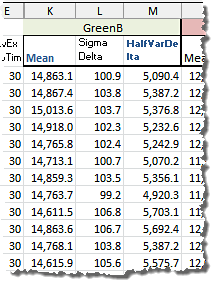
We took six shots for each exposition setting (e.g. aperture and exposition time). This gave us 15 ways to combine two of them regardless of their order. Using Iris we calculated the statistics "Mean" and "Sigma" (σ: Standard Deviation), from a sample of 32x32 pixels in each channel of both, the average and the difference image of each couple.
The relevant data looks this way:
In the picture above "Mean" is the (arithmetic) mean of the raw pixel values in the sample channel from a pair of identical shots and "Sigma Delta" is the Sigma (Standard Deviation) of the pixel values in the sample channel from the difference-image of the same pair of shots. The value "HalfVarDelta" is calculated as the half of the squared "Sigma Delta". You can download this data using this link (44 KB).
The summary of our findings while fitting the model is shown below. You can read about the whole procedure, the proceedings details, and model quality statistics following this link.
The following Tableau visualization tells the summarized story about the model fitting for the HalfVarDelta versus Mean model:
In the slide (1) of the viz above, the observations are pairs of HalfVarDelta and Mean values from the green (red row) channel, they are shown as green dots. The line represents a simple OLS (ordinary least squares) regression fitting the data.
An accurate regression line, is not easy to obtain right from this data. As can be seen in the slide (1) above, the observations are more spread for higher values of Mean. This non constant variance in those data points is called heteroscedasticity and unfortunately means that a simple OLS (Ordinary Least Squares) regression is not adequate to model the relationship between HalfVarData and Mean: the regression coefficients wont be correctly estimated. As an example of that, in the slide (2) we can see how the simple OLS regression misses the data trend close to the axes origin.
To get an accurate linear regression, some analysis, data transformation or the use of a Weighted Least Squared (WLS) regression is required. The slide (3) shows that kind of model fitting: notice how the data trend close to the axes origin is not missed by the model. Unfortunately, the observations with greatest Mean (those above 5,000 ADUs) does not seem to follow the pattern of the other points: in the slide (4) we can see most of the observations with Mean above 5,000 ADUs are below the model line.
The slide (5) shows how the addition of a Mean quadratic term to the model fixes the problem of most observations falling below the regression line at the higher end of the Mean variable.
At the end (slide 6) we got the same regression for both green channels (quantitatively speaking) but with the blue and red channel regressions showing their greater values. However, this is completely explained by the digital amplification of those channels, found in their histograms, by a factor of 9/8 for the red channel and 7/6 for blue one. Discounting this amplifications, all the regressions are very similar to each other.
The following table summarizes the regressions we found:
| Channel | Intercept | Slope |
|---|---|---|
| Red | 1.87 | 0.4537 |
| Green R | 1.34 | 0.4026 |
| Green B | 1.31 | 0.4043 |
| Blue | 1.73 | 0.4723 |
Building the Regression for Var vs Mean
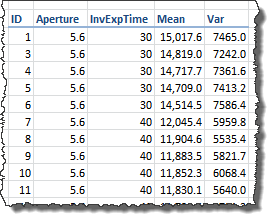
We have six shots for each camera setting (e.g. aperture and exposition time). Using Iris we calculated the statistics "Mean" and "Sigma" (σ, Standard Deviation) from a sample of 32 x 32 pixels in each channel and shot.
In the picture above "Mean" is the (arithmetic) mean of the of the pixel values in the sample channel, "Sigma" is the Standard Deviation of the same sample pixel values (this column is not included in the image). The value "Var" is the "Sigma" squared. You can download this data using this link (21 KB).
In the same way as when "Building the Regression for HalfVarDelta vs Mean", this data is heteroscedastic. We applied the same analysis and techniques we learned fitting HalfVarDelta to get the best possible fit. You can read the detailed analysis and the resulting models details, following this link.
The following table summarizes the four channels model coefficients:
| Channel | Intercept | Mean | Mean² |
|---|---|---|---|
| Red | 1.98 | 0.4527 | 1.121e-05 |
| Green R | 1.11 | 0.4061 | 6.770e-06 |
| Green B | 1.17 | 0.4078 | 6.853e-06 |
| Blue | 1.71 | 0.4733 | 6.585e-06 |
In the following Tableau visualization we can see each fitted regression per channel.
Comparison of Noise Models Linear parts
According to the theoretical formulas in the section "Summary of Formulas Modeling the Sensor Noise", the coefficients for the linear part of Var vs Mean should be equal to those in the regression of HalfVarDelta vs Mean. In this section we will see how much that is true.
We will do this analysis just as an exercise. We say that, because the data behind each channel have a very different domains.
As the target was white, and for that color the blue and red channels have a light sensitivity 1.5 and 2.1 times smaller than the green one, the green channels data contain observations for the whole possible spectrum of the Mean variable, but the blue and red only 1/1.5 and 1/2.1 respectively. This makes unfair, at least conceptually, to compare regressions built on such a different domain of values.
In the regressions analysis, in the article Handling Heteroscedastic Data from Camera Sensor Noise we found the Blue and Red channels are digitally amplified, and if we reverse those amplifications, the different channel regressions are more amenable to be compared between them. We did that to the expected coefficients and to their lower and upper confidence limits (2.5, 97.5) and got the values shown below, which you can get through this link (3 KB).
> head(reg.coeffs.df)
| method | channel | coefficient | variable | value | |
|---|---|---|---|---|---|
| 1 | HVDVM | Blue | Intercept | mean | 1.48 |
| 2 | VVM | Blue | Intercept | mean | 1.47 |
| 3 | HVDVM | Blue | Intercept | llim | 1.19 |
| 4 | VVM | Blue | Intercept | llim | 1.06 |
| 5 | HVDVM | Blue | Intercept | ulim | 1.78 |
| 6 | VVM | Blue | Intercept | ulim | 1.87 |
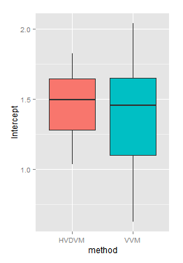
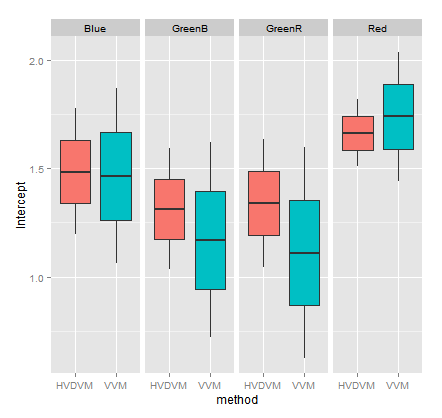
If using those "deflated coefficient values" we compare the interception values found in all channels through the "HalfVarDelta versus Mean" (HVDVM) against those from the "Var versus Mean" (VVM) method, we get:
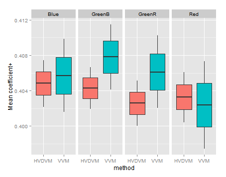
If we make that comparison by method and channel, we get:
Notice how, in general terms, the intercept confidence intervals in the HVDVM method (red boxes) are almost always inside the confidence limits in the VVM method (turquoise boxes). The HVDVM limits are a subset of the VVM ones.
In the heteroscedasticity correction we found the transformation or the use of 1/mean² as weight in a weighted regression, give us a normally distributed error. Which in turn means the linear coefficients of the resulting regression are normally distributed. That allows the use of the t-test.
We will run a paired t-test to find out if both samples of interception values, found for each channel by each method, have a significant difference. In this test the null hypothesis is "There is no difference between the treatments". As alternative hypothesis we will ask in the test if the HVDVM method brings smaller intercept values. Also, as we know the variance is different in each set we will run the test using var.equal=FALSE.
# Get the channel intercept values from HVDVM
> int.hvdvm <- arrange(subset(reg.coeffs.df,
    coefficient=='Intercept' & method=='HVDVM'), channel, variable)
# Get the channel intercept values from VVM
> int.vvm <- arrange(subset(reg.coeffs.df,
     coefficient=='Intercept' & method=='VVM'), channel, variable)
# t-test for the Intercept coefficient comparing both methods
> t.test(int.hvdvm$value, int.vvm$value, alternative='less', paired=TRUE, var.equal=FALSE)

    Paired t-test

data:  int.hvdvm$value and int.vvm$value
t = 1.5105, df = 11, p-value = 0.9205
alternative hypothesis: true difference in means is less than 0
95 percent confidence interval:
      -Inf 0.1723397
sample estimates:
mean of the differences
             0.07873271
The p-value tell us, very strongly, we can not reject the null hypothesis. The interception given by both methods are, statistically speaking, the same.
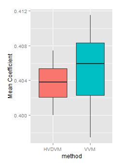
If we look now to the Mean variable coefficient, we will found again the ones found with the HVDVM method are a subset of those found with VVM.
In the detail by channel three of four channels have a HVDVM coefficient smaller than the corresponding VVM one. However this is found looking very closely, because in both methods they are in a very narrow range.
Lets run the t-test again to see what we found:
# Get the 'mean' variable coefficient values from HVDVM
> coeff.mean.hvdvm <- arrange(subset(reg.coeffs.df,
      coefficient=='Mean' & method=='HVDVM'), channel, variable)

# Get the 'mean' variable coefficient values from HVDVM
> coeff.mean.vvm <- arrange(subset(reg.coeffs.df,
      coefficient=='Mean' & method=='VVM'), channel, variable)

# Test both sets
> t.test(coeff.mean.hvdvm$value, coeff.mean.vvm$value, alternative='less',
    paired=TRUE, var.equal=FALSE)

    Paired t-test

data:  coeff.mean.hvdvm$value and coeff.mean.vvm$value
t = -2.5561, df = 11, p-value = 0.01335
alternative hypothesis: true difference in means is less than 0
95 percent confidence interval:
          -Inf -0.0005272639
sample estimates:
mean of the differences
           -0.001772874
This time we can not reject the null hypothesis! There is only a probability of 1.34% that the HVDVM values are smaller than the VVM by chance alone. Which —of course— is hard to believe. It seems the HVDVM method brings smaller mean variable coefficients. However, that difference is very small, just a 5%:
> (median(coeff.mean.vvm$value) - median(coeff.mean.hvdvm$value))/median(c(coeff.mean.vvm$value, coeff.mean.hvdvm$value))*100
[1] 0.5186846
This is like a tied decision: the HVDVM method brings smaller Mean coefficient, but the difference is almost neglectable!
Interpretation of regression coefficients
Using the formulas developed in the section "Use of Linear Regressions to get Sensor Noise Characteristics", we can get the camera sensor characteristics from the regression coefficients. We will do that using the deflated quadratic average from VVM. This means the expected Var and Mean photosites values are related this way:
\begin{equation} VarAdu = 1.45 + 0.4038 \cdot MeanAdu + 6.830 \times 10^{-06} \cdot MeanAdu^2 \label{eq:eva-var} \end{equation}
According to the formula 11:
\begin{equation} \eqalign{ RN &= \sqrt{1.45} = 1.20 \cr PRNU &= 0.4038 \times \sqrt{6.830 \times 10^{-06}}/(1 + 6.830 \times 10^{-06}) = 1.055 \times 10^{-03} \cr EM &= PRNU / \sqrt{6.830 \times 10^{-06}} = 0.4038 \cr {PRNU \over EM} &= {1.055 \times 10^{-03} \over 0.4038} = 0.26\% \cr } \label{eq:cam-char} \end{equation}
Numerically, we can see how the slope of HalfVarAdu vs Mean, equal to $(EM + PRNU^2~/~EM)$, (see formulas 6 & 7) can be rounded just to $(EM)$ (0.4038), because the $(PRNU^2~/~EM)$ (2.758-06) term is many orders of magnitude smaller than $(EM)$. So, removing it from the slope of HalfVarAdu does not change any of the three or four significant digits of $(EM)$.
Many web posts about noise just use this fact to compute $(EM)$ as the linear coefficient in the regression of HalfVarDelta vs Mean. However, we have seen that the involved data is no linear (as theoretically expected) and is also tricky to compute because its heteroscedasticity. The HalfVarAdu vs Mean regression coefficients bring us values with more accuracy and certainty to compute the sensor characteristics.
The $(EM)$ factor is the camera sensor gain. However, this gain is often expressed as the unity gain wich is just its reciprocal value. For the Nikon D7000 at ISO 100, according to our data, this unity gain is:
$$ \text{unity_gain} = 0.4038^{-1} = 2.476 \enspace [{e^{-} \over ADU}] $$
With the value of the sensor gain, or with its unity gain, we can convert any raw pixel value from ADUs to electrons. For example we can compute the Read noise in electrons:
$$ RN = 1.20~/~0.4038 \equiv 1.20 \times 2.476 = 2.972 \enspace [e^{-}] $$
One sensor characteristic known as the "Full Well Capacity" is the maximum amount of electrons each photosite can collect without saturation. For this camera, the saturation of the green channel, at ISO 100, occurs at 15,779 ADU, which corresponds to:
$$ \text{full_well_capacity} = 15,779~/~0.4038 = 39,076 \enspace [e^{-}] $$
The ratio $(PRNU~/~EM)$ —computed in \eqref{eq:cam-char}— is the photosite sensitivity relative Standard Error. Notice how small is this value, just a 0.26% of relative Standard Error! However, as this factor is scaled by the Mean squared value, these deviations might hurt the image quality.
In the following Tableau viz we can see the contribution of each noise type to the whole image noise. We have built this graph using values from the equation \eqref{eq:eva-var}.
By far, the main component is the Photon Shot noise (blue areas). This noise comes from the term $((EM^2+PRNU^2) \cdot \lambda~)$ in the equation 8, which numerically is equivalent to just $(EM^2 \cdot \lambda)$ because the $(PRNU^2)$ addition is relatively very small. As the $(\lambda)$ value comes from the own physical nature of light, the only way to get a better sensor noise response is having one with more sensitivity and therefore requiring a smaller gain $(EM)$. In other words, a sensor with lower gain is noise-aware better —ceteris paribus— than other with greater one.
The PRNU noise (orange area) can be noticed just in the last 0.82 stops (with Mean around 9,250 ADU), from 10% up to 18% at the top of the scale of Mean. In a later graph of SNR vs Mean we will see how this almost doesn't affect the SNR.
The following Tableau story shows, in the first slide, the SNR curve for each raw channel. It gives us a rough idea that most of the data in a well exposed image will correspond mainly to right half of the SNR graph, dominated by the Photon Noise like in an ideal camera. It is hard to notice how the PRNU bends slightly the right top end of the curve diminishing its growing rate.
The second slide is the Photon Transfer Curve (PTC), with both axis in logarithmically scaled ADU. The same comments we did before can be applied here. Just the last two top stops show a slight increment in the curve slope caused by the PRNU. The third slide also shows the PTC, but this time in logarithm base 10 of electrons.
![Photosite reading value [ADU] as function the photon flux and photosite light sensitivity Photosite reading value [ADU] as function the photon flux and photosite light sensitivity](rsrc/img/ADUp.png)


